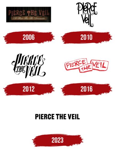
The Pierce the Veil logo is simple and foundational. In the emblem’s elements, profound emotions and experiences blend with loud music. The combination of words, melodies, and the musicians’ emotions is reflected in the symbol, representing a romantic band that plays rock.
Pierce the Veil: Brand overview
| Founded: | 2006 – present |
| Founder: | Vic and Mike Fuentes |
| Headquarters: | San Diego, California, U.S. |
| Website: | piercetheveil.net |
Meaning and History
The band’s logos are closely linked to its discography. Therefore, the number of emblems and rebranding years align with the release of the five albums. The designs resonate with album cover designs and song themes that revolve around the artists’ personal experiences. The main creator is the older brother, Vic Fuentes. The tracks and emblem styles contain many of his personal stories about painful relationships. The group chose their name as the logo and continually worked on its transformations and unique fonts.
What is Pierce the Veil?
One of the few rock bands that sacrificed its founder and drummer due to moral principles, becoming a trio in 2017. Distinct among post-hardcore bands, they have a Spanish flair in their compositions; hence they’re often called “mexicore.” The band is always on tour, delaying the release of new albums. In 17 years of their career, only five albums have been released.
2006
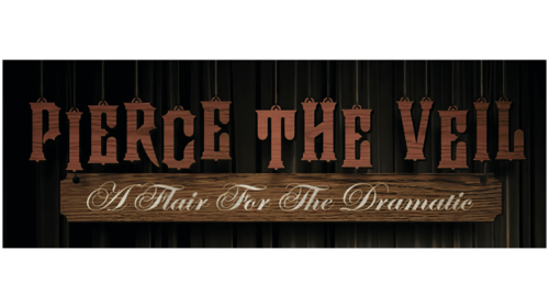
The band’s first emblem consists of the group’s name, written in red on a black background. The emblem was created for their debut album, which the brothers recorded together.
The name is styled like a tree. Each letter looks as though it’s carved out of wood, hanging at different levels on specific suspensions, also visible in the image.
The brothers took the band’s name from a song in the compilation “A Celebration of an Ending,” recorded with their previous ensemble. The track’s content speaks of a breakup, the decision to leave, even if it means ending one’s life to erase someone from the heart. This choice symbolized the main direction of the band’s creativity, addressing life and death, love, and friendship, which is reflected in the emblem by the red inscription.
Dramatic-theatrical tones are conveyed by wooden letters resembling marionette puppets on strings. This design reflects our dependence on the decisions of the Higher Powers, some predestination, and depression.
Below, on a separate board, the intricate album title “A Flair for the Dramatic” is written in white paint.
The font of both inscriptions gives a sense of antiquity and romance.
2010
The emblem of the second disc is tied to the release of the studio album “Selfish Machines.” The logo’s name is designed in a feminine and even tender style. The choice of letters with elegant swirls relates to the song themes, written from a girl’s perspective. The tracks are filled with the heroine’s pain due to the guy’s behavior. Hence the hint of selfishness in the collection’s title.
The upper parts of the symbols extend beyond the usual boundaries, while the lower parts feature spiral details, forming a font in the style of a princess. This choice conveys the anticipation of the beautiful and unattainable. The close arrangement of letters embodies the theme of intimacy and relationships.
Interestingly, the album title “Machines” resonates with the use of the Auto-Tune device for recording.
2012
The rebranding for the third album, “Collide with the Sky,” reflected the drive, certain aggression, and confrontation felt in the song lyrics. The scroll elements of the design reveal notches and spikes. The symbols are sharp and angular. In conjunction with the album cover design, the letters convey the challenges and troubles that prevent one from leaving the past behind and starting anew.
Interestingly, although the band switched to Fearless Records, the new album again emphasized the original writing style, as in the previous two.
2016
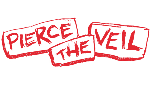
The logo for the “Misadventures” album appears as three separate words, each enclosed in an individual outline. It resembles a stone inscription that has broken into separate slabs. This technique conveys failed relationships that have left fragments behind. The emblem’s red color symbolizes blood, representing a wounded heart.
The red emblem also points to the events of the previous year’s terrorist attack in France, which killed 130 people and injured 416. Several tracks on the album are dedicated to these events. The inscriptions appear as stone fragments from devastating explosions.
2023
The 2023 logo, designed for the latest album, “The Jaws of Life,” features strong, bold letters representing changes in the band’s line-up and their views. After excluding the younger brother, Michael Fuentes, who was accused of rape and harassment, the band showcased its members’ maturity and convictions. The album’s music seems calmer and more profound, just as the emblem letters appear confident and reliable.
Font and Colors
The primary colors of the logo are black and red. These shades convey emotions: the intensity of love and the bitterness of parting. The pain of loss, a wounded heart, and sorrow are combined in the emblem with the strength and expression of music. Changes in moods are depicted by transitions from bright scarlet letters to dark black ones. The latest logo conveys serenity and the evolution of the musicians and their choice of direction.
The font of the “Nidex” inscription is simultaneously angular and soft, just as the artists’ performance blends the powerful chords of rock with the romantic gentleness of Spanish motifs.
Pierce the Veil color codes
| Black | Hex color: | #000000 |
|---|---|---|
| RGB: | 0 0 0 | |
| CMYK: | 0 0 0 100 | |
| Pantone: | PMS Process Black C |

