


![]() Pinarello Logo PNG
Pinarello Logo PNG
The Pinarello logo can be found on sports, casual, and electronic models worldwide. The famous bicycle brand is proud of its logo, which symbolizes its rich history and connection with two-wheeled transport. The Pinarello logo embodies dizzying speed, unimaginable curves, adrenaline, and vivid emotions.
Pinarello’s story began in Catena di Villorba near Treviso, where Giovanni Pinarello was born in 1929. One of 12 children, he started working at 15 at Cecchini’s bicycle workshop, learning frame-building and production from the inside. He also raced professionally, and in 1952, he turned his Giro d’Italia place into the money needed to open a small bicycle shop in Treviso.
From the beginning, Pinarello focused on racing bikes rather than the mass market. Giovanni understood what riders needed because he had raced himself. In the 1970s and 1980s, the Italian bicycle industry was highly competitive, with Colnago and De Rosa fighting for the same professional teams. At the same time, Pinarello built its name through close work with racing squads and custom frame geometry.
A breakthrough came with Miguel Indurain, who won the Tour de France five consecutive years from 1991 to 1995 on Pinarello bikes. The brand’s presence in Grand Tours continued in the 2000s through its partnership with the British team, later known as Team Sky. Bradley Wiggins won the Tour de France in 2012, followed by Christopher Froome’s victories in 2013, 2015, 2016, and 2017 on the Pinarello Dogma.
The Dogma became the company’s flagship model, known for its carbon frame and asymmetrical geometry developed for racing loads. Under Fausto Pinarello, the brand expanded into Asia and North America. In 2016, L Catterton acquired a controlling stake, while the Pinarello family stayed involved in management. Giovanni Pinarello died in 2022, leaving behind a company that had grown from a Treviso shop into a global racing bicycle maker.
Meaning and History
![]()
The visual symbol was changed only once, but not significantly. In both the original and modern styles, they retained the name and a distinctive icon that sets the brand apart.
What is Pinarello?
World-famous manufacturer of bicycles and accessories for racing, triathlon, urban, and mountain roads. They were founded in 1952 in Italy by cyclist Pinarello.
1994 – 2016
![]()
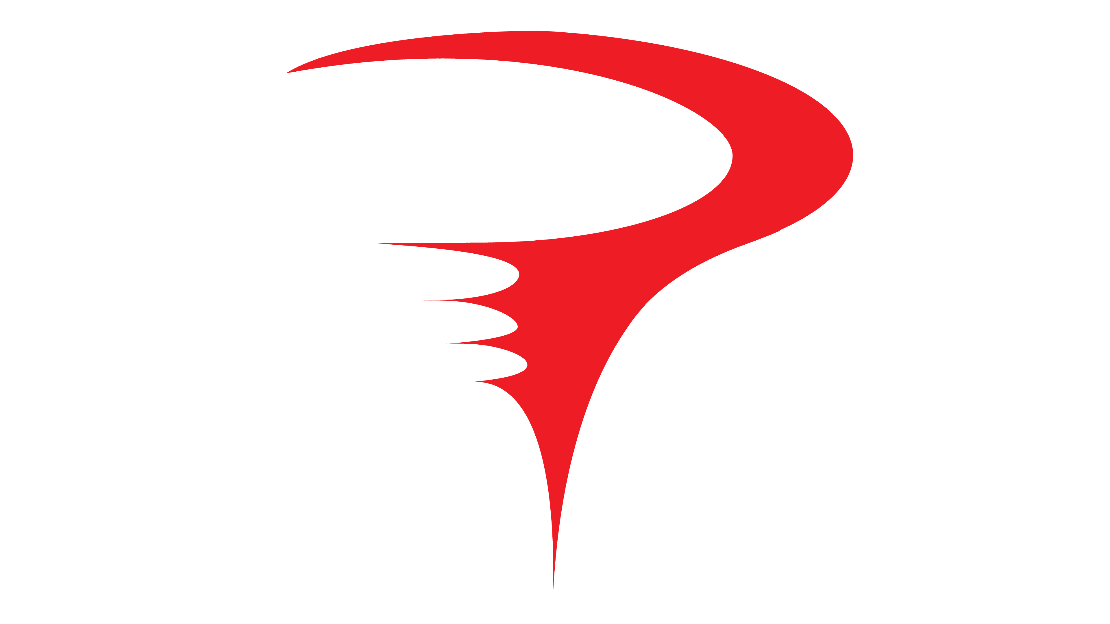
The Pinarello sign is an ode to streamlining and dynamism. Smooth, rounded letters with a forward slope symbolize speed, the desire to win, and cycling.
The red sign above the letter R, rising into the sky, adds to the logo’s unusualness. It is associated with the following:
- A whirlwind rushes forward, raising clouds of dust and sparks.
- A bicycle handlebar that was caught on camera.
- Funnel tornado, moving and capturing everything around, like a group of cyclists flying to the finish line on Pinarello.
The image fits perfectly with the cycling flagship that sponsors famous racing teams. A red racer who sits on a black letter model gives it the energy to move.
The company has a strong, solid foundation in knowledge and experience, as indicated by a large black name. And the driving forces behind creating new models are a hot mind and a love for bicycles. They are symbolized by a red sign rising like a sail.
2016 – today
![]()
In 2016, the family company, led by the founder’s children, was sold to new owners, a large concern that brings together luxury brands. They did a little rebranding. By correctly placing the accents in the existing logo, the shareholders have achieved a more modern, brighter, and more accurate reflection of Pinarello’s essence.
The new visual sign has become more compact, grouped like a sprinter flying to the finish line. The letters were brought together, forming a single whole. On the surface, traces of the dissection of the air are visible due to the rapid movement. They slide over the tops of the P, I, R, and O. The elements make the font sharper and add a jerk.
The sharp bottom of the tornado badge has fallen into the recess between A and R and looks like a burning torch of the Olympic Games, the flame that blows back from fast movement. Visually, the symbol has been reduced.
All the logo details seem to hold together, forming a cohesive composition.
Font and Colors
Black and red are the perfect combination to convey the idea of speed. They are associated with tango dance, the unity of opposites, and perpetual motion.
- Black – reliability, power, bike lubricant, tire color, and handicraft.
- Red – dynamism, speed, and love for one’s work.
There is no exact font match. It is similar to the modified italic from Trivia Gothic X2 Expanded Bold Italic.