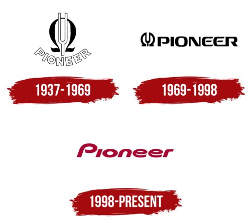
The Pioneer logo is smooth and vibrant. The emblem represents a blend of emotionality and technical excellence the company strives for. The mark emphasizes the quality of the manufacturer’s equipment and stylish design.
Pioneer: Brand overview
| Founded: | 1 January 1938 |
| Founder: | Nozomu Matsumoto |
| Headquarters: | Bunkyō, Tokyo, Japan |
| Website: | global.pioneer |
Initiated as a modest venture for repairing radios and speakers in Tokyo in 1938, Pioneer had its roots in Nozomu Matsumoto’s aspirations. A year before establishing the company, Matsumoto had crafted Japan’s inaugural Hi-Fi dynamic speaker, the A-8, under the “Pioneer” label, effectively laying the cornerstone for the firm’s future.
In the aftermath of World War II, Pioneer experienced a surge in growth, evolving from a repair shop to an eminent manufacturer of an array of audio products—from home stereo systems to car audio equipment. The enterprise achieved several groundbreaking feats, such as the launch of standalone stereo systems in 1962, the introduction of laserdisc players in 1979, and the development of the first car-based navigation systems in 1990, among others.
Taking its venture to the public market in 1961, Pioneer set its sights on global expansion as it opened sales branches in the United States and Europe during the 1960s. Under the stewardship of Seiya Matsumoto, the founder’s son, the company sustained its upward trajectory until the 1980s.
Pioneer is a formidable global audio and video player specializing in home audio systems, car electronics, and DJ equipment. With an enduring legacy of audio innovation, the company remains dedicated to advancing technologies, especially in automobile electronics. Overall, Pioneer transformed itself from a humble Tokyo repair shop to a worldwide influencer in the audio industry, consistently driving innovation in car and home sound systems.
Meaning and History
The word Pioneer evolved from a brand name to a company name. Hence, the history of the logo intricately intertwines with brand development and corporate establishment. The first emblem is related to the unofficial name of A-8 speakers from Fukuin Shokai Denki, thereby reflecting the device’s features. In 1961, Fukuin Denki was renamed Pioneer Electronic Corporation. The transition from a product to a global visual symbol of a large company becomes evident with the second emblem.
What is Pioneer?
A Japanese technical corporation with a revenue of $1.8 billion. Specializes in audio equipment. Includes 39 subsidiaries that operate in Europe, America, Africa, and Asia. Over 8,000 employees work in the conglomerate. The headquarters is in Tokyo.
1937 – 1969
The logo features a tuning fork surrounded by the Greek letter Omega. Beneath the composition, the name Pioneer is written in a semi-circle, in white letters with a black outline.
The tuning fork was chosen to commemorate the unforgettable experience of listening to music on hi-fi speakers, which inspired Pioneer’s founder, Nozomu Matsumoto, to engage in his developments. The instrument is a nod to the theme of sound. The company’s first products are closely tied to sound waves. In 1937, production began on dynamic and later Hi-Fi speakers, along with a radio repair workshop.
In addition to the tuning fork, the image resembles a magnet. The speakers amplified sound by moving a current coil in a magnetic field.
Omega originates from the Greek word “mega,” meaning “large.” The logo signifies the amplification of sound, a feature provided by the speakers of Fukuin Shokai Denki devices. This letter also represents electrical resistance, representing the company’s work with electrical appliances. The shape of the letter resembles the horn of a loudspeaker.
The name Pioneer was chosen to signify leadership in the field of speakers in the Japanese market. Nozomu Matsumoto, a son of missionaries and a devout individual, believed his innovations would assist in missionary work. Pioneer is also a term for missionary settlers and was chosen to hint at spreading the faith.
The white color of the letters embodies lightness and the transmission of invisible sound through the air.
1969 – 1998
The company changed its name, expanded to five factories, and began manufacturing stereo systems and car radios. The new logo reflected the company’s scale and captured the unique spirit and individuality of the manufacturer.
The emblem consists of the Omega letter merged with a tuning fork, forming wings.
The Greek symbol establishes the corporation’s connection with electricity. The company’s name is Pioneer Electronic Corporation. Most devices involve complex electronics and operate on electric currents.
The company’s primary focus is sound reproduction equipment, reflected in the tuning fork image. The desire to offer people unique listening experiences is fundamental to the company’s development. Hence, the tuning fork is placed at the heart of the emblem.
The wings symbolize the corporation’s leadership qualities and innovation. The melodies produced by Pioneer’s high-end systems inspire and offer a sense of freedom.
The logo resembles the “Play” button found on radios and players.
The name Pioneer follows the symbol on the right.
The giant’s name is rendered in modern letters with open glyphs. As individual sound waves create a melody in space, the separate elements form the inscription—the glyphs curve and sway, showing either sharp angles or smooth curves. Open elements represent a readiness to evolve and embrace modern innovations.
1998 – today
In 1996, the corporation changed presidency. Kaneo Ito influenced a shift in Pioneer’s image. Previously a graphic element with inscription, the logo was replaced by a streamlined and dynamic wordmark.
The company’s price list began featuring televisions and GPS systems alongside CD and DVD players. Therefore, the tuning fork symbol no longer represented the corporation’s diverse operations and was removed. The new logo features a smooth inscription of the company name in red.
The font embodies the corporation’s flexibility and communicative nature. It reflects the aim to softly impact the soul through sound and image, as highlighted in the slogan “Sound.Vision.Soul.” The absence of sharp ends conveys an unforgettable and pleasant experience with the manufacturer’s products.
The slight forward tilt indicates dynamism. The company continues to expand and create new product lines.
Font and Colors
The color red conveys the idea of positive, stirring emotions, which the corporation strives for. The shade creates a sense of celebration. It speaks to a love for the craft and dedication. Red embodies a leader capable of rapid change, adapting to customer needs.
The inscription’s font is unique. It incorporates features from Shary IBlack, Good Timing Bold Italic, and CentreForward Black Italic.
Pioneer color codes
| Vivid Burgundy | Hex color: | #a90533 |
|---|---|---|
| RGB: | 169 5 51 | |
| CMYK: | 0 97 70 34 | |
| Pantone: | PMS 200 C |


