


 PJ Masks Logo PNG
PJ Masks began in 2008 as Les Pyjamasques, a children’s book series by French writer Romuald Racioppo. The books followed three young heroes who went on night missions in pajamas, a premise centered on adventure, friendship, and problem-solving. In 2013, Entertainment One (eOne) acquired the rights to turn the French book concept into an animated television series.
Production moved forward in 2014, when the company worked with the French animation studio TeamTO. The adaptation was prepared for an international preschool audience, so the title was changed to PJ Masks and the characters’ visual style was adjusted for television. The series premiered in the United States on Disney Junior on September 18, 2015.
The television launch quickly led to franchise expansion. In 2016, Just Play became the global toy partner and released the first toy line, including vehicles and figures. By 2017, the show had been translated into many languages and aired in more than 85 countries. The official YouTube channel appeared in the same year, giving young viewers another way to follow the characters outside broadcast television.
Licensing continued in 2018 through clothing, accessories, bedding, and other children’s products. In 2019, the third season added new characters and locations, while PJ Masks Live! began an international stage tour. In 2020, the fourth season introduced new adventures and the special Heroes of the Sky. In 2021, Hasbro acquired eOne, placing the series inside a larger toy and entertainment portfolio.
Meaning and History
What is PJ Masks?
Romuald Racioppo’s “Les Pyjamasques” book series inspires this animated children’s television show. It follows the nighttime adventures of three childhood friends who transform into their heroic alter egos when they put on their pajamas. As Catboy, Owlette, and Gekko, they use their unique abilities to fight crime and solve mysteries in their city, often facing off against clever villains. Each episode emphasizes themes of friendship, problem-solving, and teamwork as the heroes work together to overcome challenges. The show combines humor, action, and moral lessons and is geared toward preschoolers and elementary school-aged children.
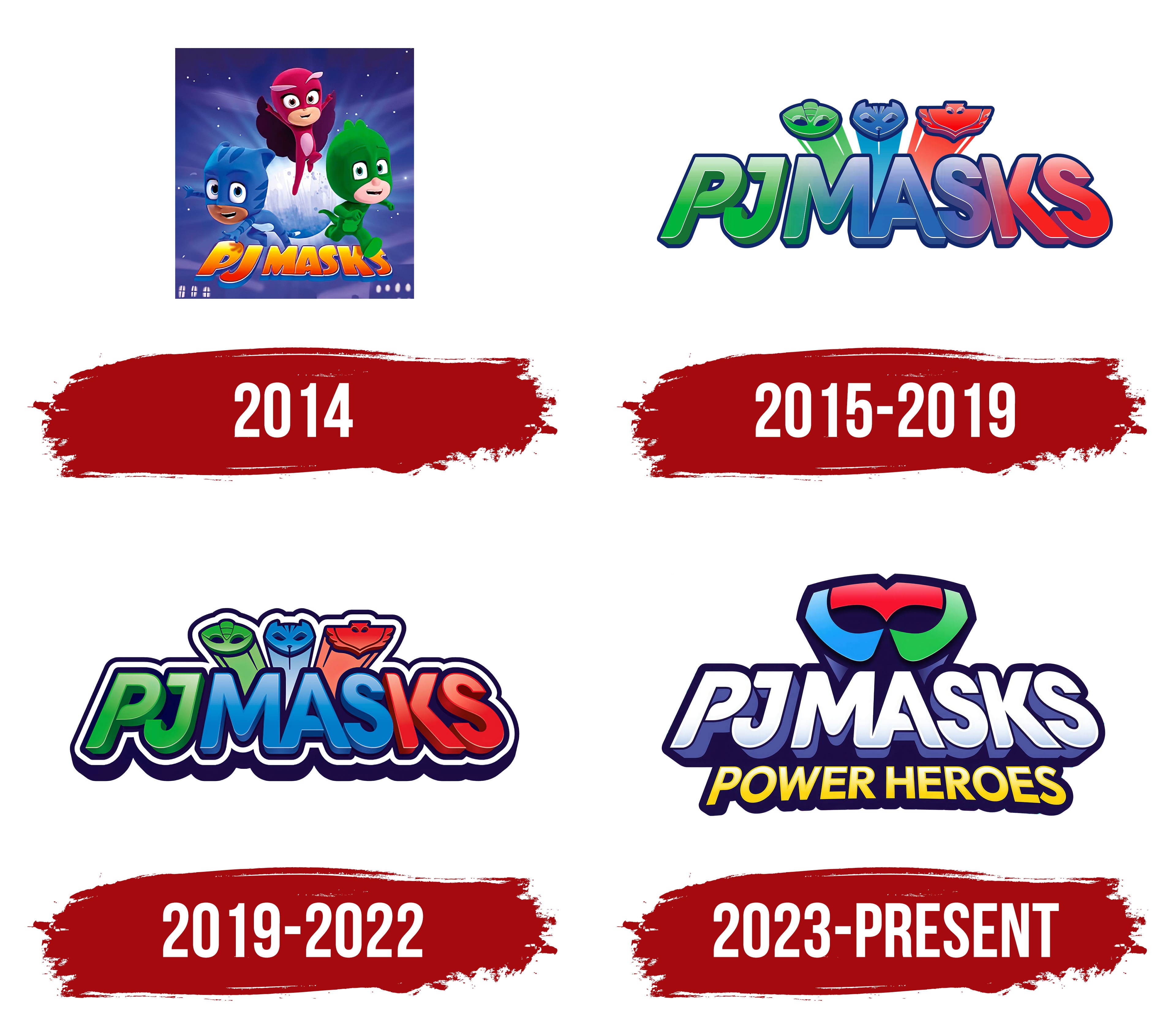
2014

2015 – 2019
2019 – 2022
The PJ Masks logo is designed in vivid tones, creating an atmosphere of childhood adventure and superhero storytelling. At the top are stylized figures of the show’s main characters: a green lizard, a blue cat, and a red owl. These characters are represented as recognizable silhouettes integrated into the letters of the show’s title.
The title itself is color-coded to match the heroes: the initial “PJ” in green, the middle “MAS” in blue, and the final “KS” in red. This combination reinforces the connection between the name and each character’s identity and powers. The font is bold, dimensional, and tilted, with smooth color gradients that add depth. Dark outlines and shadows enhance the text’s 3D appearance and visual impact.
The overall composition of the logo feels dynamic and playful, aligning with the show’s theme of imagination and heroic adventures. The bright color scheme and expressive forms make the design visually engaging and well-suited for a young audience.
2023 – today
The PJ Masks logo features a bold, vibrant color palette that captures the animated series’ energetic tone. At the top of the emblem is a stylized mask composed of three segments, red, green, and blue, each representing one of the show’s main characters: the red owl-themed hero, the green lizard-themed hero, and the blue cat-themed hero.
Beneath the mask sits the series title, “PJ Masks,” written in large, dimensional letters. The typography features a white gradient that gives the impression of bright illumination. The letters are slightly tilted backward, adding a sense of speed and motion. Deep shadows enhance the 3D effect and visual intensity of the text.
At the bottom is the phrase “Power Heroes,” highlighted in a bold yellow with smooth edges that stand out against the blue background. This additional line reinforces themes of adventure and heroism.
The logo’s overall design is defined by vivid colors, sharp outlines, and dramatic 3D elements, all of which contribute to a playful and dynamic visual identity. Every aspect of the design references the show’s central characters, their costumes, and their unique superpowers.