


![]() Planet Fitness Logo PNG
Planet Fitness Logo PNG
It’s time to tune your body to the wave of sports and physical activity. The Planet Fitness logo is hurried. The emblem invites you to visit the fitness rooms and train hard. The sign guarantees excellent health and excellent muscle relief.
Meaning and History
![]()
It all started when members of the Grondahl family bought Gold’s Gym from Dover, which was experiencing serious financial problems. They renamed the franchise Coastal Fitness, closed the previous gym location, and opened a new one. Michael and Marc then recruited another business partner (Rick Berks) and renamed the organization Planet Fitness in 1994. Berks named her after his daughter’s school project. So there was a radical turn in the fitness network’s development.
The owners focused on the casual-goer segment rather than on specialized bodybuilders. They breathed new life into the center so that everyone could come to the gym and work out, warm up, and lose weight. As a result, the sports brand has renewed its concept, atmosphere, style, appearance, and identity.
But the hall’s inexpensive, accessible business model, which lets everyone go, has irritated regulars at such places. Therefore, in 2010, Men’s Health magazine named Planet Fitness the worst gym in the United States. Another source of dissatisfaction among weightlifters and bodybuilders is the ban on certain strength exercises on this site. Despite the attacks from the “pros,” the franchise continued to develop and expand, going beyond a single country. In 2019, its branches appeared in Australia.
In 2016, American Franchise Times named Planet Fitness the fastest and most responsible chain, placing it at number 1 on its list. At the same time, Forbes magazine ranked it 4th, elevating the brand to a very high level and making its simple logo widely recognizable. It includes a successful combination of text and graphics, executed in the same style – serious but not aggressive.
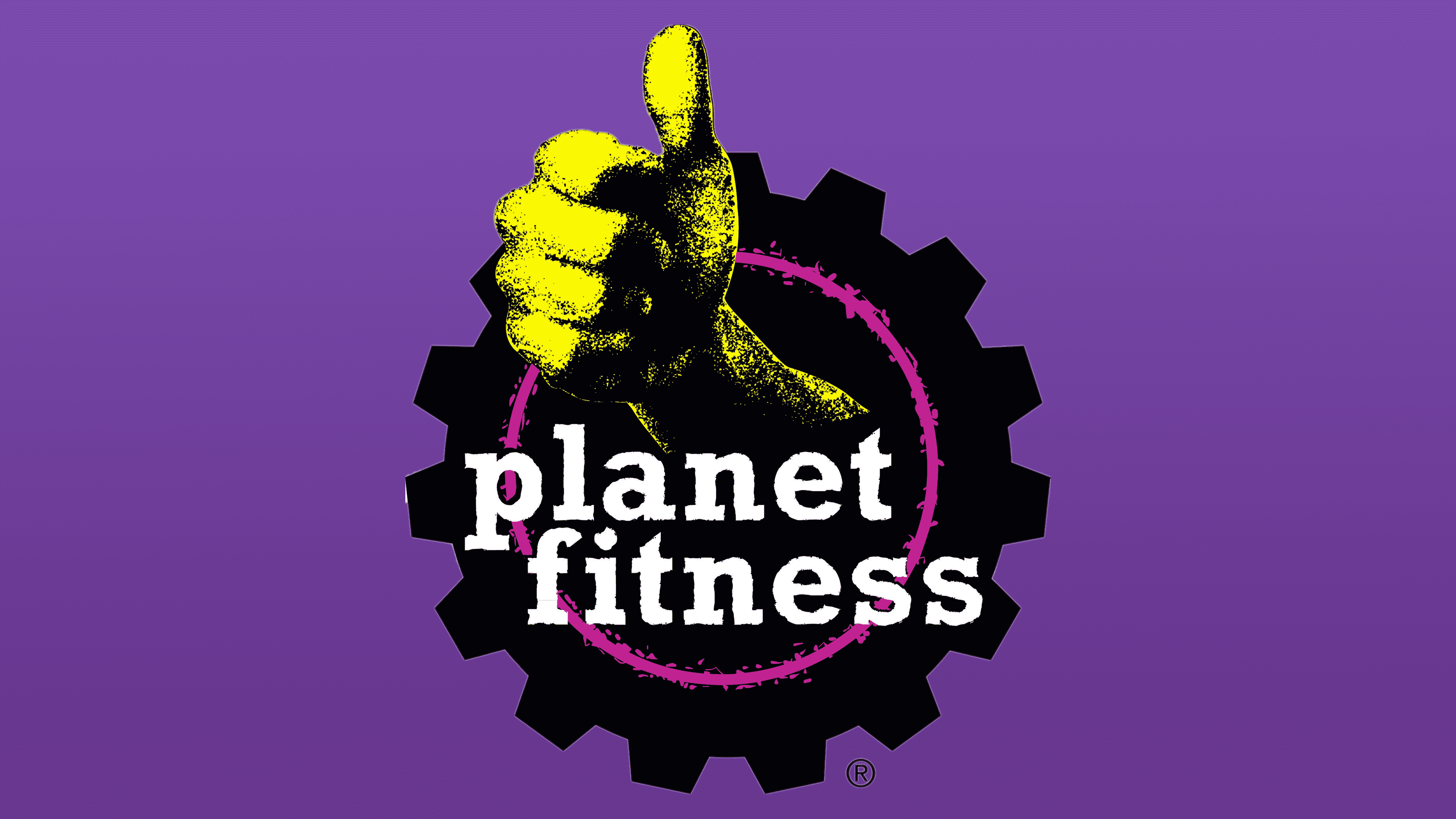
The franchise uses gear as a visual identifier. It is massive, large, and wide. This element symbolizes the opportunity for everyone to become fit and physically strong through diligence – exercises performed mechanically. In addition, the gear is a key element of all kinds of simulators; without it, they would be a non-functional pile of metal. That is, a very large semantic load is hidden in this detail.
A hand with an extended thumb passes through the slit in the logo. With this gesture, people usually convey a positive attitude, approval, and support to those around them. This is how the network of sports centers conveys to potential clients that its halls have a great, cool atmosphere. The middle of the gear is highlighted with a dark purple ring. The line is rough, with jagged edges. All elements are overlaid with a white inscription, executed in lower case with large serifs. And the outstretched hand, the thumb, and the circle are grainy, which adds dynamics to the emblem.
Font and Colors

The name “Planet Fitness” is set in a classic typeface. The letters are straight, the same size, and lowercase. They feature bold serifs reminiscent of wide exercise machine stands.
The color palette is quite varied and consists of black (used for the gear), on which the white lettering stands out perfectly. The signature palette also includes yellow (hand) and purple (center ring).