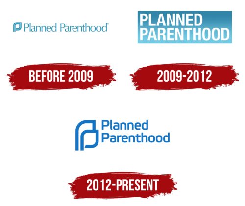
The organization’s visual identity is based on its basic principles – trust and support. This perfectly reflects the current Planned Parenthood logo. It uses a rather soft-flowing typeface to denote kindness, comfort, reliability, a friendly attitude, and an appropriate color scheme. It consists of two shades, which are most often used for the design of the emblems of medical institutions. They symbolize a high degree of responsibility, calmness, and reliability. In general, the concept provides for an original layout, part of which is a stylized graphic symbol.
Planned Parenthood: Brand overview
| Founded: | October 16, 1916 |
| Founder: | Margaret Sanger |
| Headquarters: | Manhattan, New York City, New York, and Washington, D.C., United States |
| Website: | plannedparenthood.org |
Planned Parenthood is one of the largest reproductive technology organizations in the United States. The main branches are located in Washington, New York, and Manhattan. In addition, the influence of the organization extends to other countries. At the international level, activities are regulated by Planned Parenthood Global and IPPF.
Planned Parenthood is a global organization with over 100 medical and non-medical affiliates. About 500 American clinics operate under their leadership. In addition, the organization has established close cooperation with medical institutions worldwide. The main area of work, both within the country and abroad, is a range of services in the field of reproductive health.
Meaning and History
The company’s professional activity is successfully embodied in a stylish basic logo associated with reliability and a sense of security at the level of visual identification. To achieve this effect, the designers used a confident flowing typeface, a stylized figure, and a light base color scheme to showcase the organization’s trustworthiness. All elements are in harmony with each other, which shows the smoothness of all processes in Planned Parenthood.
What is Planned Parenthood?
Planned Parenthood is an international non-profit organization offering various reproductive health services. Among them are clinical breast examinations, pregnancy consultations, prenatal care, infection testing, various types of contraception, etc. In addition, the organization joins research in the reproductive health field and promotes sex education. The main offices are in the USA.
Until 2009
The foundation for the organization was laid in 1916 when American activist Margaret Sanger established America’s first birth control medical facility. Later, the American Birth Control League was formed, which changed its name to Planned Parenthood in 1942. At this point, the earliest version of the emblem appeared.
It was an elegant, neat, and stylish picture in which there was a word mark and a graphic addition. The basis was a text element that directly denoted the organization’s name. It was styled in a thin, modern sans-serif typeface. It was distinguished by rounded shapes, straight cuts, and a dense arrangement of letters. Trust, care, comfort, and attentiveness were seen in the chosen design.
These principles were part of the philosophy of the organization. In addition, the message of Planned Parenthood was about trust and reliability. The designers used two corresponding colors – white and blue- to reflect the features at the visual identity level. The concept was completed by a miniature graphic detail that resembled the letter P and, at the same time, a leaf from a tree. She favorably diluted the strict laconic verbal sign.
2009 – 2012
In 2009, the light, sophisticated logo was replaced by a more confident and expressive image. It was a confirmation of the expansion of the scope of activities and obtaining a higher status at the country level. The title was still the base, but now the element was presented in a two-level format and placed against a rectangle background.
The letters became more massive, symbolizing a more confident position and improving the quality of services. Straight lines and even cuts also testified to the immutability of organization principles. There was no decorative symbol in this version, but a stylish blue border in the form of a rectangle appeared. Against its background, the inscription looked very powerful and impressive, and a large amount of blue showed a high level of reliability and responsibility. The picture was complemented by a neutral white background, symbolizing purity, safety, and honesty.
2012 – today
Since 2012, Planned Parenthood has used a version of the logo that is still relevant today. It consists of a two-level inscription and a decorative addition in the form of a figure, which has several interpretations at once. The graphic symbol resembles two letters, P superimposed on each other. In this form, the detail can be interpreted as a woman and a man or a parent and a child.
These are direct associations with the activities of an organization that provides reproductive health care. The central element of the logo is the inscription Planned Parenthood. It is made in a beautiful smooth font with soft, and in some letters, beveled cuts. These characteristics, together with beautiful neutral coloring, stand for safety, reliability, comfort, and care.
Font and Colors
All the elements in the signature Planned Parenthood logo are neat and perfectly balanced. This applies not only to shapes, lines, and layouts but also to well-chosen colors. The main sign in the form of text is designed in the Flexo Bold style. This is a category of modern geometric fonts that lack traditional serifs.
The developers say that it was their most successful option because it combines sophistication, beautiful curves, and original beveled corners. Some letters also have neat diagonal cuts. Such features make the logo especially stylish and timeless. In addition, the font symbolizes progress, innovation and security.
The color scheme is dominated by a light blue hue, in which all logo elements are painted. In the color palette, it can be found by the coordinates: RGB: 23/117/194. The chosen color is a sign of quality, professionalism, and high trust, which are the key features of the organization. Complementing Planned Parenthood’s characteristic is the background’s basic white color, which symbolizes purity, responsibility, and trustworthiness.
Planned Parenthood color codes
| French Blue | Hex color: | #1474c4 |
|---|---|---|
| RGB: | 20 116 196 | |
| CMYK: | 90 41 0 23 | |
| Pantone: | PMS 3005 C |
