


![]() PNP Logo PNG
PNP Logo PNG
The PNP logo conveys this body’s importance, solid status, and significance for the local population. To fully convey this message, the designers chose a complex multi-component format.
It allows for the use of more than two elements in the logo, harmoniously combined into a single whole that reflects the essence. There are quite a few components in the Philippine National Police emblem. Among them, one can single out a common frame divided into four zones, two inscriptions, several stars, two branches with leaves, a central detail in the form of the sun, and an image of a warrior with a shield. Each figure describes a specific characteristic of the Philippine National Police.
The Philippine National Police traces its roots to local systems of order before Spanish rule, when barangay warriors served under a datu and handled protection, disputes, and village security. After Spanish colonization began in 1565, policing shifted to colonial military structures. In 1868, Spain created the Guardia Civil, a civil guard modeled on gendarmerie forces and used across its colonies.
After the Spanish-American War of 1898, the United States took control of the islands and reorganized law enforcement. On August 8, 1901, Act No. 175 created the Philippine Constabulary, an armed force with both military and police functions. Manila also received its own police department in 1901, creating a split between provincial constabulary work and urban policing.
During World War II, the Constabulary was reshaped under Japanese occupation and was restored after Philippine independence in 1946. In 1975, Presidential Decree No. 765 created the Integrated National Police, combining the Constabulary with city and local police units, including the Manila Police Department. However, the system still kept a strong military structure.
The modern PNP was created on December 13, 1990, when President Corazon Aquino signed Republic Act No. 6975. It officially began work on January 29, 1991, absorbing the Philippine Constabulary and the Integrated National Police under civilian control through the DILG. Alongside the PNP, the NBI handles major investigations, while the AFP is used against armed groups. From 2016 to 2022, Rodrigo Duterte’s anti-drug campaign became one of the most controversial periods in the force’s history, drawing international criticism over alleged extrajudicial killings.
Meaning and History
![]()
During its existence, the Philippine National Police changed its corporate logo several times. The main reasons were improvement, reform, and reorganization. Each such change also required adjustments to the visual identity, so at certain intervals the PNP adopted a new emblem. The current version is the most thoughtful of all the options presented. It fully reflects the essence, values, and features of the state structure.
What is PNP?
The PNP (Philippines National Police) is the name of the armed law enforcement agency that maintains law and order in the Philippines. The division’s headquarters is in Quezon City. The organization is currently controlled by the mayors of the municipalities and the National Police Commission. The DILG (local government) is responsible for training and equipping the necessary ammunition.
1901 – 1975
![]()
The history of the PNP dates back to 1901. It was then that the Manila Police District and the Philippine Police were established. After some time, these structures joined the Armed Forces of the Philippines. The reorganization did not end there. In 1990, the United National Police and the Police Department merged. As a result, the Philippine National Police (PNP) was established.
The new organization received its first corporate logo. It was a complex picture consisting of inscriptions, frames, and graphic symbols. The lower part resembled the shape of a warrior’s shield. Inside, there were two branches crossed at the ends, as well as an image of an object resembling a weapon. All this was complemented by a rounded upper part, in the center of which was a drawing of a knight’s helmet. Around it were three miniature stars.
The composition symbolizes valor, courage, trustworthiness, protection, and nobility. This is what directly characterizes this law enforcement agency. In addition, the combination of the presented elements makes the icon quite recognizable. The expressive coloring also contributes to this. The logo uses blue (symbolizing trust), yellow (denoting energy), red (symbolizing courage), white (reflecting responsibility), and green (symbolizing calm and comfort).
1975 – 1991
![]()
In 1975, the law enforcement agency changed its logo. The updated picture was, in many ways, similar to the Philippine flag. It was a large frame, similar to a shield, but with three pointed tops. Along the edges, the figure is decorated with two branches, which, according to the designers’ idea, were associated with a laurel tree, a symbol of peace and goodness. There were also three neat stars on the pointed tops, resembling the figures on the country’s flag.
At the center of the emblem was a sun-like symbol with a knight inside. This element also has similarities with the elements of state symbols, and the figure of a warrior was a direct reference to the organization’s activities. Under the stylized sun on the emblem, a ribbon bearing the inscription INP was placed. The color scheme was dominated by red, blue, white, and gold hues, which are also present on the flag of the Philippines.
A dark green shade was also used here (leaves of laurel branches are decorated). Due to the specified elements and colors, the PNP badge is directly associated with government agencies. Thematic icons emphasize its character and direction, represented by an image of a knight and a wordmark.
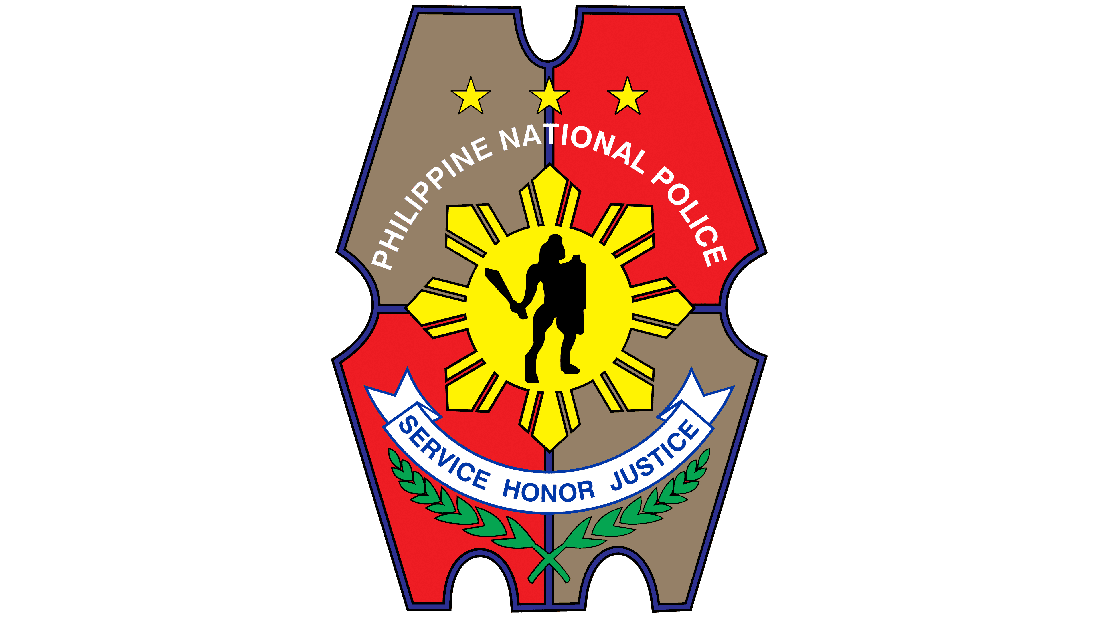
1991 – today
![]()
In 1991, the visual concept of PNP was formed, which is still used today. This is a modern, detailed logo created in accordance with the institution’s traditional scheme. All content was contained within a frame resembling a modern law enforcement shield. It is divided into four parts and has small indentations on the sides. In the center of the stylized shield is a symbol that resembles the sun.
Its eight rays symbolize the eight provinces that rebelled against Spanish rule. A similar sign is displayed on the country’s flag. Another element of the state symbols is located at the top of the logo: three bright stars. Immediately below them, you can see the name of the Philippine National Police in simple Roman type. In addition, the verbal part includes the inscription “Service Honor Justice,” set on a stylized white ribbon.
It stands for the Philippine National Police’s main motto: service, honor, and justice. There are also laurel branches here. They denote regional law enforcement commands. In the sun’s center is an image of a key figure, the legendary ruler Lapu-Lapu. He is considered a national hero in the country and represents the constitutional type of civil power.
Font and Colors
The PNP logo uses two wordmarks with identical designs. Service, Honor, Justice, and Philippine National Police inscriptions are composed of straight, laconic sans-serif lines. The letters look quite strict and simple, emphasizing rigor and compliance with certain rules. Expressive colors complement the concept.
It is based on blue, red, white, yellow, and green colors. Some of them are similar in color to the flag, which symbolizes patriotism and devotion. Green, in this concept, stands for calm, comfort, and safety, which are law enforcement goals.