


 Podcasts Logo PNG
The Podcast logo represents communication and information delivery. The emblem indicates the dissemination of useful, educational messages that the lecturer records for users. To listen, click the Start button.
Meaning and History
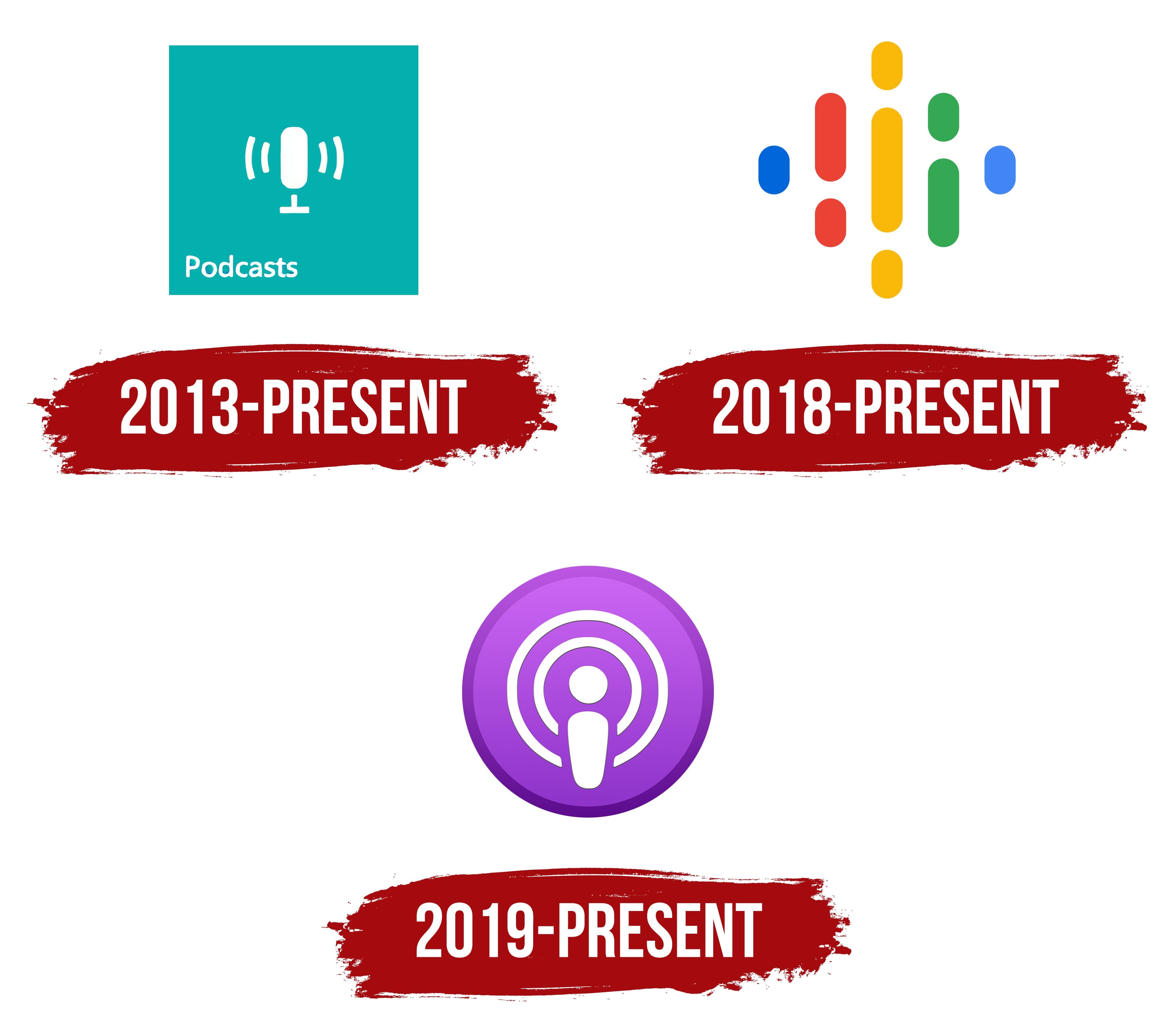
In the fall of 2000, Tristan Louis proposed attaching video and audio files to RSS feeds. Dave Winer, the author of RSS and a software specialist, implemented the idea. His work helped drive the widespread adoption of podcasting, as this medium became in demand for personal and corporate content.
The first application to turn theory into practice was iPodderX. August Trometer and Ray Slakinski developed it. This transition gave podcast theory a sharp impetus and helped drive its widespread use. By 2007, the new format made it possible to do what had previously been done only through radio broadcasts. Matt Schichter launched the first chat show, The BackStage Pass, in 2003.
The hour-long program was recorded live and converted to 16 kbps audio for streaming over a switch connection. As a result, the show was renamed Matt Schichter Interviews and became the first podcast to appear online.
Another show worth noting is Daily Source Code, launched in 2004 by Adam Curry. He popularized the new technology, offering news broadcasts, celebrity chronicles of daily life, and emerging podcasts.
What is a Podcast?
A podcast is an audio recording you can download or stream online. It can be a story with creative elements or a program in which a host converses with guests. Both large media companies and individual users can create podcasts.
2013 – today (Windows)
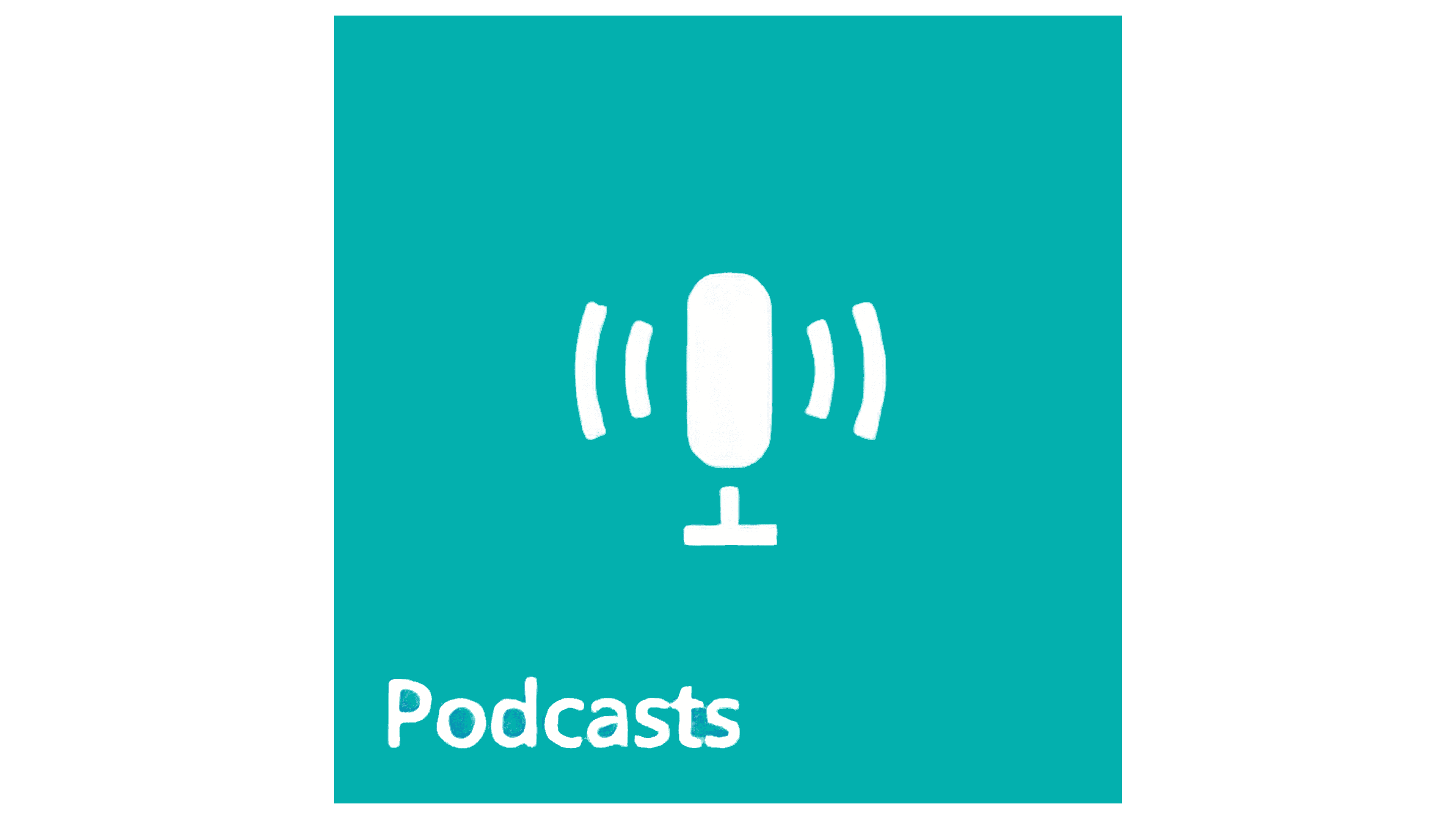
In 2013, a personal icon for Windows Phone platforms was launched in several versions, from 8.1 to 10. Although users set the pattern and background color individually, a general logo scheme is in place. It is an emerald square with a large microphone on a stem. The microphone itself looks like a vertical oval of the correct shape, and its leg resembles a perpendicular symbol, resembling an inverted “T.”
Ethereal waves radiate from the microphone in different directions, symbolizing the broadcasting process. They look like mathematical brackets, four of them, two on each side. The word “Podcast” is written in the lower-left corner of the square. It is derived from two pillars: “iPod” and “broadcast.” The beginning is taken from one word, and the end from another.
2018 – today(Google)

In 2018, Google also launched its own podcast distribution platform. The logo for this service is not similar to Apple’s or Microsoft’s icons, but it follows the corporate style of the company’s emblems. It features dots and dashes arranged in a rhombus, each in a different color. In this logo, the developers sought to convey the perception of sound to first-time viewers.
2019 – today(macOS)
Apple Podcast logo
In 2019, Apple approved a version of the logo for macOS 10.15 version 1.0. This sign looks a little different than the first one. It uses a purple circle with a dark border. In the center is a large white dot under which an impromptu leg is located. It is a vertical oval. The bottom side is narrower than the top. Open rings surround all elements, symbolizing the territory’s widespread broadcast coverage.
Font and Colors
The designers opted for a sans-serif typeface with close-spaced letters for the Windows Phone logo. The macOS logo has no text.

Although the logos’ palettes differ, both variants share white and are available in emerald and purple.