


![]() Polly Pocket Logo PNG
Polly Pocket Logo PNG
Each brand product features a chic Polly Pocket logo that perfectly conveys the atmosphere of childhood. It is a two-level inscription, complemented by a beautiful, delicate detail: a miniature heart. The decorative element with a playful, soft font creates a graceful, friendly image that conveys creativity, beauty, and lightness. A feature is an attractive soft font that lacks sharp corners. It emphasizes product safety and excellent performance.
Polly Pocket began in 1983 at the home of British inventor Chris Wiggs. He made a small gift for his daughter Kate by placing a tiny room and a miniature girl figure inside a cosmetic powder compact. The toy closed like a case and fit in a hand, which became the basis of the later product.
Bluebird Toys, founded in 1980, bought the concept and released Polly Pocket in 1989. The original sets were small plastic cases that opened to reveal miniature rooms, gardens, castles, shops, or other play scenes. The figures were only about two to three centimeters tall, and the full set could fit in a pocket. This gave the brand its name.
The idea stood apart from larger toy lines such as Barbie by Mattel. Polly Pocket offered small portable worlds that children could collect, carry, and trade. Bluebird Toys expanded the line with many themed sets and, in 1993, used a related format for Mighty Max, a boys’ line built around monsters and adventure settings.
By the mid-1990s, Polly Pocket had become one of Bluebird Toys’ major successes. In 1998, Mattel bought Bluebird Toys and later changed its product line, replacing tiny figures with larger dolls and rubber clothes. In 2006, Mattel recalled about 4.4 million Polly Pocket accessory sets because of small magnets. In 2018, the brand was relaunched with compact cases, smaller figures, and an animated series, returning closer to the original Bluebird Toys concept.
Meaning and History
![]()
The visual identity has changed many times over the years, directly related to design changes and the release of new toys in the series.
It was produced under more than seven logos. All of them were created based on the toy line’s name and complemented by bright decorative symbols associated with children’s themes. The current logo is the most stylish and perfect version of all the options presented. It looks very gentle, beautiful, and neat. This effect is achieved through a special handwritten font, soft contours, and friendly colors.
What is Polly Pocket?
Polly Pocket is the name of the original line of children’s toys produced by the well-known company Mattel. At one point, the series was manufactured under the Bluebird Toys brand. At the moment, such models are collectible. The main part of the line consists of dolls, accessories, toy houses, and various additional details.
1989 – 1998
![]()
Chris Wiggs designed the Polly Pocket line in 1983. It was originally produced by Bluebird Toys, which licensed the series in 1989. But by 1998, the brand had already been acquired by the well-known toy giant Mattel. Up to this point, the series was identified by the corporate logo, an oval with the name inside.
The two-level funny inscription was supplemented with a symbol consisting of two small hearts, symbolizing joy and kindness. For the design, a thick original font with curls was used. The picture was complemented by bright doll colors: pink, yellow, and blue.
1998 – 2003
![]()
In 1998, Polly Pocket received a more themed logo. It retained an oval frame and an inscription, but in a different format. Inside, the figure of a little girl was added, which focused on products, along with an exclamation mark complemented by a flower. The font style has changed to a subtler, more cartoonish one. It featured curls and decorative projections along the entire length of the letters. The colors were dominated by pink, showing the toy theme. In addition, yellow and white colors were present, diluting the picture favorably.
2003 – 2006
![]()
In 2003, a more refined version of the previous logo was introduced. It was an oval without contours, still containing Polly Pocket’s inscription. It retained an exclamation mark with a flower instead of a dot and bright colors. The designers removed the image of the girl. The main change was the arrangement of the words.
The word “Polly” occupied almost the entire space and was set in a massive, fun scrolly typeface. The Pocket emblem was almost invisible due to its thin, neat lines. It was placed on the tail of the letter y. The chosen concept showed friendliness, care, warmth, and positivity.
2006 – 2008
![]()
In 2006, the visual concept underwent dramatic changes. For the inscription, a smooth, modern font with rounded ends was chosen; the image of a flower replaced the letter o, and the word mark extended beyond the oval frame. This marked a new stage in the series’ development.
The manufacturer introduced new dolls and reinforced the release with a more modern emblem. In it, not only was the font updated, but the colors were as well. Purple, white, and dark olive colors were used here. This design showed luxury, a childish atmosphere, safety, and comfort.
2008 – 2012
![]()
The 2008 logo was a simplified version of its predecessor. In the Polly Pocket lettering, the outlines have become less expressive, but the font itself has remained the same. Soft shapes and smooth cuts characterize it. Instead of the letter o in the first word, a beautiful image of a flower is also used. But now, the inscription is not placed in an oval but in a rectangle, with rounded ends at two points. The diagonal arrangement gave the logo a dynamic feel. At the level of visual identity, this meant progress and improvement.
2012 – 2015
![]()
During this period, the toy series featured a minimalist logo: a rectangular frame with an inscription. There are highlights in the logo and small shadows in the inscription. This made the picture quite modern and realistic. The toy theme was highlighted with a vibrant color palette of pink, purple, white, and green.
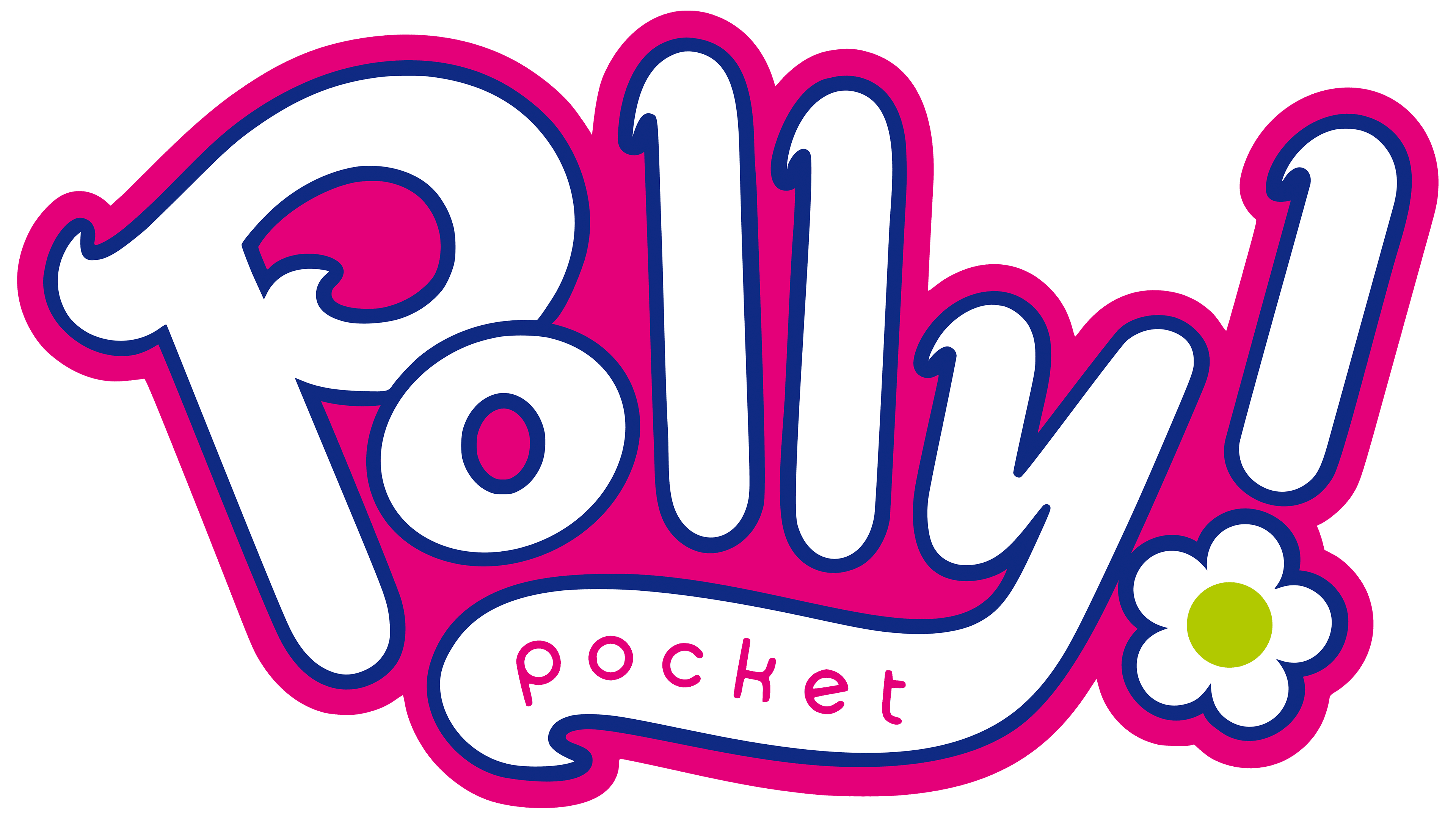
2018 – 2021
![]()
In 2018, the manufacturer decided to rebrand again. The new logo was a more attractive version of the 2006 badge. There were no frames here, and the inscription was on two levels. Instead of a flower, a tender heart was used. You can see a slight glow on handwritten soft letters in this version. The chosen design showcased elitism, creativity, and safety, the main characteristics of the popular series.
2021 – today
![]()
In 2021, the logo underwent minimal changes. The updated picture was in many ways similar to the previous version. It retains the same color scheme and letter arrangement, as well as an expressive graphic element: a heart. Changes, to some extent, affected the colors. The glare has disappeared from the logo, making it clearer and more expressive. This testifies to the stability that has emerged in the line’s production.
Font and Colors
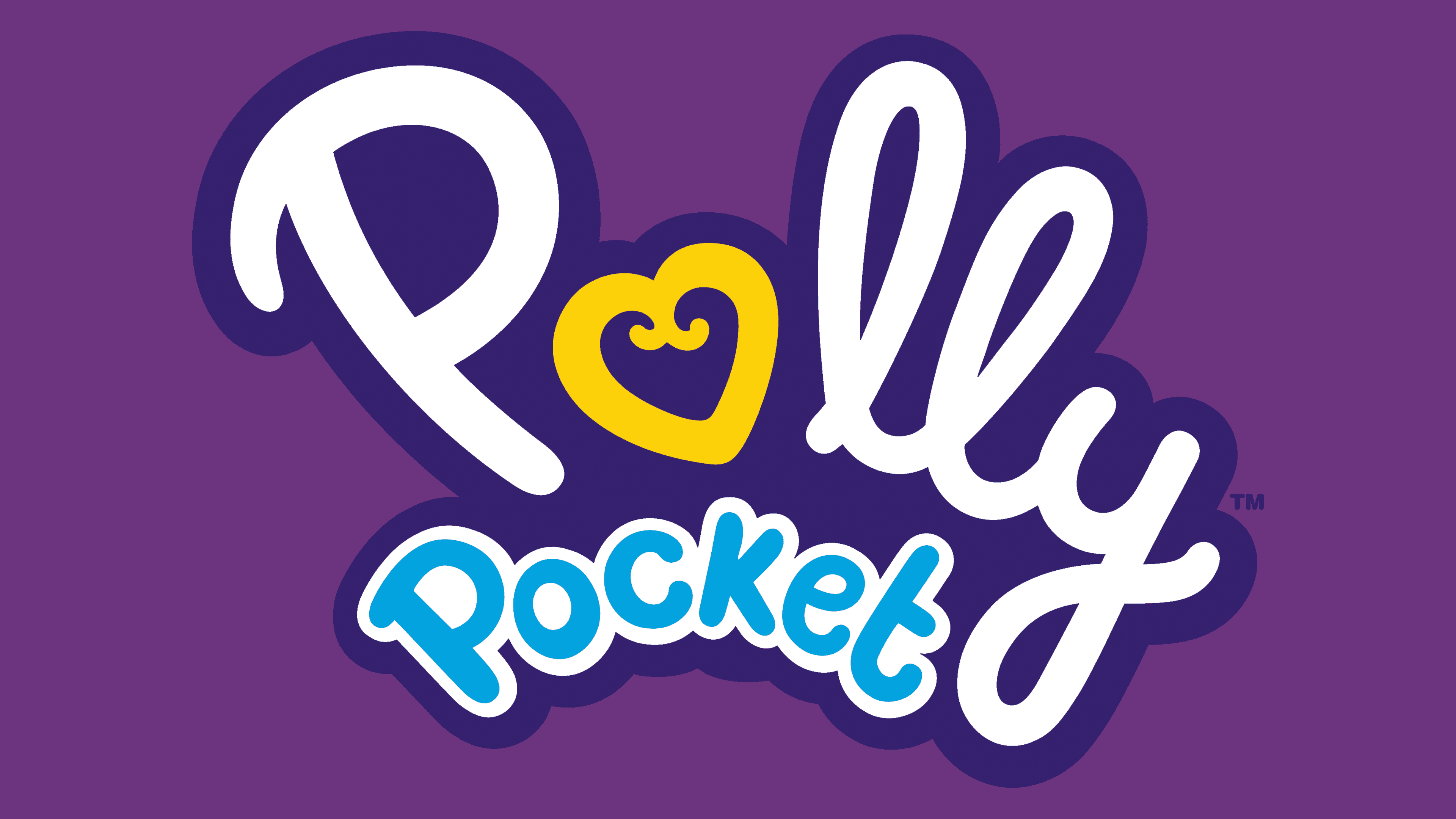
The Polly Pocket emblem is one of the best examples of branding for children’s toy brands. The theme presented here is manifested in every detail. A rounded cursive font with two connected Ls looks cartoonish. It demonstrates comfort, friendliness, and positive emotions.
Goodwill is also reflected in the colors. The emblem features warm yellow, associated with comfort and joy, and basic white, symbolizing purity. The main elements also use light blue and deep purple hues. Light blue denotes trust and reliability, while purple is the color of luxury and elitism.