


![]() Postmates Logo PNG
Postmates Logo PNG
The Postmates logo rushes toward customers so fast that it leaves a trail of sparks. The selected product will be delivered instantly. To do this, the company employs a full staff of couriers. The emblem inspires an order to experience the service’s operation.
Bastian Lehmann started in Germany as managing director at Spreadshirt. After moving to London in 2005, he faced inefficient courier services while trying to deliver a snowboard. High costs and delays exposed limits in urban logistics. Back in the US, he launched Seven a Day, a flash-sale project that closed after about a year. In San Francisco, he met Sam Street and Sean Plaice. In May 2011, they founded Postmates, building a service centered on independent couriers.
The model differed from standard delivery platforms. Couriers could buy goods from almost any store or restaurant and deliver them within an hour. Early operations relied on manual coordination while the team refined dispatch systems. In 2011, Postmates joined Angelpad and raised over $800,000, plus $250,000 from an investor who had previously worked with Uber.
In December 2014, the company launched an API that allowed merchants to connect directly. This opened the platform to smaller retailers, as well as partners such as 7-Eleven and Apple.
Expansion included entering the Mexican market in 2017, though the market closed in 2019 due to scale constraints. By 2018, competition intensified with DoorDash, Grubhub, and Uber Eats. Postmates raised $300 million in 2018 and $100 million in 2019, reaching a $1.85 billion valuation and about 10 percent market share. In July 2020, Uber agreed to acquire Postmates for $2.65 billion after losing Grubhub to Just Eat Takeaway. The deal closed in December 2020, and the service was integrated into Uber Eats while the brand remained active for a period.
Meaning and History
![]()
The company was founded in 2011 and initially only served San Francisco. It provides services in many cities worldwide, collaborates with thousands of trading partners, and offers its regular customers a profitable Postmates Unlimited program. Another thing that makes it stand out is the extraordinary logo with a simple yet stylish design.
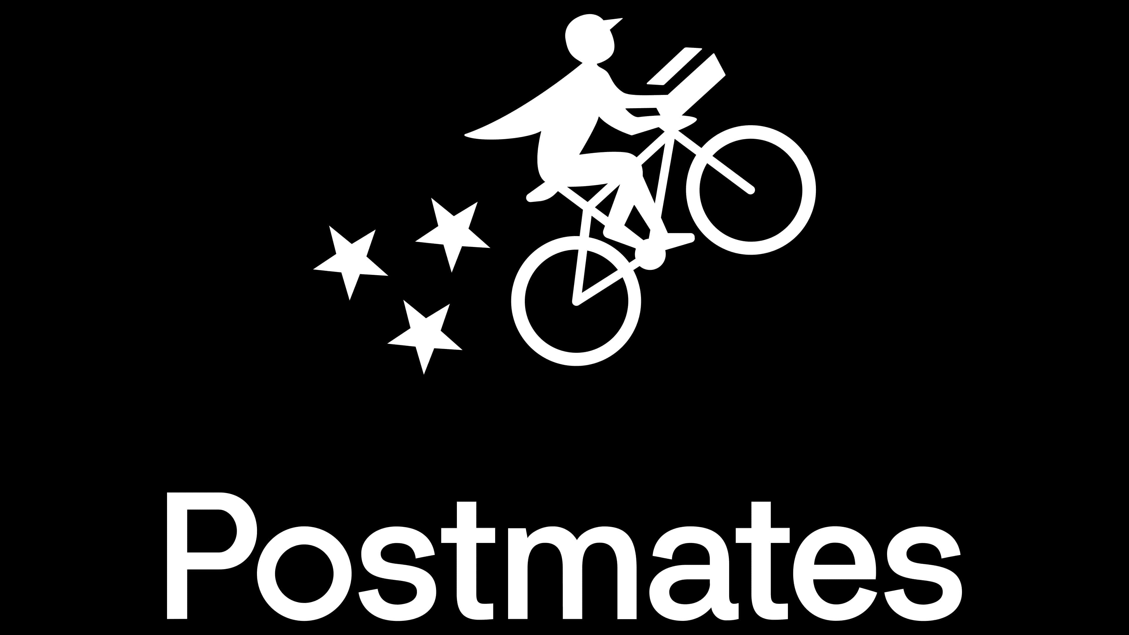
It consists of lettering and a fancy icon. The centerpiece is the cyclist, presumably a Postmates courier, because there is a box in the front trunk. The drawing resembles the famous shot from the science fiction film E.T. The Extra-Terrestrial. The character appears as a superhero: a long cloak flutters behind him, and a bicycle lifts off the ground on its front wheel.
The three stars shown at the back have several meanings:
- They add dynamism, creativity, and brand identity to the design.
- It is a symbol of night flying, so there is no doubt about the bicycle’s ability to fly.
- The stars indicate the Postmates rating system, which evaluates delivery service and employees.
The full version of the logo, next to the picture, is in bold black text. It can be at the bottom or anywhere else, depending on the visual context.
The flying cyclist is a recognizable symbol of Postmates. He says there are no obstacles for this service’s carriers: they will quickly deliver any product, even if it’s impossible. This drawing represents everything a brand does and is closely related to other identity elements, such as icons that appear on the map to show where the courier is and how he travels: by car, on foot, or by bike.
The emblem is found not only in the application but also on bags, helmets, and other Postmates employee paraphernalia. A creative image supports the company’s image and clarifies its concept.
What is Postmates?
Postmates is an American food delivery and home shopping service, and its mobile app. It has been operating since 2011 and is owned by Uber. Its offices are located in almost 3,000 cities in the United States (as of 2019).
2011 – today
![]()
A flying bicycle courier is the hallmark of American food delivery and shopping service to your home or office. This image emphasizes the most important thing: the instantaneous overcoming of distances and arrival at the address in a short time. The bike is classic, but it moves uncharacteristically upwards, reminiscent of a scene from the movie E.T. the Extra-Terrestrial. He clearly indicates that the service representatives will make every effort to deliver the order. A fluttering jacket on a person and stars flying out from under the wheels testify to the high speed. They also hint at the service rating from users who rate the couriers. All elements are gray and are on a white background.
2011 – 2012
![]()
To show the scale of the delivery service, the developers made the Postmates logo round, like a globe, and divided it into two color-coded segments. They painted the bottom half dark gray with a white cyclist, and the top half light gray with an orange Brooklyn Bridge. The designers left the courier, stars, and bicycle images unchanged from the previous emblem. The levels are separated by a curved strip consisting of mini-arches.
2012 – 2018
![]()
To update the logo, the designers turned to minimalism. They removed all unnecessary details, keeping the legendary courier on a bicycle with stars flying behind. The background has also disappeared, so it seems the person is driving into a space. At the same time, the delivery service’s name appeared next to it. The word “Postmates” is printed in capital letters. They are fat and grotesque. Both graphics and text are black.
2018 – today
![]()
The current version of the logo is almost identical to the previous one. The differences between them are minimal: only the proportions of the main elements have changed. So, the inscription became smaller, and the courier, three stars, and the bicycle, on the contrary, became larger.
Font and Colors
A minimalist sans-serif font balances out a complex character. The rounded strokes of the inscription visually “smooth out” the straight lines of the drawing, softening them and making them more expressive. The spacing between letters is small, but this does not affect the text’s readability.
The monochrome color scheme was chosen for the same purpose to simplify the logo, which has many graphic details. It makes the brand recognizable because other food delivery companies avoid the classic black-and-white palette in their logos. In the case of Postmates, monochrome looks great: contrast attracts more attention than bright multi-colored paint.
![]()
FAQ
What is the meaning of Postmates?
This on-demand delivery service lets you order food and goods from local restaurants, grocery stores, and other retailers. The name “Postmates” combines “post” (delivery) and “mates” (friends), suggesting a friendly, reliable service. It offers a convenient way to deliver meals, groceries, or personal items to your doorstep. This service connects customers with local couriers who deliver anything from a quick meal to household essentials, making it a handy solution for busy urban lifestyles.
What does postmate mean?
In the context of the Postmates delivery service, “postmate” means something different than its dictionary definition. The name “Postmates” combines “post” (suggesting delivery) and “mates” (implying friends), highlighting a friendly, reliable delivery service.
This on-demand delivery platform connects users with local couriers who deliver food, groceries, and other goods from various local businesses. This service provides convenience and flexibility, making it easy for busy people to get their favorite meals and essential items delivered to their door.
The name “Postmates” reflects the company’s mission to be a dependable and approachable delivery partner, like a helpful friend always ready to assist.
What is the Postmates logo?
The logo shows the company’s focus on speed and reliability in delivery services. It features a bicycle soaring through the air, symbolizing fast delivery. This image highlights the company’s dedication to quick service.
A man is depicted on the bicycle in a dynamic pose. He wears a baseball cap and a jacket that flutters in the wind, emphasizing swift movement and urgency. His attire and posture show he is moving quickly and has a unique brand commitment to speedy deliveries.
Three stars behind the rider enhance the feeling of speed and dynamism. They add a sense of motion and excitement and indicate efficient and reliable service.
The logo design combines these elements to create a clear visual message. It captures what the company offers: quick, reliable, and friendly service that customers can trust.
What is Postmates delivery?
This courier service delivers purchases from shops and restaurants to customers’ doorsteps. Users can place orders through the Postmates app on their smartphones or computers.
The brand offers a variety of delivery options to suit different needs. You can order groceries, restaurant meals, or items from local stores. This service is convenient for busy people or those who prefer to stay home.
The app is easy to use. Users can browse restaurants and stores, select items, and place orders quickly. The app provides real-time tracking so customers can see their delivery’s progress from pickup to arrival.
A network of couriers picks up orders and delivers them. These couriers are independent contractors who use their own vehicles. This model helps the brand deliver fast, efficient service.
The service handles deliveries of food, groceries, alcohol, office supplies, and personal care items. This versatility makes it valuable for many consumers.
Why do they call it Postmates?
The name “Postmates” reflects the service’s job of delivering orders, much like postmen deliver mail. This shows how couriers deliver accurately and quickly. Just like postmen ensure mail reaches its destination efficiently, Postmates couriers aim to deliver orders quickly and accurately.
The name shows the brand’s focus on reliable service. Couriers bring items directly to customers, similar to postmen. This creates a sense of trust and reliability, which are key for a delivery service.
The brand wants a smooth customer experience, ensuring orders are handled carefully and delivered on time. The name “Postmates” captures this goal, showing that customers can count on the service to meet their needs, just like they rely on the postal service for their mail.
Who founded Postmates?
Three entrepreneurs, Bastian Lehmann, Sam Street, and Sean Plaice, founded the company in San Francisco. They wanted to create a platform to quickly and efficiently deliver anything from any store or restaurant to customers’ doorsteps.
Bastian Lehmann, the CEO, aimed to meet the growing demand for on-demand delivery using a mobile app. He assembled a team with the necessary skills to realize this vision.
Sam Street and Sean Plaice developed the technology and infrastructure for the service. They focused on creating an easy-to-use app that connects users with couriers and streamlines the delivery process.
San Francisco was chosen as the launch city because of its tech-savvy population and high demand for convenient delivery services. The founders sought to offer a faster, more versatile solution than traditional delivery services, paving the way for the brand’s growth.