The Premier Inn logo evokes associations with a cozy night’s stay and sweet dreams, representing hospitality and comfort. The company’s emblem conveys a clear message to travelers searching for a place to stay. The symbol embodies peace, quiet, and coziness, which is especially important for weary travelers looking for a calm and comfortable resting place.
Premier Inn: Brand overview
Whitbread, first well-known for its breweries and pubs, decided to expand its operations and join the low-cost hotel sector in 1987, marking the beginning of Premier Inn’s history. The first hotel, “Travel Inn,” opened in Bedford, UK. With this change, Whitbread entered a new chapter and set the stage for what would eventually become the biggest hotel chain in the United Kingdom.
Travel Inn quickly grew over the ensuing years, adding new hotels nationwide. Travelers found affordable, high-quality lodging very enticing, and the chain had several dozen hotels by the early 1990s.
An important development in the business’s history happened in 2004 when Whitbread paid 505 million pounds to acquire the rival hotel chain, Premier Lodge. As a result of this acquisition, the chain was rebranded and more than doubled in size; the new network was called “Premier Travel Inn.”
For the brand, 2007 was a sea change. “Premier Inn,” still in use today, became the name. Alongside this makeover, a substantial marketing campaign and investments were made to raise the caliber of the rooms and services.
The firm started its global development in 2008 when it opened its first hotel outside the UK in Dubai, United Arab Emirates. This signaled the beginning of ongoing global expansion.
The cutting-edge “hub by Premier Inn” concept debuted in London in 2011. These hotels targeted travelers who appreciated the convenience and current technology. They offered small, technologically equipped rooms in prime locations in major cities.
Cementing its status as the largest hotel operator in the UK, the firm inaugurated its 700th property in 2015.
The brand began international development in 2016 when it launched its first hotel in Frankfurt, Germany. This opening began the company’s ambitious intentions to expand in the European market.
The company reiterated its goal to become a major force in the German budget hotel sector in 2018 as it revealed plans for major development in Germany.
A significant corporate shift occurred in 2019 when Whitbread successfully sold its Costa Coffee division to Coca-Cola, freeing up all resources to concentrate on growing the chain. This move emphasized the significance of the hotel business to the organization.
Despite difficult circumstances, the enterprise increased its market share in Germany in 2021. The firm confirmed its plans to grow throughout Europe by launching several new hotels in major German towns like Munich and Hamburg.
Premier Inn Business, an upgraded loyalty program targeted at corporate clientele, was also introduced in 2021. This club provides extra benefits and more flexible booking terms for frequent business travelers.
In 2022, the chain continued investing in cutting-edge technology. Introducing a contactless check-in and check-out system greatly accelerated these procedures and improved visitor convenience.
Additionally, the business opened multiple new “hub by Premier Inn” hotels in well-known UK cities as part of its expansion of this product. Customers gave these hotels, which cater to tech-savvy tourists, good reviews.
The brand declared its intention to continue growing in foreign markets in 2023. As the next phase of its European growth strategy, the company announced its desire to enter the Dutch market.
Additionally, in 2023, the enterprise completely renovated the interiors of several of its hotels in the UK to uphold the highest standards of contemporary comfort.
The chain kept refining its sustainability plan, installing energy-saving equipment in its hotels, and attempting to reduce waste.
Throughout its existence, the enterprise has consistently invested to raise the caliber of its offerings. To ensure customers a quality sleep, the company offered a refund in the event of dissatisfaction with their stay. This program became a crucial component of the marketing plan and enhanced the firm’s standing.
Additionally, the business has actively embraced technological advancements. In the 2010s, the firm launched free Wi-Fi in all its hotels and created a smartphone app for easy reservation booking and management.
The company keeps growing domestically and internationally, emphasizing offering reasonably priced, high-quality lodging to various travelers. The chain continues to provide comfortable accommodations at affordable rates, staying true to its original concept while making constant adjustments to meet the evolving demands of its customers and changes in the hospitality sector.
Meaning and History
What is Premier Inn?
This UK-based hotel chain is the largest hotel brand. It is known for providing cozy and affordable accommodations for business and leisure travelers. The company takes great pleasure in offering a reliable and quality experience in its many locations, focusing on cozy mattresses and restful sleep. Modern, well-furnished rooms, on-site restaurants (usually called Thyme or Beefeater), and practical extras such as free Wi-Fi are all standard features of the hotels. The company is widely distributed in major UK cities, as well as in areas near transportation hubs. It also operates globally in a few select destinations. With its easily recognizable purple branding and trusted reputation, the brand has become a popular option for budget travelers who don’t want to sacrifice cleanliness and comfort.
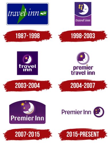
1987 – 1998
The first logo, associated with the network’s original name, Travel Inn, was simple and functional. The emblem featured a blue rectangle with a white and blue border, resembling a road sign or a sign in front of a hotel. This created an association with a reliable place to stop for the night.
The name “Travel Inn” was written in white cursive letters, emphasizing the hotel’s staff’s readiness to care for their guests. Behind the name, a large green triangle symbolizing a bed was placed on a green rectangle. This element reinforced the visual connection to comfort and coziness.
The logo invited travelers to stay at the network’s establishments, promising comfortable beds, peace and quiet, and a picturesque green view from the window. This made the establishment appealing to weary travelers looking for a resting place.
1998 – 2003
The Travel Inn logo, introduced in 1998, maintained its primary focus on the theme of rest and lodging but changed the presentation style, making it more modern and appealing. Visually, the logo was elongated vertically, resembling a poster that can be seen at the hotel entrance, giving it solidity and recognizability.
The canvas of the emblem is divided into two parts: the upper blue and the lower purple, separated by a white semicircular stripe. The upper part symbolizes the night sky, where the sleeping crescent appeared for the first time — a new and now main company symbol. The crescent is depicted with closed eyes, emphasizing the theme of sleep and rest, and from its “mouth,” the first letters of the name “ti” seem to be exhaled, adding dynamism and creativity to the emblem. A star replacing the dot above the letter “i” symbolizes stars in the night sky and adds lyricism and romance to the overall image. The bright yellow color of the letters perfectly complements the idea of a starry sky, creating a warm and friendly impression.
This symbol became an invitation for travelers, indicating that it was time to pause and rest, offering a cozy place to stay. The image of the night and the sleeping crescent is universal and understandable in any culture, making it especially successful for an international brand. The logo was so well-received that its key elements were preserved in subsequent versions.
The lower part contains the company name, written in white letters on a purple background. The font of the inscription emphasizes the continuity and stability of the brand. The visual sign represents care for customers and invites them to peaceful and comfortable rest anywhere the brand is present.
2003 – 2004
The logo acquired a more square shape and a unified background depicting a dark sky. The pleasant dark blue color creates associations with a calm and deep night. A drowsy crescent is depicted inside the circle, symbolizing a full moon, which looks very cozy. Next to it is a golden star, like a nightlight, guarding sleep. A soft, muted light emanates from the circle, emphasizing the atmosphere of comfort and tranquility.
The brand name is written in large white letters on two levels in the lower part of the logo. The bold font symbolizes the network’s growth and stable development, giving the logo additional confidence and authority.
2004 – 2007
After acquiring the large hotel chain Premier Lodge and changing its name to Premier Travel Inn, the company introduced a new logo that reflected its expansion and updated image. The main change was removing the background, symbolizing the brand’s global expansion, which included more than 140 new hotels. This move emphasized openness and readiness for further growth, showing the company was reaching a new level.
The logo retained the circle with the image of a sleeping crescent and a star, which had already become a symbol of the chain. Inside the circle is a fragment of the night sky, creating a sense of calm and serenity, which perfectly aligns with the brand’s philosophy — to offer guests a comfortable stay and cozy atmosphere.
Below the brand symbol is the new name of the chain — Premier Travel Inn. The font of the inscription became more rounded and smooth, enhancing the focus on comfort and convenience provided to guests. The star replacing the dot above the letter “i” creates a visual tandem with the star in the circle, uniting the elements into a cohesive whole.
2007 – 2015
In 2007, the company’s logo took on a shape resembling the side railing of a bed, symbolizing the comfort and coziness awaiting guests in every room. The purple background emphasizes the association with the starry sky. It hints at the premium service that had become the standard after the opening of over 500 hotels and the acquisition of another competitor. This design also reflects the company’s goal of unifying the bedroom design, which explains the choice of a bed-like shape.
At the logo’s center is a crescent moon, whose contours are highlighted by a lighter glow. This moon exhales stars that trail off into the distance, emphasizing the theme of travel. Although the word “Travel” was removed from the name, the logo continues to convey that the company’s hotels serve as guiding stars for travelers, offering them always-available and reliable places to stay. The number 3 in this context symbolizes the merging of three hotel companies into one powerful network.
The brand name has been shortened to “Premier Inn” and is written in white font. The bright light tone, similar to moonlight, makes the text easy to read and visually appealing while maintaining a connection to the theme of night and tranquility.
2015 – today
The company updated its logo again, reflecting the brand’s evolution and commitment to modernization while maintaining continuity and a connection to the past. The new logo once again removed the background, emphasizing modernity and minimalism in the design.
The crescent moon and stars, which have become recognizable symbols of the brand, are retained and placed in a separate circle to the right of the name as a reminder of the style of previous emblems. This symbol represents night and sleep, creating associations with the comfort and rest that the hotel chain offers.
The network’s name, written in purple, stands out with thin, elegant letters. The purple color symbolizes luxury, tranquility, and confidence, highlighting the high level of service provided in the company’s more than 700 hotels. The thinness of the font gives the logo elegance and makes it visually light, which is in line with the company’s aim to create an atmosphere of comfort and coziness for its guests.


