


 Primark Logo PNG
The Primark logo is bold and concise, with clean lines that emphasize the modernity of the stores and the brand’s products. The bright, clear design points to ultra-modern boutiques, reflecting their style and approach. Primark’s main mission is to offer fashionable products at affordable prices, reaching a wide range of customers. The symbols in the emblem embody accessibility and the brand’s readiness to attract new clients, highlighting its openness and drive for growth.
Primark began in 1969, when Arthur Ryan opened the first Penneys store on Mary Street in Dublin. The retailer focused on fashionable clothing at low prices, and the format spread across Ireland. A Cork branch followed in 1971, extending the chain beyond the capital with large stores and broad product ranges.
Expansion into Britain began in 1973 with a store in Derby. Since the Penneys name was already trademarked there, the company adopted Primark for markets outside Ireland. Through the 1970s and 1980s, it opened outlets in city centers and shopping malls, selling clothing and home goods under one roof.
Growth accelerated across Britain during the 1990s, when private-label production gave the retailer closer control over pricing and merchandise. Continental Europe followed with a Madrid store in 2006, then locations in the Netherlands, Germany, Belgium, Austria, France, and Portugal. A 70,000-square-foot flagship opened on Oxford Street in London in 2009 and became one of its largest central-city stores.
Primark entered the United States with a Boston store in 2015. In 2016, it opened a 160,000-square-foot Birmingham location with clothing, restaurants, beauty services, and a Disney-themed café. During 2020 and 2021, the company tested new store formats. It expanded social-media activity while keeping physical retail at the center of its model. By 2023, the chain was still opening stores across Europe and the United States without introducing full online sales.
Meaning and History
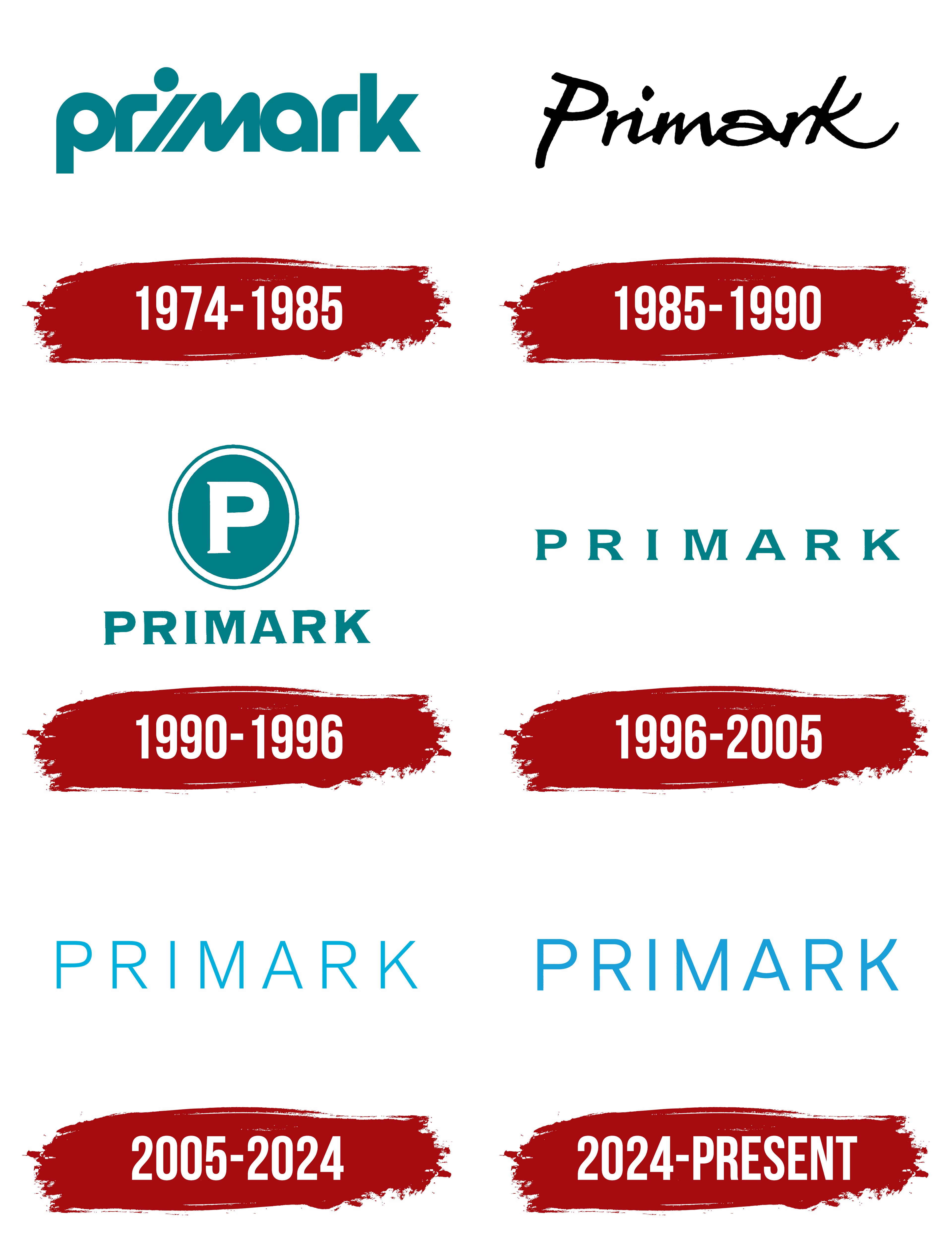
What is Primark?
This fast-fashion retail giant is known for its incredibly low prices on stylish clothing and accessories. Founded by Irish entrepreneurs, the business has expanded across Europe and the U.S., becoming a key player in the affordable fashion industry. Its business strategy is based on minimal advertising, high sales volumes, and cost-effective partnerships with suppliers. The stores offer a variety of products, including home goods, cosmetics, and clothing for men, women, and children. The retail locations are often large stores in busy areas where shoppers can enjoy the thrill of treasure hunting. The brand has gained popularity among budget-conscious consumers for its ability to quickly adapt runway trends into affordable streetwear.
1974 – 1985
The company’s logo is a wordmark, and its global name, Primark, was chosen to avoid infringement on the American brand Penneys. This logo appeared a year after the retailer expanded beyond Ireland, opening stores in the United Kingdom. The English court ruled that the name “Penneys” should be prohibited in new markets.
The new brand name combines “Prime” and “Mark,” highlighting the company’s commitment to the highest quality standards and leadership in the fashion market. This choice demonstrates the brand’s determination to continue growing and surpass its competitors, offering premium service and top-notch products.
A distinctive feature of the logo is the original letter “i,” whose stroke leans so sharply forward that the dot lags, as if unable to keep up. This element symbolizes the company’s rapid growth, which opened 24 stores in its first five years of operation. An additional emphasis on movement is created by the sharp angle of the letter “r.” The green hue in the logo signifies growth and development, while the blue tones hint at professionalism and the high quality of clothing the retailer offers.
1985 – 1990

The emblem was changed to an inscription in a casual script font. The new logo gave the impression of a handwritten signature, emphasizing the brand’s personalized approach. Moving away from the strict official style of the previous logo created a sense of accessibility and informality, making the brand friendlier and more approachable to a wide audience.
The company offered affordable yet modern models with a unique design perspective, allowing it to stand out among other fashion boutiques. This updated logo became an expression of the brand’s originality, offering consumers a chance to try something new and unconventional, and highlighting the brand’s individuality and bold approach to fashion.
1990s – 1996
In the 1990s, the brand introduced a new approach, reflected in the updated emblem. At the top of the logo, an oval resembling a mirror appeared. This element symbolizes harmony and the successful combination of items that create a stylish and complete look. The shape reflects the company’s desire to meet customer expectations and needs, as if “mirroring” their requests. Inside the oval is the first letter of the brand’s name.
The full name is set in a serif font with thin serifs, giving the inscription a neat, tidy appearance. The small protrusions on the letters hint at the refined details in the outfits that make them look unique.
The logo returned to blue-green, emphasizing its connection to Ireland and symbolizing growth and professionalism, and has remained a distinctive feature of the brand for many years.
1996 – 2005
After acquiring the Co-op store chain, the logo was expanded and minimized. The new design became simpler yet more expressive, consisting solely of the brand’s name. The serif font was retained, but the spacing between the letters was increased, adding lightness and visual clarity. These changes symbolized the company’s growth and its focus on fast fashion.
The logo now reflects the brand’s philosophy, where every new step adapts the assortment to rapidly changing fashion trends. It conveys transformation and flexibility, emphasizing the company’s readiness to respond quickly to fashion market demands and to offer relevant solutions to its customers.
2005 – 2024
The emblem reflects an important event in the brand’s history: the acquisition of competitor Littlewoods and the integration of 40 stores into the Primark network. The finest light-blue letters, set in a sans-serif font, create a sense of lightness and airiness. This style emphasizes the brand’s commitment to high fashion standards and offering an elite selection accessible to a wide audience.
The store shelves always feature the latest arrivals, aligning with current fashion trends. The light blue shade of the emblem symbolizes freshness, purity, and novelty, enhancing the sense of modernity and continuous renewal.
2024 – today
While maintaining its minimalist foundation, the Primark logo changed to enhance its expressiveness and confidence. The glyphs became slightly thicker, highlighting the brand’s strengthened position on the global stage and its ambition to expand. This move is accompanied by plans to open new stores across Europe and significant investments in social programs to improve working conditions for the network’s employees. These aspects emphasize the company’s responsibility to its staff and readiness for further growth.
The logo is light blue, associated with lightness, accessibility, and freshness. This color makes the brand friendly and creates a positive perception among customers, reflecting its aim to offer fashionable yet affordable clothing. The blue shade adds a sense of openness, highlighting its focus on a broad audience.
The custom-made font Primark Basis features even, elongated lines, giving the text a light, modern feel. This style emphasizes the brand’s core principles: simplicity, accessibility, and the absence of unnecessary pretension. A distinctive feature is the letter “A” with a slight curve, adding individuality to the emblem while maintaining the overall style of clarity and purity.
Primark became popular during its growth by offering affordable, stylish clothing. The logo reflects a commitment to transparency and simplicity: nothing superfluous, only concise shapes that are easy to remember. The combination of light color and clear font creates a sense of trust and honesty, perfectly aligning with the brand’s image and values.