The Prince Motor Company logo reflects the automotive manufacturer’s commitment to safety, ensuring maximum confidence for vehicle owners. The emblem communicates this clearly and directly.
Prince Motor Company: Brand overview
On June 30, 1947, a pioneering automotive company was born in the summer heat, setting the stage for an automotive saga that would leave an indelible mark. This venture started with a focus on electric vehicles, a leap into the future of transportation.
Fast-forward to 1952, when the company rebranded itself and shifted gears towards gasoline-powered vehicles. This change heralded the arrival of the first car under the Prince marque in 1954—the Prince Sedan AISH. This vehicle marked the dawn of a new era for the company.
The following year, 1955, saw the company fully embrace its new identity, firmly planting its roots in the automotive industry. By 1957, the Prince Skyline sedan rolled out, blending luxury with innovation and capturing the hearts of car enthusiasts.
1959, the Prince Skyline Sport debuted, a testament to the brand’s dedication to performance and style. In 1961, the compact yet charming Prince Skyline 1500, designed to appeal to a wider market, was further complemented.
The year 1963 introduced the Prince Gloria, a luxury vehicle that solidified the company’s reputation for sophistication and high quality. In 1964, the iconic Prince Skyline 2000GT burst onto the scene, soon to become a legend in Japanese motorsports.
By 1965, the Prince R380 took center stage. Engineered specifically for the Japanese Grand Prix, it showcased the company’s competitive spirit and engineering prowess.
A seismic shift occurred in 1966 when the company merged with Nissan Motor Company on August 1. This union allowed the enduring legacy of the Prince name to live on through iconic models like the Skyline and Gloria, which seamlessly integrated into Nissan’s lineup and gained global acclaim.
Meaning and History
What is Prince Motor Company?
Japanese automobile manufacturers are known for producing cars and trucks. The company has built a reputation for its cutting-edge technology and innovation, especially through its luxury sedans and performance-oriented vehicles. One of Prince’s most notable contributions to the automotive world is the Skyline series, which became iconic under the Nissan brand. The company eventually merged with Nissan, but its legacy lives on through its continued production of models.
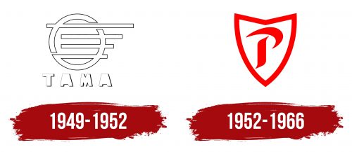
1949 – 1952
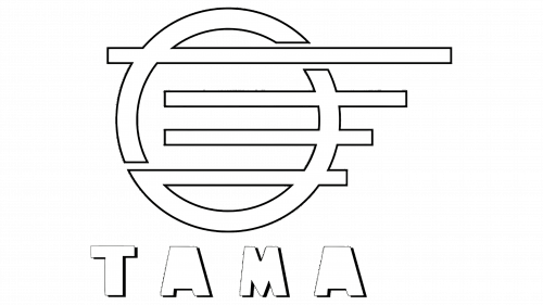
The foundation of this company’s identity consisted of a geometric element in the shape of a grille connected to a large ring. Together, they formed an original structure reminiscent of a car’s radiator grille.
- The four horizontal white stripes varied in length: the top element was the longest, and the bottom one was the shortest. The bottom stripe was the only one intersecting the ring at two points, while the other lines touched the ring at only one point. However, this was not visually striking, so it appeared that the vertical and horizontal stripes fully intersected.
- The ring was not solid; it consisted of separate segments and had a complex shape, indicating that simplicity is an ordered complexity. There were two separate structures: one line (the upper half) and three lines (the lower part). The circle was divided diagonally.
The elements were outlined with a thin black contour, making them appear empty inside. The same style was used for the inscription at the bottom: the letters consisted only of outlines that traced their perimeter. The font was uppercase, extra bold, with slight shadows to the right. The crossbars of both “A” letters were absent, a key feature of the logo, adding a distinctive touch for quick recognition.
The black-and-white palette perfectly supported the emblem’s simple style, aligning with its minimalist design. It fits precisely into the concept of visual conciseness, emphasizes a strict approach to business, and focuses attention on the company. The predominance of white over black sets a positive tone for consumers, as white symbolizes trust, sincerity, purity, and new beginnings.
1952 – 1966
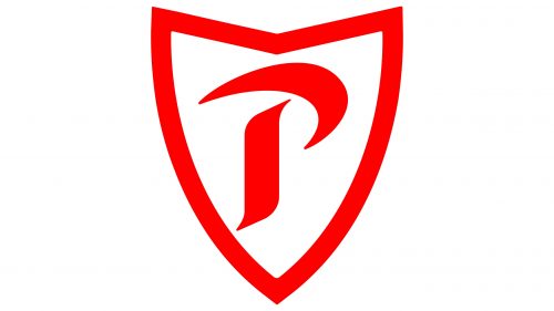
The company began producing luxury and commercial vehicles, after which it changed its emblem to match the new name. Thus, the Prince Motor Company logo was created, reflecting the manufacturer’s key idea: maximum protection of cars from any terrain challenges and technical issues during operation.
After the rebranding, the company drastically changed its visual identity, focusing on restrained brightness. To achieve this, it chose a rich red color for the heraldic shield and the first letter of the name.
The quadrilateral shield resembles a chevron, often used on clothing to distinguish groups of specialists. Similarly, the manufacturer of luxury and commercial vehicles decided to mark its products in a bright, stylish, and memorable way. The top line of the shield was bent into an angle, with a triangular indentation and sharp ends on the sides. The bottom was also sharp.
A broad red stripe highlighted the background element. Inside was a white space with a scarlet glyph mimicking a handwritten mark. This was the first letter of the name – uppercase, bold, and grotesque. It consisted of two elements:
- A boomerang (parenthesis or arc), replacing the top of the “P”
- A tilde (special character), used instead of the stem
Together, they formed a unique typographic symbol without any analogs, as it was not classical (printed) but hand-drawn. With this design, the Japanese manufacturer aimed to emphasize the individuality and uniqueness of its vehicles. This approach proved so successful that in 1966, the small company was acquired by one of the automotive giants – Nissan Corporation.


