The Procter & Gamble logo goes with everything from laundry detergent to toothpaste. A manufacturer of a wide range of consumer goods has specifically chosen such a universal sign to show its leadership in different market segments. A clean design is associated with the freshness of hygiene products and household chemicals.
Procter & Gamble: Brand overview
| Founded: | October 31, 1837 |
| Founder: | William Procter, James Gamble |
| Headquarters: | Cincinnati, Ohio, United States |
| Website: | pg.com |
Procter & Gamble is the world’s largest US company, with offices in 70 countries and headquarters in Cincinnati. Owns 300 brands of popular consumer goods. Net profit is about 11 billion dollars. The Procter & Gamble logo unites household chemicals, cosmetics, medicines, products, and equipment brands.
One of the oldest companies today was founded in 1837 by two partners who married sisters. Procter and James Gamble chose the most sought-after products among all population segments: soap and candles. Using the principle of necessity, the company expanded its range, offering powders, toothpaste, toilet paper, shampoo, diapers, coffee, etc. The ability to do business has turned a small company into a giant worldwide conglomerate with hundreds of sought-after brands.
Meaning and History
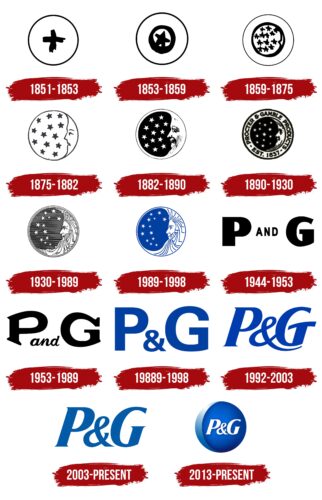
All Procter & Gamble logos can be combined into two large sections: hand-drawn and letter. And given the almost two hundred years of the company’s past, there are many changes in visual signs.
What is Procter & Gamble?
An American corporation, one of the top 100 largest companies in the world. Among its offerings are such well-known brands as Pampers, Tide, Ariel, Head & Shoulders, Pantene Pro-V, Tampax, Gillette, Wella, Always, and others, which are sold in 180 countries.
1944 – 1953
Television is on the rise in the US. Advertising requires a short letter. It was made quite simple: P AND G. Large capital letters meant the first letters of the founders’ names. The smaller AND was placed right in the center between the initials. This showed equal participation. Each contributed $3,596 to form the company.
1953 – 1989
The letters of the surnames are elongated so that the composition forms an oval as if the image is in a soap bubble. P&G sponsored operas on the radio, and the term “soap opera” gradually emerged. Tide powder is also becoming very popular. And the logo hints at foam bubbles during washing.
1989 – 1998
The logo was released simultaneously as the latest emblem of the stars. They are both blue and are used both together and separately. The company is actively absorbing other brands, and its portfolio is expanding sky-high. Large straight letters are an indicator of confidence and stability.
1992 – 2003
It was decided to majorly reorganize assets with the closure of unprofitable factories and staff reductions. The changes also affected the logo of the company. The new sign is written in italics as an indication of change and moving forward with new forces.
2003 – today
In 2003, it was decided to say goodbye to food brands. The change in the direction of activity was marked by rebranding. Ampersand’s long tail was removed, and the logo’s color paled. This indicated the clipping of one of the directions.
2013 – today
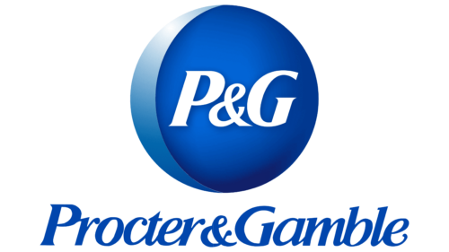
The company celebrated its 175th anniversary with a new logo. Landor Associates worked on the creation of the visual sign. The composition took into account the historical features of visual signs using luminaries. Therefore, the abbreviation of the name was placed on a round blue ball with a light crescent on the left. The dark blue background with a gradient is a prototype of the night sky. The badge is used together with the main emblem of 2003. The logo, touching on the company’s past, returns it to its original goals – to trade only the most necessary goods for people. Therefore, it was decided to part with 60 percent of the brands, leaving only the most popular and important.
Moon and Star
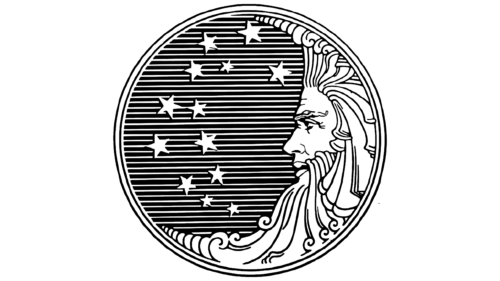
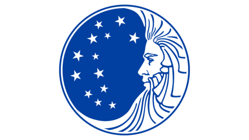
Initially, before the advent of the verbal logo, the company used a visual sign in the form of a sphere with a month and stars. However, claims that it is similar to satanic led to the subsequent rejection of the image. The last logo of this plan appeared in 1989.
1851 – 1853
The first visual sign was quite simple – a circle with a cross. The image spoke of the Christian faith and possibly indicated a simple mark with a cross on a certain batch of goods.
1853 – 1859
The concept of the logo has changed significantly. It resembled a spyglass in the center, a schematic representation of a star. History reports that the boxes that were transported to the place of the sale were marked with a star. Since the candles were called Star, the workers drew a schematic star for orientation. She later became the designation of P&G.
1859 – 1875
The company decided to go further and expand the line of products that are constantly in demand by customers. Procter & Gamble offers its powder, toothpaste, and toilet paper. As the firm grew and its influence expanded, so did the spyglass view. Part of a crescent and many stars appear on the logo of this time. Since Procter & Gamble was famous for candles, the visual sign featured an image of the night. The circle pointed to the globe, the number of stars to the growing list of goods. The number 13 is chosen in honor of the thirteen British colonies in America.
1875 – 1882
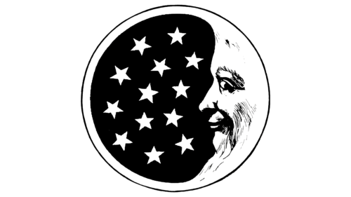
This year, the logo became similar to the real one for the first time. If, before that, all the signs resembled a hastily sketched sketch, then the emblem of 1875 includes traced elements of the stars and the month. At the same time, the Moon acquires human features with eyes, nose, and mouth. The company has a great impact on people. As the stars and the moon light up the night, Procter & Gamble products make life brighter and cleaner.
1882 – 1890
Newspapers started advertising soap, for which they allocated 11 thousand dollars. It was then that the first funds were invested in the design of a professional logo. The emblem is an excellent example of artistic creativity. The brightest and most beautiful sign of all the previous ones. A wide white border around the edge of the circle, a black sky with sparkling stars. An image of a crescent moon close to the real face of an older person. Interestingly, with the age of P&G, the age of the Month in the logo has also changed.
1890 – 1930
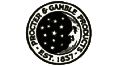
Around the “telescope,” there is a rim with the name of the company and the year of its formation. This is the first sign that connected the luminaries with the name of Procter & Gamble. The company is preparing to conquer the market in other countries, so stars and the Month alone are not enough to recognize.
1930 – 1989
The logo moves away from naturalness and becomes more fabulous. The sky is stretched strings, on which stars are hung, and a crescent moon with curls and a beard twisted in all directions. This year it was decided to develop a brand management system. Perfectly taut strings and attached stars visually demonstrated tidying up. However, it was in this image that users in the late 80s found a problem: the curls of the moon resembled the number 666, and the twisted ends of the horn. This strengthened the similarity of the sign with satanic symbols in people’s minds. Yes, and there were 13 stars in the image. But the company just wanted to hint at beautiful clean curls washed with their popular soap.
1989 – 1998
The logo was changed so as not to cause misunderstandings, and the curls were removed. But it did not help. The company even sued the spreaders of false rumors in 1982 and 1995. It was decided to abandon the emblem. Blue skies and white stars are this series’s latest Procter & Gamble image. The blue and white colors link the emblem to Christendom. They are a type of heaven, faith, purity, and chastity. This is one way to refute accusations of Satanism.
Font and Colors
In recent years, the main color of the company has been blue. From replaced black at the time of the fight against rumors of Satanism. Color inspires confidence and conveys calmness and confidence. As a celestial shade, blue indicates the patronage of higher powers, serious success, and the company’s scale, which has become one of the largest manufacturers in the world.
Reserve Condensed Black Italic font.
Procter & Gamble color codes
| Pale Cerulean | Hex color: | #8ebbdb |
|---|---|---|
| RGB: | 142 187 219 | |
| CMYK: | 35 15 0 14 | |
| Pantone: | PMS 297 C |
| Cerulean Frost | Hex color: | #61a0cd |
|---|---|---|
| RGB: | 97 160 205 | |
| CMYK: | 53 22 0 20 | |
| Pantone: | PMS 298 C |
| Medium Sapphire | Hex color: | #0158a4 |
|---|---|---|
| RGB: | 1 88 164 | |
| CMYK: | 99 46 0 36 | |
| Pantone: | PMS 2945 C |
| Bright Navy Blue | Hex color: | #0264d5 |
|---|---|---|
| RGB: | 2 100 213 | |
| CMYK: | 99 53 0 16 | |
| Pantone: | PMS 2935 C |
| Royal Blue | Hex color: | #12206b |
|---|---|---|
| RGB: | 18 32 107 | |
| CMYK: | 83 70 0 58 | |
| Pantone: | PMS 662 C |
