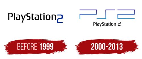
The PS2 logo is consistent with the overall style of this family of game consoles. It is geometric, strict, and not without creativity. Simple lines make it recognizable and easy to read, despite its two-dimensionality. The top and bottom are highlighted with different color palettes: the former is light, the latter dark. The gradient and shape of the emblem immediately create a sense of gameplay.
PS2: Brand overview
| Founded: | 2000 – 2013 |
| Founder: | Sony Computer Entertainment |
| Headquarters: | California, U.S. |
Meaning and History
The creation of the second version of PlayStation began during the release of the original – at the end of 1994. The work was conducted secretly under the leadership of lead designer Ken Kutaragi from Sony. The success of the debut version was overwhelming, so the creators of the console were not mistaken and did not waste resources on an improved novelty.
Although the PS2 retained the old name, simply supplemented by the next number, it received a different logo. It is more modern, two-dimensional, and as simple as possible. There is nothing extraordinary about it except for the color palette with a gradient. Otherwise, it consists of straight lines and right angles.
What is PS2?
PS2 is the PlayStation 2 gaming console created by Sony Computer Entertainment. It was released in 2000 and discontinued in 2013. During its existence, the console became the best-selling among its counterparts.
Before 1999
The prototype emblem of the PS2 was textual. It consisted of the horizontal inscription “PlayStation 2”. The “P” and “S” were capitalized, while the other letters were in lowercase. The number “2” was large and extended beyond the general row. To make it stand out distinctly, the designers colored it blue and gave it the shape of a capital “S.” Thus, the two did not deviate from the overall style and looked like a letter because it merged with the text: the distance between it and the “n” was minimal.
2000 – 2013
In the spring of 2000, the first batch of consoles with the modernized PS2 logo appeared. It indeed attracted attention to the novelty. Unconventionality, geometricity, strictness, two-dimensionality – everything indicated that this was an innovative gaming console in front of the users. The developers reduced the inscription from the prototype emblem and placed it at the bottom, separating the number from the text. Above, they placed an unusual graphic element formed from the abbreviation. The shortened form consisted of straight segments, bent at a right angle, and colored in several shades of blue with a gradient transition. In 2013, the trademark ceased to exist as the production of the sixth-generation console was halted.
The evolution of the individual PS2 sign is short: it consists of its prototype and the actual logo. Although the sketch was worked on long before the gaming console’s release, it did not become the main detail. Designers supplemented it with a more striking element reminiscent of a pixelated inscription.
Font and Colors
The typeface used in the PS2 logo is an individual development created to meet the requirements of this project. All similar fonts appeared later and were developed based on its example. The emblem’s palette includes three colors: black (full name), blue (abbreviation), and white (traditional background).
PS2 color codes
| Navy Blue | Hex color: | #13017d |
|---|---|---|
| RGB: | 19 1 125 | |
| CMYK: | 85 99 0 51 | |
| Pantone: | PMS 2738 C |
| Green Blue | Hex color: | #118fdb |
|---|---|---|
| RGB: | 17 143 219 | |
| CMYK: | 92 35 0 14 | |
| Pantone: | PMS Medium Blue C |
| Black | Hex color: | #000000 |
|---|---|---|
| RGB: | 0 0 0 | |
| CMYK: | 0 0 0 100 | |
| Pantone: | PMS Process Black C |


