The sign indicates a place where fresh and natural products are sold. The Publix logo narrows the search area, showing that the network points are always near the house. The store will become the center where residents of the area go to shop.
Publix: Brand overview
Publix is a trademark of Publix Super Markets, Inc., a regional grocery chain from the USA. It is privately held and wholly owned by members of the Jenkins family and employees of the corporation. Supermarkets operate throughout the southeastern zone of the country, including Florida, Georgia, Alabama, Virginia, North Carolina, Tennessee, and South Carolina. The largest number of retail outlets (831) are concentrated in the state of Florida. The central office is located in Lakeland. The organization’s founder is George W. Jenkins, who registered it in 1930. It ranks 12th among the top 100 American firms regarding work conditions. These are the data for Fortune magazine for 2019. And Forbes ranked it 7th on the list of America’s largest private companies.
The store chain was opened by someone well-versed in sales: before that, Jenkins had been a manager and salesman at Piggly Wiggly for four years. He established his first retail outlet in Winter Haven, Florida, in a 3,000-square-foot building. Five years later, he launched a second store called the Economy Food Store.
Despite the Great Depression raging in the country, its commercial network was profitable, so in 1940 the owner opened the first supermarket. It had the latest technology: air conditioning, music, freezers, refrigerated display cases, automatic doors, and flower and donut sales departments. After World War II, businessman George W. Jenkins bought competing American grocery stores and replaced them with Publix Super Markets.
In 1957, the entrepreneur launched a full-service bakery at each outlet. They have supplanted donut departments. In addition to bakery products, the commercial network also produces delicacies, dairy products, and other food products. It currently has 1,239 points of sale located domestically.
Meaning and History
When opening the first store, Jenkins chose the name Publix. It used to be part of the name of the ruined luxury cinemas Publix Theaters Corporation. The founder said he liked the word’s sound, but the cinemas were closing anyway, and they no longer needed it. Therefore, he borrowed it, making the basis of the emblem.
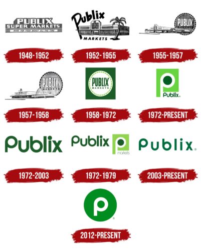
The main trend of the Publix logo change is a simplification. Every year, the badge loses some secondary elements. This continued until the “squeeze” was left of it; the essence is a stylized letter “P.” The supermarket chain’s owner chose a text emblem (name), sometimes supplementing it with various details. Depending on the period, these were geometric figures, images of architectural objects, and informational inscriptions. You can see their evolution in more detail below.
What is Publix?
Publix is a US supermarket chain founded by entrepreneur George W. Jenkins in 1930. It is legally a privately owned corporation with stakes held by its employees and family members of the founder. The office is located in Lakeland, Florida.
1930 – 1948
The fundamental principle of the Publix logo is the name. It served as a sign installed on old and new supermarket buildings when new points of sale appeared. It was designed differently at different times but always adhered to current trends and customer reactions. A deep subtext was also necessary so that the symbolism corresponded to the intent and purpose.
1948 – 1952
The three-level emblem contained the main information about the stores – the name, type of outlet, and slogan. Each line was designed in an individual style. At the top, the letters were huge and blocky, complete with side shadows. In the middle, the signs were on a dark rectangle. At the bottom, the glyphs were thin and small on a striped background with a white backing.
1952 – 1955
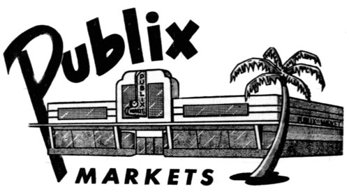
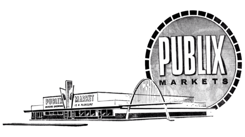
The logo depicted a two-story building – an artistic redrawing of the store. The lines were thin, contoured, and sometimes dashed. Automatic sliding doors and large glass showcases already complement the large building. In the center was a high pediment with a vertical inscription. To the supermarket’s right was a sprawling palm tree with a curved trunk. The designers placed the brand’s name on the left, providing an informal typeface. The inscription formed a kind of arch, and the elongated “P” leg went beyond the corner wall of the store. The bottom part was occupied by the word “Markets.”
1955 – 1957
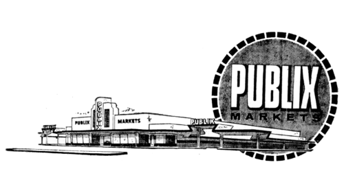
The Publix logo features a refurbished store building with covered parking on the sides. The palm tree from the logo disappeared as an insignificant element since, by that time, many already knew that the supermarket was located in the country’s southern zone. To the vertical inscription on the facade, two more were added – horizontal, placed on the roofs of parking lots. The designers also moved the retail chain’s name from left to right and placed it in a circle with a dotted border. They chose a large white elongated font to make the text stand out clearly on a dark background. Subsequently, this sign was separated into a separate logo.
1957 – 1958
After the store’s reconstruction, its building became even larger. It got a high arch, the shape of the parking area’s roof was changed, and the pediment was completely redone, which began to resemble an open book. The inscription on the round badge remained the same, but the background was slightly lightened.
1958 – 1972
This version of the sign adorned the facades of shops until 1972. It was simple and consisted of a name in long and bold type with a dotted line along the outline. The word “Publix” occupied the central place, and below it was a small inscription “market.” It was almost imperceptible, yielding attention to the upper part. All elements were in a white circle placed in a green square.
1972 – today
This period is famous because it marked the beginning of the iconic version of the logo – color, with rounded letters and conceptually close to the company’s strategy. It was he who opened the era of the capital “P.” The sign was not only part of the name of the supermarkets – it denoted a road with a parking lot. Therefore, it can be interpreted as a welcoming symbol inviting all passers-by and passing to wrap up in the store.
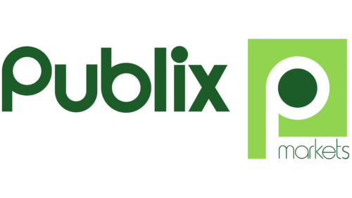
The first letter from the name of the trading network is used as an icon. It is painted white to contrast better with the green elements. The upper lumen (ring) has a solid dark green fill and a light green square background around the sign. In the lower right corner is the word “Publix.” It consists of lowercase characters except for the first. Moreover, “P” looks like an inverted “b” – both in shape and size. The dot above the “i” has been made much larger than usual to match the circle in the in-letter lumen of the graphic.
1972 – 2003
The designers removed the blocky “P” and the square it was in and enlarged the word “Publix.” The color and shape of the letters remained the same: they were rounded and olive green.
1972 – 1979
The light green square with a single “P” shaped like a circular bypass returned to the Publix emblem. The designers placed it to the right of the trading network’s name and supplemented it with the word “Markets” at the bottom of the niche. The font was thin, lowercase, and with minimal letter spacing.
2003 – today
The personal brand sign is an inscription with a wider arrangement of letters than in the first version. The designers removed the rest of the details, leaving the verbal designation of the trade network, intended not only for the emblem but also for the signs. The logo looks almost identical to the previous version – with the same rounded symbols without corners, smooth lines, the same “P” and “b.” The color is also preserved. The only difference is in the free space between the letters and the reduced point above the “I,” which the developers have returned to its normal value.
2012 – today
The last identity update occurred in 2012 when the trading company switched to a graphic icon, sometimes accompanied by a corporate inscription. The icon has a round shape and contains the letter “P” inside, which echoes the original version of the logo. The designers have shortened the leg but retained the similarity to the ring road. The letter is colored white, and the gap and background are green.
Publix: Interesting Facts
Publix Super Markets, Inc., known as Publix, is a big supermarket chain in the US that employees own. It started in 1930 in Lakeland, Florida, by George W. Jenkins. Unlike many other supermarkets, the people who work there and some family members own the company.
- Employee Ownership: It’s the largest company owned by employees in the US. This means the company isn’t sold on the stock market; only employees and the Jenkins family can own shares.
- Growth: Publix has grown massively from a single store in 1930 to over 1,200 stores in states like Florida and Georgia.
- Supermarket Concept: Publix was one of the first in the Southeast to offer a wide range of food and household items in one place, with great customer service.
- Environment: The company is known for caring about the environment. It works on saving energy, reducing waste, and recycling.
- Publix Sabor: In 2005, Publix started stores called Publix Sabor for Hispanic customers, offering Latin American and Caribbean foods.
- Cooking School: Some stores have cooking schools where customers can learn from professional chefs about various cuisines and cooking methods.
- Community and Giving: Publix is big on helping the community. Its charity arm supports education, hunger relief, and disaster relief.
- Awards: Customers love Publix, which shows in their high satisfaction ratings and many awards for being a great workplace and for its responsibility to society.
- Pharmacy and Health: Many stores have pharmacies and offer health services like flu shots. This started in the 1980s and has expanded to include clinics in some places.
- Private Label Brands: Publix sells its brand products, from everyday items to organic ones, under its Publix GreenWise label, which is known for being high quality and good value.
Publix stands out because of its employee ownership, community efforts, and dedication to customer service. Its willingness to adapt and innovate has made it a favorite in the Southeast US, differentiating it in the competitive grocery market.
Font and Colors
Publix’s visual identity symbol has always been based on its name. It has been used in various ways but always remained rounded and soft, with smooth transitions and lines. Moreover, the developers transferred the text style to the icon, using an element from the supermarket chain’s name—the letter “P.”
The designers opted for a typeface reminiscent of Opificio Bold and Sinn Bold to match the emblem with the chosen concept. Although they are not identical to what is shown on the logo, they are still quite close, especially the letters “u” and “b.” The differences mainly concern “P,” which has more curves and is characterized by a friendly look. The second font was designed by Alec Julien and published by Haiku Monkey.
The key identity palette comprises white, green, and light and dark shades. This choice is not accidental since the brand is engaged in the sale and production of products. Particular emphasis is placed on flour-baked goods and dairy products, which are usually white. Green in the palette means naturalness because it is the color of nature, a symbol of product safety and environmental friendliness. He is also associated with pharmacies that operate in Publix supermarkets.
FAQ
What is the Publix font called?
The well-known grocery chain’s logo uses Opificio Bold. This font has a strong, clean look that matches the brand’s reliable and approachable image. Using Opificio Bold helps the brand stay visually consistent, crucial for customer recognition and loyalty. This font works well for signs and marketing materials where things need to be easily seen and read.
What is Publix famous for?
It is known for its fresh produce, brand-name merchandise, and great BOGO deals that help customers save money. The stores are clean, well-lit, and organized, making shopping a pleasant experience. Friendly staff and good customer service make the brand stand out in the food market. All these factors combine to make shopping here an enjoyable experience, living up to its slogan, “Where shopping is a pleasure.”
What does the Publix logo mean?
The grocery chain’s logo features the letter “P” in the middle of a circle, symbolizing a ring road inviting customers into the store. The letters “P” and “b” are designed as paths and parking lots around the supermarket. This design choice highlights the brand name while making it welcoming and approachable. The circular shape and repeating patterns of the logo create a sense of community and ongoing presence, indicating that the brand plays an important role in the daily lives of its customers.
What is Publix’s motto?
The slogan “Where shopping is a pleasure” was adopted in 1954 and has remained unchanged. This motto reflects the grocery chain’s desire to ensure the satisfaction of its customers. It highlights the importance of customer service and maintaining a positive atmosphere in all stores. This tagline is important to the brand, reinforcing the idea that a store is not just a place to buy groceries but where shopping is a truly delightful experience.
When did Publix change its logo?
In 1972, the brand introduced a single mark as its logo, and the latest update was in 2012, featuring a white “P” inside a green circle. Even with these changes, the chain continues to use all its previous logos. This method helps the brand keep its historical connection while adopting a more modern look.
What color is the Publix logo?
The Publix logo is green, changing from light to dark over the years. The logo’s current green color is coded as #3e902d in the RGB color model, which consists of 56.47% green, 24.31% red, and 17.65% blue. This combination creates a unique green color that makes the brand easily recognizable to customers.
