The Purdue Boilermakers logo emphasizes the strength and technical focus of Purdue University. The emblem reflects a proud sports history with notable victories that earned the players their famous nickname.
Purdue Boilermakers: Brand Overview
Established in 1869, Purdue University rapidly developed its athletic teams. In the 1890s, students who worked in local railroad shops building steam boilers were inspired by the nickname “Boilermakers.”
The football program began in 1887. In 1891, Purdue helped found the Western Intercollegiate Athletic Association, later evolving into the Big Ten Conference. The team achieved major success in 1931 and 1932, winning Big Ten championships. In 1943, they shared the national championship title.
A legendary coach, Jack Mollenkopf led the football team from 1956 to 1969, securing three conference titles and rising to prominence in the Big Ten under his guidance.
The men’s basketball team was established in 1896. Their first significant achievement came in 1932 when they won their first conference title. The team saw substantial success under coach George King (1972-1983), reaching the NCAA Final Four in 1980.
Gene Keady, who coached from 1980 to 2005, continued to elevate the basketball program, winning three Big Ten titles. His tenure is among the most successful eras in the program’s basketball history.
Women’s sports gained momentum in the 1970s with Title IX’s adoption. The women’s basketball team won the national championship in 1999 under coach Carolyn Peck.
The university has excelled in volleyball, baseball, softball, and track and field, producing standout athletes who achieved professional success.
Notable alumni include:
- NFL quarterback Drew Brees.
- NBA players Glenn Robinson and Rick Mount.
- Olympic pole vault champion Brian Sternberg.
Created in 1940, Purdue Pete is the team’s mascot, symbolizing a hardworking figure in a helmet. The “World’s Largest Drum” has accompanied the football team since 1921.
The football team plays at Ross-Ade Stadium, which opened in 1924 and seats over 57,000 spectators. The basketball team competes in Mackey Arena, which opened in 1967. Both venues have been renovated to maintain their historic charm while offering modern amenities.
Meaning and History
What is Purdue Boilermakers?
It is the team representing Purdue University in intercollegiate competitions. The university is located in Indiana, USA. The sports teams participate in various sports, including football, basketball, and volleyball. The teams are known for their achievements and traditions; fans and alumni actively support them. Their mascot is a railroad worker, symbolizing hard work and determination.
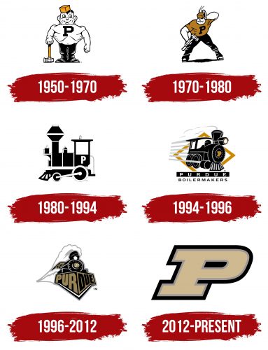
1950 – 1970
The team’s first emblem featured a muscular jester nicknamed Purdue Pete. Art Evans drew the character for the student library. The well-built muscles symbolized good athletic condition. The hammer indicated the university’s industrial focus. On the character’s head was an official university color orange square cap.
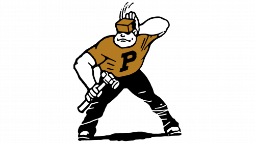
1970 – 1980
The logo retains the university mascot but in a more realistic, non-cartoonish form. The large, muscular, tall Pete represents the image of a true athlete from the university team. The character scratches his head in confusion but confidently holds a hammer, ready to fend off an attack.
1980 – 1994
In the 1980s, a locomotive appeared on the team logo. The image was chosen to honor the university’s early experiments with steam engines and locomotives. The symbol alluded to engineering graduates who passionately played on the university’s sports teams.
1994 – 1996
The locomotive races down the track, emerging from an orange diamond. This design choice added a sense of dynamism and motion. It showcased the university’s development and the achievements of its sports teams. Players, like locomotives on the field, are known for their strength and speed. The emblem received its first inscription, tied to the nickname given to the athletes after their 44-0 victory in 1891.
1996 – 2012
The train on the late 20th-century emblem appears more modern and powerful, embodying the technological progress the university contributes to with its discoveries. The viewer sees the train from below, indicating the success and popularity of the athletes. The emblem uses the university’s contemporary colors—black and gold—for the first time.
2012 – today
Purdue University has significantly expanded the number of programs available to students, necessitating an update to its symbols. The shift from the locomotive symbol to the letter “P” reflects both athletic and academic excellence. The logo embodies the integration of sports and education, emphasizing that the team and the university are united in their pursuit of success and excellence.
The Purdue Boilermakers sports club logo is presented as a giant capital letter “P.” This symbol is shared by both the university and the team, highlighting their unity and continuity.
The size and shape of the large capital “P” in the emblem symbolize the club’s strength and resilience. This reflects the power and reliability of the team within the arena of U.S. collegiate sports teams. The double outline around the letter emphasizes the athletes’ endurance, adding depth and multilayeredness, which can symbolize the multifaceted development of athletes and students.
The font of “P” is strict and modern, underscoring the team’s seriousness and professionalism. The font style aligns with contemporary trends and the demands of modern sports marketing.
- The primary color of the letter “P” is gold, symbolizing success, wealth, and prestige. This color reflects the high standards and achievements of the university and its sports programs.
- The gray outline adds a classic and refined look to the logo. It emphasizes solidity and stability, complementing the gold color to create a harmonious combination.
- The outer black outline completes the image, adding clarity and contrast to the logo. Black symbolizes strength, confidence, and determination.


