The Pure Romance logo is full of love, sweet emotions, and romance, which is the best fit for an adult goods store. The emblem beckons with its grace and promises pleasure within and beyond what is permitted.
Pure Romance: Brand overview
| Founded: | 1993 |
| Founder: | Patty Brisben |
| Headquarters: | Cincinnati, Ohio, United States |
| Website: | pureromance.com |
Meaning and History
The history of this brand began in Loveland when Brisben opened a small company called Slumber Parties. It included several retailers who sold massage oils, lotions, and sex toys under contract. By 2000, the firm’s revenue had reached nearly $ 2 million. At that time, six people were constantly working in it.
Over time, the son of Chris Cicchinell joined the mother’s business. He persuaded her to expand the activity area and take the company first out of one state and then – the country. This period became a turning point for the brand because, after three years, it was well known in 46 states of the United States, the number of employees increased to 3,500, and revenue increased to $ 30 million per year. At the same time, the chain store was named Pure Romance.
By 2011, the brand has captured the attention of such large continents like Africa and Australia. Its profit was $ 100 million, the number of consultants reached 75,000 people. The unprecedented surge in popularity of the intimate goods network was influenced by the publication of the novel 50 Shades of Gray. In 2014, the company bought rival Slumber Party and moved its headquarters to Cincinnati. Two years later, she joined Passion Party, a commercial chain selling similar products.
As for the visual identity mark, it was romantic from the very beginning and perfectly echoed the store’s name. After the enlargement of the business and the relocation of the headquarters, the organization redesigned the logo, but the changes were minor. This is due to the widespread popularity of the brand, built on the principle of network marketing: it was well known under the initial logo, so it did not want to lose recognition.
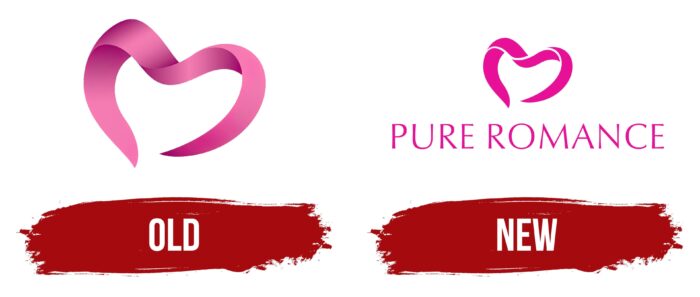
Old
It was originally a small graphic icon with no text, consisting of a single element – a delicate fuchsia ribbon. She was depicted in one stroke and had the shape of a heart with an open base. Although the sharp ends did not reach each other, thanks to the shadows and smooth curved lines, it was clearly visible that this is the heart that lovers usually draw. The pink color had gradient transitions from dark to light, making the stripe appear sinuous. The left side was just below the right, emphasizing the slight negligence.
New
After the company’s expansion and moving to another city, the trademark underwent a redesign. The emblem received a similar design, but in a modern interpretation, because at that time, 2D graphics were in vogue – easier to read and easier to label goods. The visual identity sign of the new format looked better on any advertising media. It still has the same ribbon curved in the shape of a romantic heart. Only now, it has a thin white line that runs along the edge and divides the central image into four disproportionate segments.
Added an inscription at the bottom – the name of the chain store. It consists of capital letters. The font is grotesque but with a barely noticeable expansion at the ends of the legs, which visually adds stability to them. The letter-spacing is wide, making the logo legible despite the thin lines. Both the text and the graphic sign are colored in the same tone.
Font and Colors
The Pure Romance brand identity is harmoniously combined with the name: the lines are smooth, smooth, clean, with a romantic slant and an image of the heart. Although the lettering is a little out of this style with its sharpness, it adds dynamics and practicality to it.
For the text part of the logo, the designers chose a typeface called Baker Signet. It is semi-grotesque – no distinct serifs, but also miniature extensions at the ends of the letters. The firm palette is stable and always consists of deep pink, close to the color of fuchsia.
Pure Romance color codes
| Deep Pink | Hex color: | #ff079a |
|---|---|---|
| RGB: | 255 7 154 | |
| CMYK: | 0 97 40 0 | |
| Pantone: | PMS 906 C |


