The QantasLink logo embodies reliability through its elegant lines and recognizable colors. Its dynamic shape conveys an innovative approach to air travel, highlighting the aircraft’s high power and speed. The emblem symbolizes the airline’s safety and stability.
QantasLink: Brand overview
QantasLink, a regional subsidiary of Australia’s leading airline, Qantas, is a reliable and affordable provider of air transportation services for domestic and international passengers.
In 1922, Qantas made history by launching the first passenger flight connecting the cities of Charleville and Cloncurry in Queensland. This marked the beginning of QantasLink’s regional operations, laying the foundation for the airline’s growth and success.
In 2002, Qantas consolidated its regional operations under a single QantasLink brand.
To meet the growing demand for air transportation, QantasLink invested in a modern and diverse fleet, including aircraft such as the Boeing 717 and Bombardier Q400.
QantasLink’s commitment to connecting metropolitan areas and regions across Australia has allowed for the significant expansion of its route network.
QantasLink proudly serves over 50 destinations nationwide, offering passengers various travel options.
In addition to domestic services, QantasLink has expanded its reach to short-haul international flights, making it easier for passengers to explore neighboring countries.
Throughout its existence, QantasLink has become one of the largest regional airlines in Australia and the entire Oceania region.
Meaning and History
What is QantasLink?
In 2002, QantasLink emerged from a move to consolidate several smaller regional airlines under a single brand. This organization combined many of the services previously provided by Sunstate Airlines and Eastern Australia Airlines, which allowed it to expand its regional reach. The company increased the number of routes, updated flight schedules to improve service quality, and added new and more efficient aircraft to its fleet.
2002 – 2007
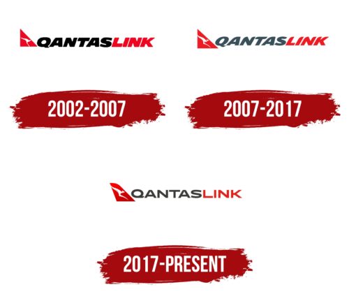
The newly established QantasLink wanted to attract attention, so it adopted a logo with a contrasting color scheme. The combination of red, black, and white quickly became its hallmark, representing the diversity of its services.
Designers incorporated a stylized kangaroo into the emblem to highlight the brand’s connection to Australia. This animal, an endemic and one of the most recognizable symbols of the continent, is known for its endurance and strength. In the context of QantasLink, it embodies high speed and efficiency in air travel. The kangaroo emphasizes the airline’s national identity, patriotism, and pride in the country.
The white silhouette of the kangaroo is set within a small red triangle, resembling part of an airplane’s tail. This signifies the brand’s association with the aviation industry. The adjacent text alludes to an airplane, though the metaphor is subtler. The bold, italicized font evokes a sense of rapid flight, visually representing the energy that drives QantasLink forward, expanding its route network and modernizing its fleet.
2007 – 2017
Designers detailed the logo, giving the kangaroo silhouette a more defined shape. It now features front legs, a head, ears, and a gracefully curved tail. The sharp lines and points make the design energetic. This new style reflects the kangaroo’s endurance, strength, and ability to move quickly. These qualities characterize the airline, which prides itself on stability, reliability, and high speed.
The white silhouette of the kangaroo is placed within a red triangle, which is symbolic. The bright geometric shape resembles a tail stabilizer, an essential component for an airplane’s flight, providing control and stability. The current design features sharp, clear angles, unlike the previous emblem with softened triangle corners. These sharp forms evoke innovation and progress, emphasizing the airline’s professionalism and commitment to advanced technologies.
The name QantasLink remains in bold italics but now features a unique font. Each letter has a rounded top, enhancing the sense of movement. To balance the logo’s high dynamism, designers colored the word “QANTAS” in gray. This subdued shade tones down the brightness of the red elements. Such harmony is crucial for the company, which aims to instill trust in its clients.
2017 – today
Given Australia’s worldwide recognition for its kangaroos, a local airline selected this iconic animal as the central element of its logo. The designers cleverly placed the kangaroo on the left side of the logo, set against a background resembling an airplane’s tail section. This choice is intentional because the image of this unique marsupial adorns the livery of the airline’s aircraft. The distinctive marsupial directs attention toward the airline’s name, presented in a flattened, wide font. Despite the cohesive spelling, the words “Qantas” and “Link” stand out due to their different colors: “Qantas” is rendered in dark gray, while “Link” is depicted in red.
The kangaroo’s selection as a symbol underscores a unique aspect of Australian culture, reinforcing the airline’s strong national identity. The thoughtful combination of dark gray and red produces a striking visual contrast, ensuring that the words and other elements of the logo are easily distinguishable. A wide font for the company name imparts a sense of stability and balance to the overall design.
By integrating these elements, the logo showcases the airline’s connection to Australia and highlights its commitment to delivering a reliable and distinctive service. The choice of colors and the iconic kangaroo create a memorable and impactful visual identity that resonates with national and international audiences.
