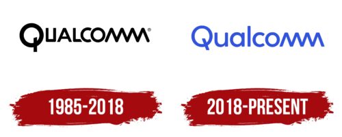
The Qualcomm logo looks very simple and stylish at the same time. It uses only one component – a verbal sign. But, it is enough to convey a well-known company’s main message fully. Due to the original design of the ending of the inscription and the modern rounded font, the designers managed to convey innovation, progressiveness, development, and professionalism. It is these features that are the basis of Qualcomm’s philosophy.
Qualcomm: Brand overview
| Founded: | July 1985 |
| Founder: | Irwin Jacobs, Andrew Viterbi, Franklin P. Antonio |
| Headquarters: | San Diego, California, U.S. |
| Website: | qualcomm.com |
Qualcomm is one of the largest American developers of software products and high-tech wireless devices. The company mainly supplies various types of telecommunications equipment and semiconductors to the market. But the main product is unique processors that are widely used today in various gadgets.
The creators of Qualcomm were initially set up for large-scale research and creating completely new wireless products. At various times, the manufacturer was engaged in creating functional cell phones and programs for navigation. The company later acquired an OFDM communications research firm. But, it did not stop there; Qualcomm introduced server-type processors and high-tech software a few years later.
Meaning and History
There has been some stability in the activities of the brand throughout the entire period. At the same time, the brand has constantly been developing and improving, which is confirmed by the periodic appearance of new products. The combination of these characteristics became the basis for creating a visual concept. The designers managed to convey these features through a confident inscription made in a modified author’s font with decorative elements. An additional feature is the modern confident coloring.
What is Qualcomm?
Qualcomm is a well-known software and wireless technology company. A feature of the manufacturer is the use of completely new 5G and 4G formats. Qualcomm is currently headquartered in the United States of America (California). The company’s products include BREW, CDMA Chipsets, QChat, and MediaFLO.
1985 – 2018
An early version of the Qualcomm logo was introduced in 1985 when the company first entered the market. It was a discreet inscription indicating the name of the brand. For the design, an unusual geometric font was chosen, in which there were straight lines, sharp corners, and rounded bends. But, the main features of the inscription were the special design of the two letters m and the first letter of the name.
The Q symbol resembles the power button on computers and other gadgets, which directly evoked associations with high-tech inventions. In addition, the inscription ended with the connected letters m, which resembled a wave. This icon symbolized the company’s gradual smooth movement and development, and the font design reflected the company’s innovations in the work process.
The color scheme of the Qualcomm logo consisted of only two traditional colors: white and black. Such a palette symbolized high status, prestige, and professionalism. Black reflects basic values, while white shows reliability, responsibility, and simplicity. This description is fully consistent with the developer’s activities and philosophy.
2018 – today
In 2018, there was a need to change the logo. The company decided to make the corporate identity more modern and stylish. The designers left the basic image the same but made some changes to the design. The font has become smoother and more rounded, and a stylish light palette has replaced the strict monochrome colors. Such changes emphasized the progressiveness of the brand, as well as its desire for improvement.
A softer font can be interpreted as comfort and friendliness, and a neutral light coloring emphasizes reliability, trust, and safety. Minor changes also affected the decorative elements of the inscription. The wavy letters m now have straight cuts, which indicates adherence to principles, and the first letter has become more expressive due to a change in the direction of the tail.
Font and Colors
Qualcomm is one of the most progressive American companies that work in the field of telecommunications and wireless technologies. To convey these characteristics as effectively as possible, the designers used a modern author’s sans-serif typeface. Among the features of this format are soft, smooth lines, a neat shape, and the presence of small spaces that provide a high level of readability. Decorative elements are also provided in two parts of the inscription.
They are presented in the form of a smooth wave created by two letters, m, and a stylized letter, Q. The sign looks like a power button, so it fits perfectly into the overall concept. The color palette of the logo consists of two neutral colors. For the design of the inscription, the light blue color is used, demonstrating reliability, trust, and responsibility. The background is presented in white, reflecting honesty and integrity. In the design context, such shades look fresh and stylish, positively affecting the logo.
Qualcomm color codes
| Byzantine Blue | Hex color: | #3253dc |
|---|---|---|
| RGB: | 50 83 220 | |
| CMYK: | 77 62 0 14 | |
| Pantone: | PMS 2728 C |


