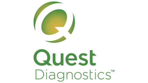
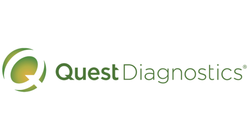
The Quest Diagnostics logo is a harmonious picture that evokes extremely positive emotions. To a greater extent, this effect is achieved through the use of eye-pleasing green. It is often used to design the corporate identity of medical institutions and medicines. This is because green is associated with calmness, balance, and vitality. Combined with a round decorative badge and a flowing font, it creates a harmonious emblem that inspires confidence among customers.
Quest Diagnostics: Brand overview
| Founded: | 1967 |
| Founder: | Paul Brown |
| Headquarters: | Secaucus, New Jersey, U.S. |
| Website: | questdiagnostics.com |
Quest Diagnostics is the name of one of the American laboratories providing diagnostic services. The main office is located in the USA (Secaucus). It uses the latest equipment of various classes, which allows testing of diseases of the cardiovascular system, oncology, neurological disorders, etc.
Quest Diagnostics is one of the most modern clinical laboratories in the USA. The company has achieved incredible success in the field of diagnostics and was able to create all the necessary conditions for high-precision testing. Thanks to this, the laboratory repeatedly ranked first in the world rankings. The institution’s owners have always prioritized the high quality of service. This was also noticeable at the visual identity level.
Meaning and History
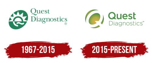
For the entire time of its existence, the laboratory had two logos, and both showed the same message, only in different interpretations. In an earlier version, there was a sun symbol, denoting life and energy, and in the modern version, a stylish oval sign conveys the same meaning. The central element has always been the name of the institution, which emphasizes its significance and significant contribution to the healthcare sector.
What is Quest Diagnostics?
Quest Diagnostics is one of the most trusted clinical laboratories in the United States of America. It provides services in diagnosing cancer, infectious diseases, COVID-19, and many other diseases. The main office is located in the state of New Jersey. At the same time, the organization has branches in Brazil, Mexico, and Puerto Rico. Quest Diagnostics currently has over 40,000 employees.
1967 – 2015
Quest Diagnostics began operations in 1967. It was founded by a specialized specialist – MD Paul. A. Brown. Initially, the laboratory was called the Metropolitan Pathology Laboratory, then changed its name several times and became the property of different companies. It received its current name only in 1991. From the moment of its creation until 2015, the medical institution had an original emblem consisting of several elements.
The main part was occupied by a two-level inscription made in the classic Serif serif style. The presented type of font is characterized by the presence of thin, neat lines and beautiful curls that make some letters in words expressive. The Serif font demonstrates reliability, confidence, and respect for tradition.
In addition to the inscription, the logo also had a graphic addition in the form of an oval with a stylized letter Q inside. Part of her looked like a sunrise. The picture symbolizes life, new energy, rebirth, and renewal. Due to this, it favorably fits into the visual concept of the laboratory, which works in the field of healthcare. Designers interpret the sun sign as a chance for new opportunities for healing and recovery.
The line of vitality continues here also in a balanced color scheme. Its main shade was a beautiful green color. In the context of visual identity, it means harmony, balance, calmness, and comfort. In addition, it is associated directly with medicine and healthcare for many. In this case, white, used for the graphic sign and background, symbolizes purity, responsibility, and reliability.
2015 – today
In 2015, the management decided to update the emblem to make its design more stylish. The main requirement at the same time was to preserve the base of the logo. As part of the requirements, the designers changed the font style and simplified the oval-shaped graphic sign. For the first part of the wordmark, a rounded bold format was used, in which there were beveled cuts. Some letters are more pronounced, giving the font an original appearance as a whole.
The second part of the inscription in the form of the word Diagnostics is designed in a more elegant thin type, which includes soft, rounded curves. He showed confidence, resilience, and a friendly attitude. A stylish addition in the form of an oval inside a stylized letter Q also has a similar load. The element evokes positive associations associated with comfort and trust. These are the basic principles by which the well-known laboratory works. Quest Diagnostics has all the conditions for accurate diagnostics and customer comfort.
Font and Colors
The corporate identity of Quest Diagnostics is based on its basic principles – care, support, and professionalism. These features can be seen directly in the color scheme, as well as in the design of the word mark. For it, the designers used two types of fonts, perfectly combined and conveying the company’s message.
The word Quest is distinguished by more massive and clear forms. The letters show beautiful roundness, as well as original oblique cuts. They are especially noticeable in the letters Q and T, which makes the inscription outstanding. At the bottom level is the word Diagnostics. The sign differs significantly from the top text, as it is presented in a thin format without beveled cuts. These neat, round letters show precision and high quality.
The color scheme, as in most medical products, includes a pleasant green tint complemented by white inserts. The first symbolizes comfort, vitality, balance, and security. The second favorably emphasizes purity, responsibility, and conscientiousness. Together, these elements reflect the core strategy pursued by Quest Diagnostics.
Quest Diagnostics color codes
| Middle Green | Hex color: | #498e46 |
|---|---|---|
| RGB: | 73 142 70 | |
| CMYK: | 49 0 51 44 | |
| Pantone: | PMS 348 C |
| Metallic Gold | Hex color: | #d2b044 |
|---|---|---|
| RGB: | 210 176 68 | |
| CMYK: | 0 16 68 18 | |
| Pantone: | PMS 7752 C |
