


![]() Quizlet Logo PNG
Quizlet Logo PNG
Looking at Quizlet, the logo is clear: the platform’s content is concise, consistent, and easy to understand. Attention is focused on the main points. And each client can take as much time as they need to study.
Quizlet began in October 2005, when 15-year-old Andrew Sutherland was studying for a French test in Maine. Paper flashcards felt inefficient, so he built a simple digital flashcard program for 111 words. After scoring 100 out of 100, he shared it with friends.
In January 2007, Sutherland opened Quizlet to the public. In its first 252 days, the site gained 50,000 registered users with no marketing budget. Students shared it with classmates, and teachers began recommending it in class. Within about two years, registered users passed 1 million.
Sutherland entered MIT to study computer science but later left to focus on Quizlet. The company spent its early years bootstrapping and became profitable through paid subscriptions by 2009. Until 2011, it shared resources with Collectors Weekly.
In 2011, Quizlet added text-to-speech. In August 2012, it launched apps for iPhone, iPad, and Android, then raised a small $30,000 seed round. Rivals such as StudyBlue grew, too, but Quizlet benefited from public study sets created by users. By 2015, Quizlet had 40 million monthly users and raised $12 million in Series A funding from Union Square Ventures, Costanoa Venture Capital, Altos Ventures, and Owl Ventures.
Matt Glotzbach became CEO in 2017, while Sutherland moved to the CTO role. In 2020, General Atlantic led a $30 million Series C, valuing Quizlet at $1 billion. Sutherland left later that year. In 2021, Quizlet bought Slader. Lex Bayer became CEO in 2022. In 2023, Quizlet launched Q-Chat using OpenAI’s ChatGPT API, followed by more AI tools. Kurt Beidler became CEO in July 2024.
Meaning and History
![]()
The utility’s main tasks are to provide didactic material, learning in-game and test forms, and to monitor knowledge gained. The key contingent of users is high school, college, and university students. In general, the number of active visitors has long passed the 50 million mark. No wonder that in 2016, SimilarWeb experts recognized it as the fastest-growing educational resource.
Currently, its laconic logo is familiar to users in 130 countries. It is available in many languages, including Japanese, Indonesian, English, French, Italian, Dutch, etc. Mastering the material takes place in several modes: Flash Cards, Speller, Gravity, Match, Write, and Live. The number of card sets has already exceeded 300. The resource’s short existence had two minimalist emblems: the debut and the current one.
What is Quizlet?
This multilingual American service provides educational materials to help assimilate knowledge through play and testing. It was created by Andrew Sutherland in 2005 and only became available to the general public in 2007. Its products include quizzes, electronic tests, flashcards, and matching games. The head office is located in San Francisco, California.
2007 – 2016
![]()
The site started with a simple text-only logo. It had two inscriptions in two rows. The top line was occupied by the educational resource’s name, the bottom by its domain name. The result is a full-fledged email address.
The first word was written in a type with proportionally correct serifs, such as are found in the classic printed text. They are the same length and angled downward. Although the “t” did not have a serif, it was replaced by a diagonal angle at the top. The first character, the capital “Q,” was depicted in a very interesting way. It had the shape of the number “2”. Below was the word “.com” with a dot in front.
2016 – 2021
![]()
After the redesign, the logo retained a single “Quizlet” letter, which was given a completely different style. The developers have changed the first letter, so it looks traditional and no longer looks like a two. Simultaneously, “Q” remained uppercase, and all other characters lowercase, according to the accepted grammar rules.
Another change affected the second row, which is absent in the current version. The remaining symbols have also been significantly transformed. “T” has no bottom hook, “l” has become a vertical rectangle, the middle bar “e” has become horizontal, and smooth “u” looks like an inverted arch.
2021 – today
![]()
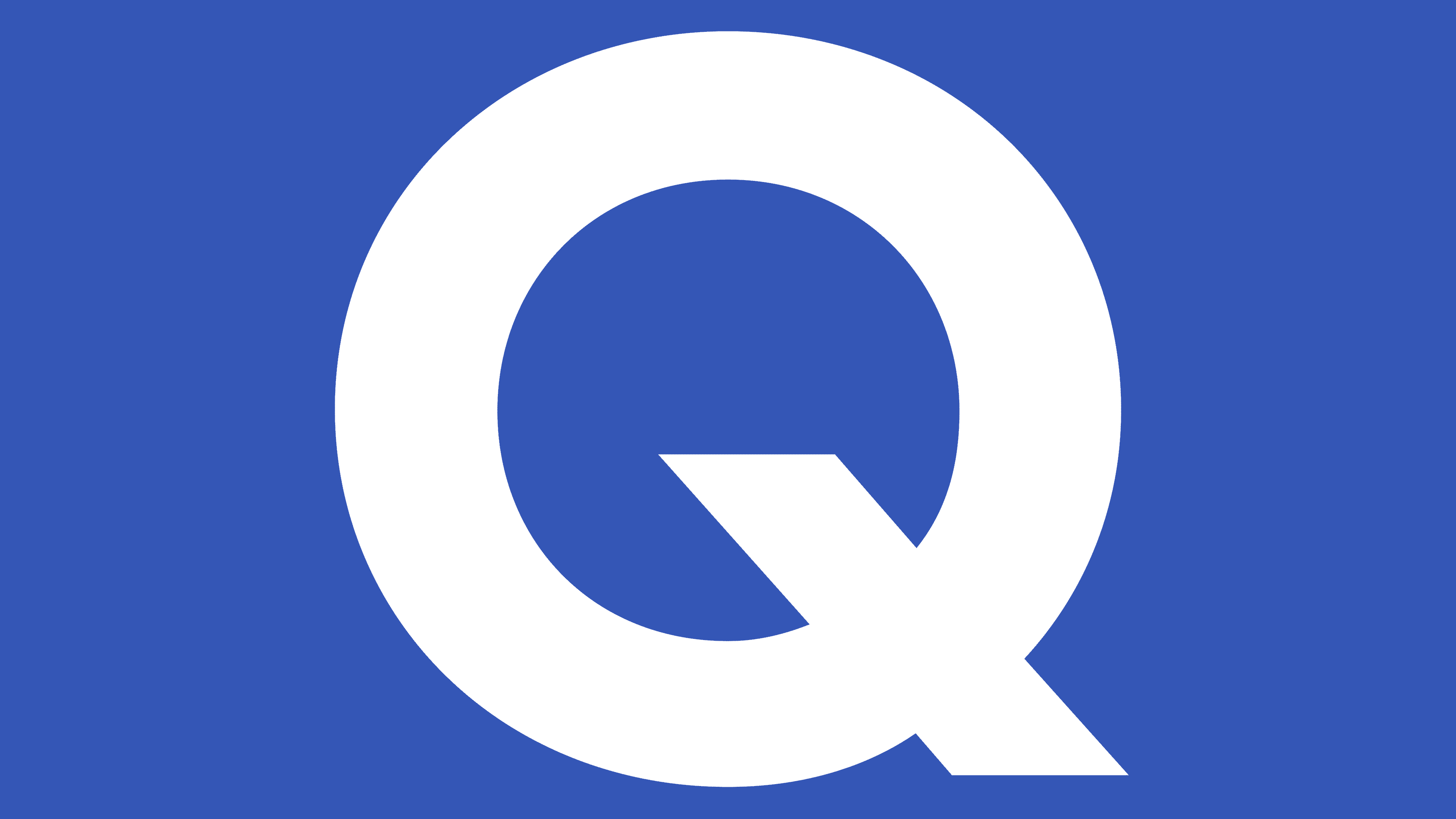
As a result of the update, the first letter of the training service’s name was streamlined. Now it is removed from both the image of the number “2” and the geometric construction, as it was last time. In addition, the developers slightly smoothed the signs’ excessive sharpness and moved the “t” crossbar to form the correct cross. At “Q,” the in-letter part of the tail is removed, and only a miniature stroke is left at the bottom right. Another major innovation is the icon. It is represented as a light blue square and contains the first letter of the Internet service’s name.
Both official logos contain only text; no graphic elements are used. This is intentional to emphasize the content of the application and website. The emblem’s evolution moved from complex to simple, so it now has no serifs or clarifying details.
This is a text logo, so writing style plays an important role. For the debut version, the designers chose a regular typeface with proportional serifs. But the developers changed it so much that it got individual features: “e” with a diagonal line in the middle and “Q,” reminiscent of the number “2”. The second emblem uses a grotesque from the Bill Corporate Narrow Extra Bold category.
The color palette also changed twice. In the first case, a dark blue shade of #044d9c was used, and in the second, a deep purple Violet-blue #4056b3.
Font and Colors
The old font has been slightly corrected in the updated logo: the “Q” has become rounded, and the “t” resembles a cross. The color palette has shifted toward the light side, so the blue has taken on a heavenly hue.

FAQ
Are flashcards free on Quizlet?
The brand offers a partially free service. You can sign up for a free version and access flashcards with some limits. The free version lets you create and study flashcards, but advanced features require a Quizlet Plus subscription.
Before 2022, students could create unlimited flashcards for free, which made Quizlet very popular. This subscription enhances the experience, but basic functions are still free, allowing users to benefit from the platform.
What color is the Quizlet logo?
The logo uses a color palette with two shades of blue. The original version featured a dark blue shade (#044d9c), used until 2021.
In 2021, the designers updated the logo to give it a fresher look. They added purple tones, changing the light blue to a soft lilac shade (#4056b3). This update made the logo more vibrant and approachable.
These color changes keep the logo’s appearance recognizable and trustworthy while aligning with modern design trends. The shift from dark blue to soft lilac shows the brand’s evolution and commitment to innovation and user-friendly experiences.
What is a corporate logo Quizlet?
The corporate logo is a custom graphic mark identifying the online learning service. This logo is used across all related training and test materials, helping establish a consistent, recognizable brand identity. The design reflects Quizlet’s focus on education and learning, symbolizing the service’s quality and reliability. The logo is a key part of the branding strategy, ensuring that all materials are easily identifiable as part of the platform.
What is a logo Quizlet?
The logo features the site’s name and an icon. The name is in a precise geometric font with smooth curves and right angles, giving it a modern look. The icon on the right side shows a white letter “Q” with a shortened tail inside a purple square. Combining the name and the icon represents Quizlet’s focus on learning and education. The logo’s simplicity and clarity make it easy for users to identify and associate it with the online learning platform.