


 Quiznos Logo PNG
The Quiznos logo represents fresh, hot sandwiches, memorable for their aroma and unique flavors. It prioritizes food quality and taste over advertising, attracting loyal customers.
Quiznos began in Denver, Colorado, in 1981, when chef Jimmy Lambatos opened a restaurant centered on hot sandwiches. Bread was toasted in an oven, a method rarely used by fast-food sandwich chains at the time. Lambatos developed proprietary sauces, bread, and recipes that later became the product format used across the chain.
Franchising began in 1983, though growth remained regional early on. Rick and Richard Schaden acquired Quiznos in 1991, standardized operations, revised marketing, and accelerated openings nationwide. The company went public in 1994 to finance expansion. By 2007, the network had grown to more than 5,000 restaurants worldwide.
Quiznos competed directly with Subway, whose lower prices, health-focused advertising, and low franchise entry costs supported broader expansion. Quiznos franchisees had to buy ingredients and supplies through corporate channels at fixed prices. High operating costs limited price competition, and disputes with restaurant owners contributed to closures. The chain fell from its peak to several hundred locations within a few years.
Quiznos filed for Chapter 11 bankruptcy in 2014 and reduced part of its debt through restructuring. High Bluff Capital Partners later acquired the brand. New initiatives included a mobile app, online ordering, delivery, drive-thru locations, and expansion in Latin America, where the chain retained stronger positions than in the United States. By 2023, about 145 Quiznos restaurants remained in the U.S.
Meaning and History
What is Quiznos?
It is an American restaurant chain known for its hot sandwiches, prepared in a special toaster oven. The bread is toasted, filled with fillings, and topped with melted cheese, creating juicy, flavorful sandwiches. Customers can watch the preparation process, which resembles a culinary show. The menu includes signature combinations of meats and sauces.
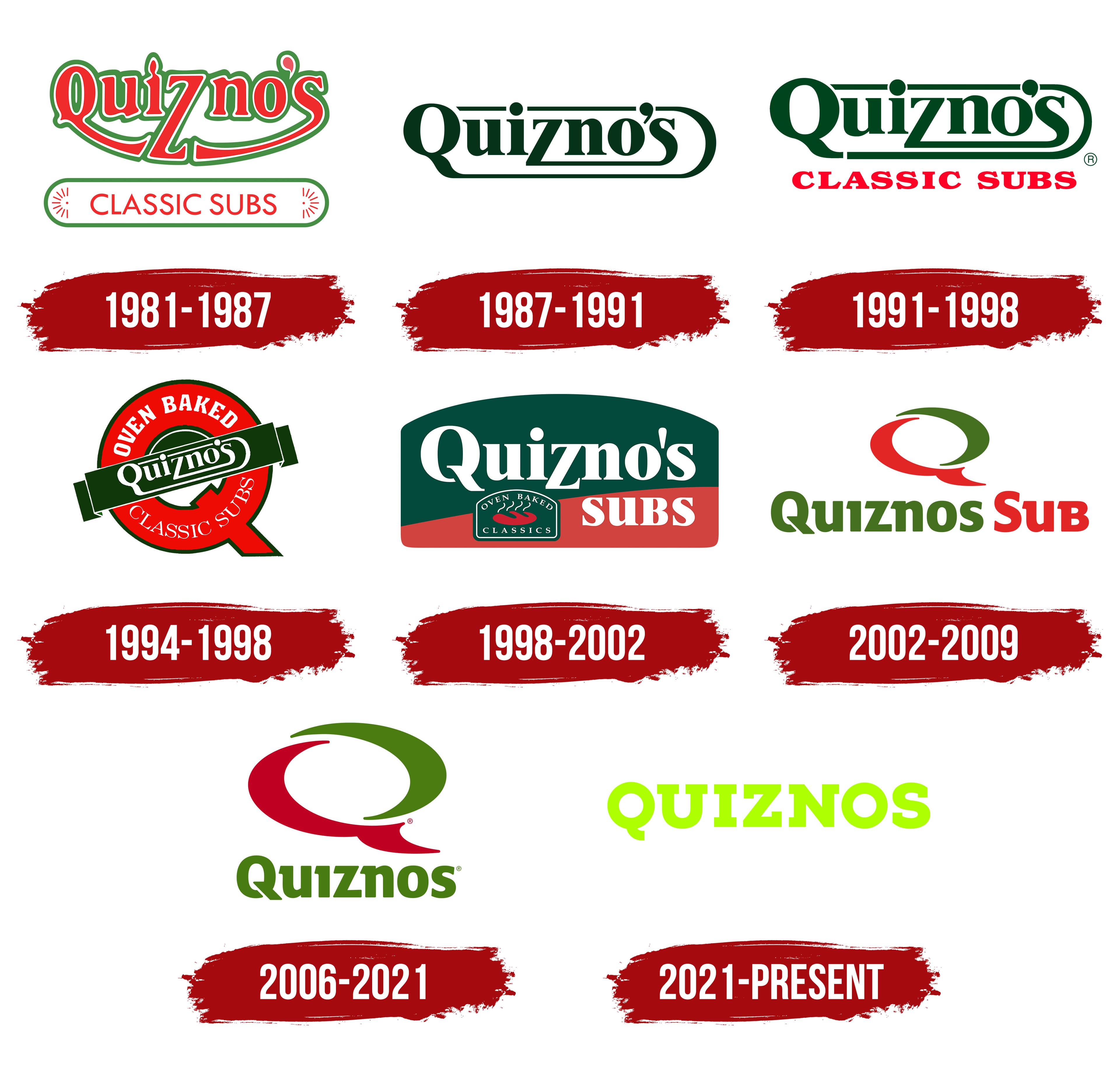
1981 – 1987
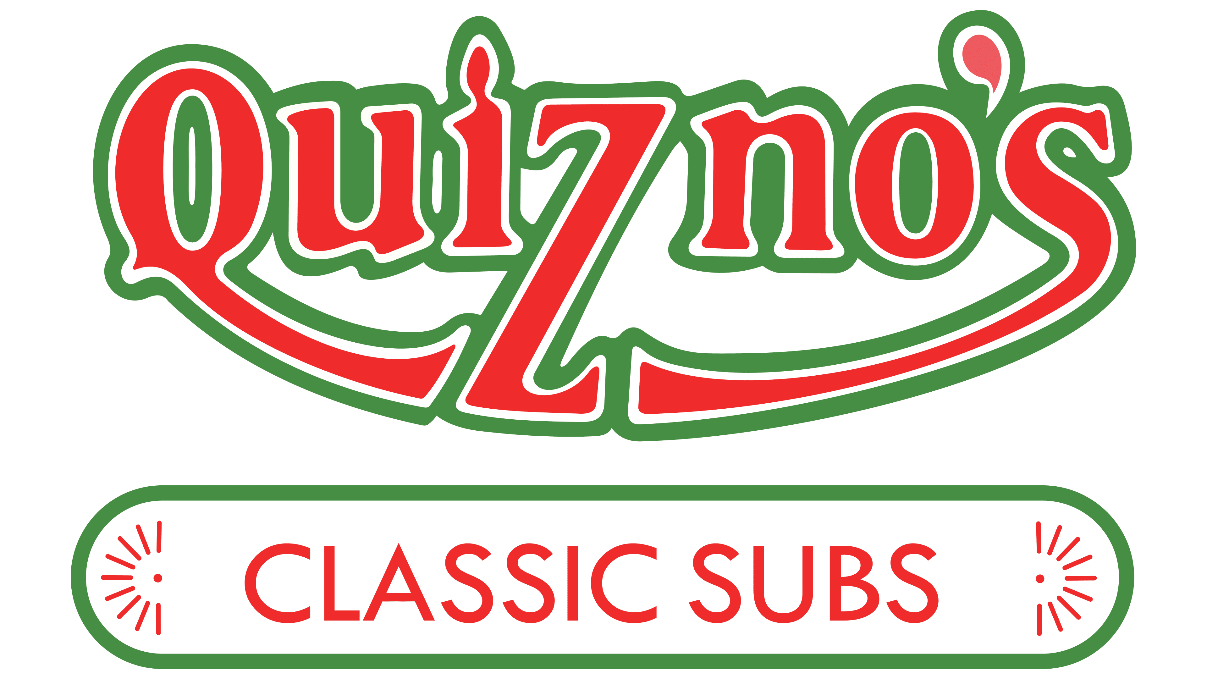
The first Quiznos café opened in Denver, Colorado, in 1981, showcasing an unconventional visual style. The name featured bold letters with dynamic graphics, with the initial “Q” uniquely extending downward to form an arc connecting to the letter “S” at the end. The letter “Z,” placed centrally, descended to enhance the dynamic shape. The bright red and green colors reflected freshness and appetite, essential for a fast-food establishment. The original letter design emphasized the playful image aimed at a young audience, distinguishing itself from traditional fast-food chains.
1987 – 1991
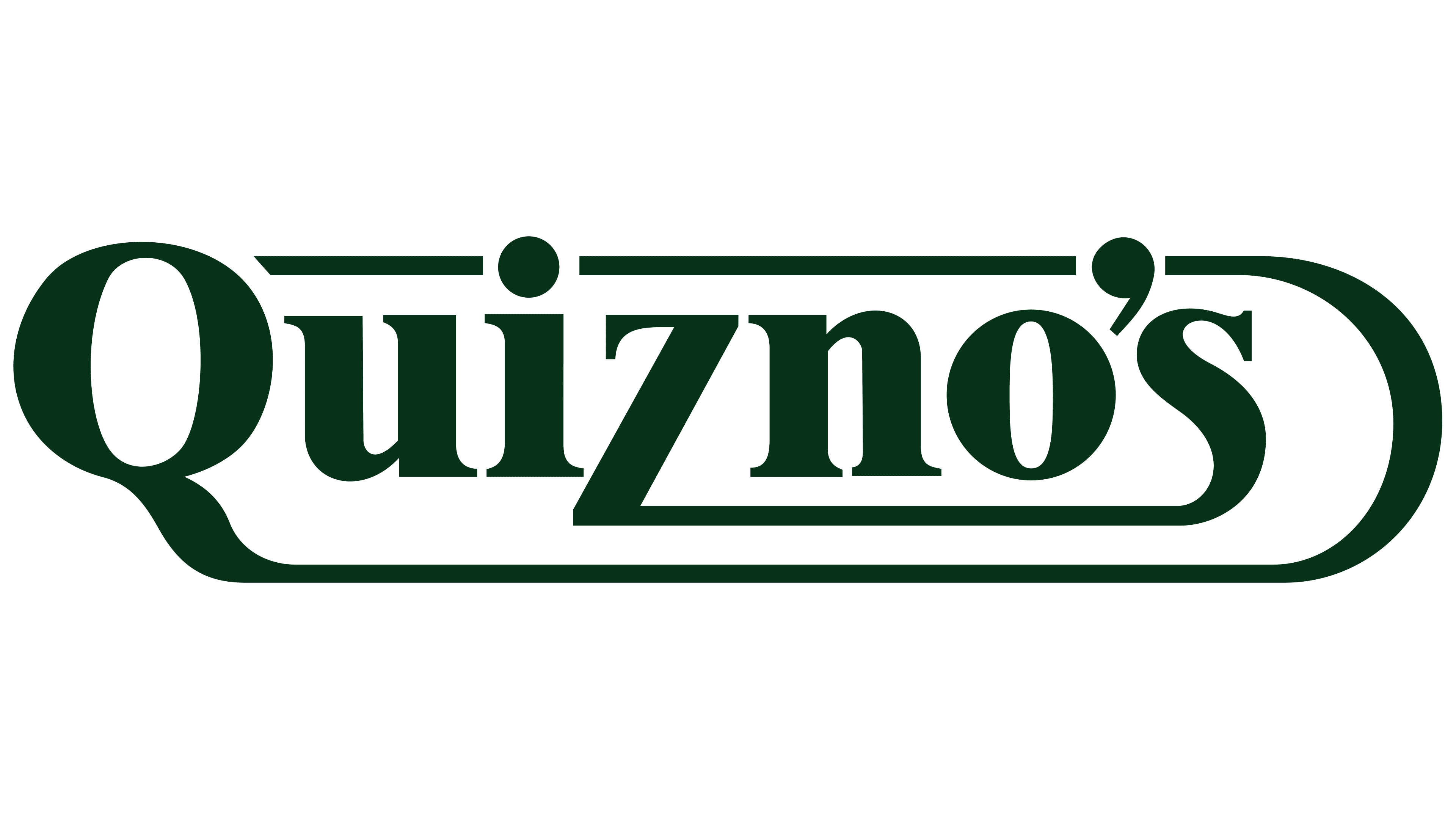
By the late 1980s, Quiznos decided to project a more refined image. While retaining the overall typographic concept, the emphasis shifted toward elegance and solidity. Letters became thinner, adopting a calmer style, with solid black highlighting the brand’s businesslike character. Key letters changed: “Q” turned neat and gently flowed into the lower line encircling the word; “Z” lost its aggressive elongation, gaining balanced proportions; the final “S” became rounded, elegantly finishing the inscription. The company struck a balance between familiarity and a restrained presentation of its new identity.
1991 – 1998
In the early ’90s, Quiznos introduced specificity with the slogan “Classic Subs” below the logo, written in bold red type with a slight retro touch. The main lettering turned green. Letters were slightly adjusted, becoming softer with fewer sharp angles. By adding red, the company emphasized traditional sandwich flavors. The slogan’s typeface resembled Cooper Black, known for its thick lines that lend a homey feel.
1994 – 1998
In the mid-’90s, fresh-baked aromas influenced Quiznos’ branding. For the first time, the chain incorporated a visual idea inside a large letter. The letter “Q,” in red, became central, resembling a round oven. Around its center, the words “Oven Baked” and “Classic Subs” appeared in white lettering.
A horizontal banner in rich green crossed the center of the letter, highlighting the brand’s natural ingredients and original recipes. “Quizno’s” appeared in white, rounded letters on the banner, evoking a baker’s handcrafted style while maintaining a friendly, comfortable feel.
The design conveyed the brand’s idea of oven-baked, homemade sandwiches and emphasized the preparation method that preserves the product’s flavor and freshness.
1998 – 2002
By the end of the ’90s, Quiznos experimented visually, adopting a new rounded-top shape, reminiscent of classic American diner signs. The upper part became dark green, symbolizing product freshness.
The name appeared prominently in white type, clearly readable. The lower part turned bright red, with the word “Subs” in contrasting colors to enhance readability.
In the bottom corner, a small green icon depicted a hot sandwich. The surrounding text, “Oven Baked Classics,” emphasized traditional preparation methods.
The visual style reflected comfort and homemade quality, clearly communicating product freshness and handmade sandwiches.
2002 – 2006
A two-tone letter “Q” became the brand’s symbol. The company moved away from previous styles, focusing on dynamic imagery. Red and green colors harmonized, emphasizing freshness and cooking heat.
Typography was updated with a clean, simple style. “Quiznos” appeared in green, “Sub” in red, highlighting the primary product, sandwiches.
This new logo overlapped with the next version until 2009, allowing a smooth transition for customers. The green color emphasized natural ingredients, while red represented the warmth of the oven.
2006 – 2021
“Sub” disappeared, and the company introduced a simplified, memorable logo. Colors became richer, with deeper shades of green and red.
The distinctive letter “Q” retained smooth curves and stayed central. “Quiznos,” underneath, was in green, clean sans-serif typography, creating a friendly appearance. The logo used VAG Rounded Bold, known for its softness and simplicity.
Dropping “Sub” underscored the brand’s versatility as it expanded beyond sandwiches.
2021 – today
In 2021, the Quiznos brand changed its logo, adopting a text-only format. The company removed the previous “Q” symbol, leaving the name as the sole element of its image. This allowed the brand to appear more current and be more easily perceived by an audience that values simplicity and clarity in visual style.
The name QUIZNOS is rendered in capital letters, forming a dense, unified construction. The typeface used is heavy, with wide strokes. It resembles Proxima Nova Extra Bold but has its own geometry and distinctive proportions, ensuring the brand’s uniqueness among competitors.
The primary color became a bright neon lime green. The tone is connected with natural themes and the freshness of the ingredients that form the basis of the company’s menu. The shade’s juiciness and intensity create a lively, light brand image, emphasizing its focus on a younger audience.
The new design highlights the company’s focus on natural products and accessibility, reflecting the brand’s desire to align with trends in contemporary gastronomy.
Font and Colors
The font and color scheme are designed to appeal to younger customers. The company adopted a monochrome palette featuring neon lime green (#CFFF04), which brought an energetic appeal.
The typeface is a customized version of Proxima Nova Extra Bold, a geometric sans-serif whose even letters stand out on various surfaces. Emphasis is placed on “Q,” with a slightly curved lower tail that highlights its uniqueness.