For a brand engaged in advertising and selling different products, it is very important to look convincing. Therefore, the QVC logo attracts attention with its conciseness, seriousness, and harmonious simplicity. It also adapts easily to the digital environment.
QVC: Brand overview
| Founded: | November 24, 1986 |
| Founder: | Qurate Retail Group |
| Headquarters: | West Chester, Pennsylvania, United States |
| Website: | qvc.com |
Meaning and History
Broadcaster QVC has made a name for itself in the retail industry with its 24-hour coverage of everything from gold jewelry to dishwashers. Its abbreviated name is derived from the phrase “Quality Value Convenience,” which hints at the advantages of the “shop on the couch” and the impeccability of the products sold. That is, it in itself performs a commercial function.
The television network was established in the summer of 1986 and acquired its first channel within a few months. She then began using radio waves to showcase her products. Naturally, she had to create a corporate identity for herself, which assumed the presence of a recognizable logo. So there was a wordmark containing the name QVC. Over the next decades, it evolved until it acquired its modern look.
The development of the digital direction drove the latest update to the visual identity: the company aimed to ensure that its application attracts attention and inspires users to make purchases. And she considered the old logo not so convincing, so she hurried to get rid of it.
What is QVC?
QVC is an American brand in the e-commerce and video sales market. Under it, in 1986, a television network and a channel of the same name were registered, operating in the “shop on the couch” format. With the development of digital commerce, a new direction has appeared: the QVC mobile application, where you can make purchases.
1986 – 1993
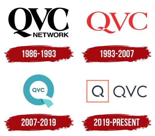
The early era of QVC’s history, which dates back to 1986, was marked by the appearance of a logo with a black inscription “QVC NETWORK.” A huge abbreviation occupied almost all the free space. The second, much smaller word was below it and was shifted to the right due to the protruding “Q” stroke. The designers used a high-contrast geometric font for the first part of the name, decorating the letters with medium-length serifs. But “NETWORK” did not have them; besides, the lines of all glyphs had approximately the same thickness.
1993 – 2007
In 1993, QVC changed its head: this position was taken by the head of Diller’s Arrow Investments, which bought out part of the TV network’s shares in 1992. A year later, he turned QVC Network into a QVC, Inc. holding to expand business opportunities and open additional divisions. The new logo was supposed to become a universal element that unites all parts of the brand – from the TV channel to the online store.
The wordmark created at that time contained the familiar abbreviation, only unlike the previous version, it was not black but red. The height and thickness of the letters have been reduced. The shape of the serifs also changed, although they remained the same length. The huge and awkward tail of the “Q” turned into a tilde, which was white at the intersection with the circle.
2007 – 2019
In 2006, QVC changed its CEO. The new CEO is heading towards e-commerce and rebranding to draw customers’ attention to the company’s evolution. This process resulted in the logo presented in September 2007 as part of marketing activities under the speaking slogan “I shop QVC, do you?”.
The abbreviation was inside a white circle with a wide annular frame in light turquoise. At the same time, the inscription was dark turquoise and consisted of sans-serif letters. The ring used as an edging was not solid: the designers made a hole in it and depicted a rectangular trapezoid on one of the edges. This element was a few shades lighter and looked like the end of a ribbon curled up. At the same time, the entire frame imitated the letter “Q.”
2019 – today
The most notorious rebranding of QVC took place in 2019. As in all previous cases, it was associated with a company management change. A focus on mobile devices has become part of the new strategy. It turned out that modern consumers go online more often than watch TV, so digital commerce has become a priority.
The QVC logo that appeared during this period was clearly visible on small screens. It contains a white square with a red border. In the center of the quadrilateral is a dark blue “Q,” and the brand’s name in the same color is written to the right.
Font and Colors
The red square symbolizes the screen; in this respect, it is universal because its shape is equally suitable for phones and computers. So the designers wanted to show the introduction of digital technologies into the work of QVC – particularly the creation of mobile applications. The round part of the letter “Q” represents the company’s continuous connection with customers. And its bottom stroke can be interpreted in different ways. On the one hand, it resembles the handle of a magnifying glass. In this case, there are associations with successful searches. On the other hand, the wavy line at the bottom of the “Q” represents an open door. And not just a door, but a passage that leads to the world of successful shopping.
The font of the QVC logo looks in contrast: the original “Q” glyph, which has no analogs, is combined with the standard “V” and “C.” The similarity of the last two letters can be found in various sans-serif typefaces: for example, Litera Serial Regular by SoftMaker, Brixton Book by Luke Ferrand, or Acherus Grotesque Regular by Horizon Type.
Designers selected the color scheme based on the requirements of the digital environment. They used a combination of red, white, and navy blue so that the logo could grab attention even on the smallest screen.
QVC color codes
| Bittersweet | Hex color: | #f67963 |
|---|---|---|
| RGB: | 246 121 99 | |
| CMYK: | 0 51 60 4 | |
| Pantone: | PMS 178 C |
| Squid Ink | Hex color: | #283349 |
|---|---|---|
| RGB: | 40 51 73 | |
| CMYK: | 45 30 0 71 | |
| Pantone: | PMS 533 C |
