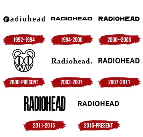
The Radiohead logo is open and confident. The emblem represents a band that isn’t afraid of experiments and has tried many genres and sounds throughout its career, excelling in every direction.
Radiohead: Brand overview
| Founded: | 1985 – present |
| Founder: | Thom Yorke, Jonny Greenwood, Colin Greenwood, Ed O’Brien, Philip Selway |
| Headquarters: | Abingdon, Oxfordshire, England |
| Website: | radiohead.com |
Meaning and History
In choosing a brand identity designer, the band showcases unprecedented consistency. Every emblem since 1994 for the band was crafted by the British designer and artist Stanley Donwood (Dan Rickwood). Stanley managed to rightly capture the band’s creative spirit and convey it on paper. This is likely due to the friendship between the maestro and the frontman, Thom Yorke, that began in university. The designer typically plays with the band’s name, but that doesn’t exclude a drastic shift from the original concept, like in 2000 when the band decided to change their musical style.
What is Radiohead?
A musical ensemble that began performing in 1985 as a private school band in Abingdon-on-Thames and gradually became a band whose albums rank 20th in the 500 Greatest Albums of All Time and top the charts in Billboard 200 and UK Albums Chart. It shifted from rock music to electronic throughout its career, achieving remarkable success in both.
1992 – 1994
The first emblem was birthed alongside the album Pablo Honey. It depicts the band’s name in lowercase, with the first letter encased in a black circle, and its color changed to white. The symbol signifies a desire for leadership and hints at discs and records constantly playing on the radio.
The band’s name was taken from a song by the musician’s favorite band, Talking Heads. It refers to a form of autism where an individual continually makes monotonous noises resembling staccato singing. Fans perceived the band’s work in this light, noting that most songs are melancholic and sung with the vocalist’s elongated voice modulations.
The band’s name also resonates with Thom Yorke’s Asperger’s syndrome.
Interestingly, the band conceived and performed all the album’s songs when they were named On a Friday. The musicians changed the name for the recording of their studio album.
1994 – 2000
The logo was designed for the EP My Iron Lung and was so successful that it remained with the band for four years. The emblem appeared on two studio albums (The Bends and OK Computer) and their associated performances.
Square letters with streamlined corners were designed by Dan Rickwood, who agreed to the job due to his acquaintance with the vocalist and initially didn’t appreciate the band’s artistry. The broad symbols convey the band’s experimentation with musical genres, initiated in The Bends and continued in OK Computer.
Uniform slender letters emphasized the equal contribution of musicians in creating and arranging songs, especially since OK Computer didn’t have a producer.
The harmonious logo seemingly foresaw the birth of music that the frontman considered the best in the group’s history. The song Exit Music (For a Film) wasn’t included in the albums but influenced the direction of subsequent creativity.
2000 – 2003
A strict emblem with straight, elongated massive letters was used for the band’s 4th and 5th albums and their reissue in 2021. Kid A (2000) and Amnesiac (2001) resulted from the lead singer’s deep fascination with electronic sound.
In albums recorded almost simultaneously, there’s a reevaluation of essential laws of existence: birth, death, reincarnation. Strict “correct” symbols point to the immutable laws of the universe. They emphasize the precise machine processing of the instruments’ sound and the vocalist’s voice. Even the album’s title, Kid A, is named after a device the band worked with.
2000 – today
The transformed face of a bear stylized like anime and Tokyo-esque, became the face of the advertising campaign for the fourth album, Kid A. The vocalist, Thom Yorke, collaborated with the regular designer on the image.
The robot bear conveys electronic processing for the songs on the album. The slightly ferocious look of the animal intertwines with the main ideas that inspired the designers for the album cover: catastrophes, the war in Kosovo, and pools of blood from terrorism victims.
2003 – 2007
The printed computer font in the album Hail to the Thief logo conveys the working atmosphere of a live recording. Quick and confident performance without re-recordings reduced the album’s production time to 2 weeks.
The font, used for internet printing, emphasized a prevalent theme in the media – the fight against terrorism. The disc, like a message from the band, contributes to the broader discussion. And the period after the inscription underlines the finality of the position.
2007 – 2011
The album In Rainbows got a very simple logo, conveying the album’s accessibility. The collection was released digitally without a label and was made available for download at a price set by the buyer. This was the first release after the contract with EMI ended.
The sign indicates that the album was recorded sporadically, so the work stretched over two years. The simplicity of the inscription also speaks about the artists’ daily lives since the collection contains many personal songs.
2011 – 2015
The King of Limbs received a majestic, slender, and “tall” logo, befitting a king. The design and title are associated with ancient oaks, tall and strong. Hence the massive letters. The album emphasizes an unusual rhythm, which, according to the musicians, is the “king” of the work.
2015 – today
The emblem of the album A Moon Shaped Pool in its font resonates with In Rainbows and speaks of simplicity in its way. The symbol emphasizes the predominance of live instruments and orchestral arrangements. Songs were recorded on a simple outdated magnetic tape, which limited the variations of working on them (for instance, you couldn’t re-record individual parts, but only erase the recording and start anew). The themes of the tracks were also simple and as old as time: love, forgiveness, regretting the past.
Font and Colors
The black color of the logos aptly matched the diverse color schemes of the cover designs, which predominantly featured red, white, and yellow colors. The shade embodies strong guitar parts and slightly melancholic lyrics, resonating with emo themes.
The font resembles Molde Semibold, where the bold uppercase letters combine with the lightness provided by the increased spacing between them.
Radiohead color codes
| Black | Hex color: | #000000 |
|---|---|---|
| RGB: | 0 0 0 | |
| CMYK: | 0 0 0 100 | |
| Pantone: | PMS Process Black C |

