


 RAF Logo PNG
The RAF logo, which often reflects the car’s shape, reflects the entire history of a once-popular vehicle manufacturer. The connection between reality and artistry resulted in an accurate emblem highlighting the company’s range.
Riga Bus Factory, known as RAF, was founded in 1949 in Riga, then part of the Latvian SSR. The plant began as a repair center for buses and trucks, working with maintenance, rebuilding, and modernization rather than full-scale vehicle production. Its early role reflected the postwar needs of Soviet transport, with existing fleets requiring servicing before new models could be developed.
In the 1950s, RAF moved from repairs into manufacturing. One of its first minibusses was the RAF-251, built on the GAZ-51 chassis. In 1955, the factory introduced the RAF-10, a 9-seat minibus developed in-house with components from the GAZ-M20 Pobeda. This model showed that the Riga plant had moved beyond workshop functions and could create vehicles under its own name.
Serial production expanded in 1958 with the RAF-977 “Latvija.” The minibus became common across the Soviet Union. It was used as a route taxi, ambulance, police vehicle, and service transport. Production lasted until 1976. During the 1960s, RAF increased its capacity and exported vehicles to other socialist countries, giving the brand a broader industrial role beyond Latvia.
In 1976, the plant launched the RAF-2203 “Latvija,” the most-produced and most recognizable model in its history. In the 1980s, RAF reached an output of up to 17,000 minibusses per year and became one of Riga’s major industrial employers. After the Soviet Union collapsed in 1991, supply ties broke down and demand fell. From 1992 to 1997, RAF tried to adapt with the RAF-3311 cargo van and updated RAF-2203 versions, while talks with foreign manufacturers failed to secure stable production. In 1998, the factory filed for bankruptcy and ceased operations. Over nearly 50 years, RAF produced hundreds of thousands of minibusses used across the USSR and Eastern Europe. Today, RAF-2203 “Latvija” vehicles remain known among collectors and restorers.
Meaning and History
What is RAF?
It is a Latvian automobile and bus manufacturer known for producing a range of vehicles, including minibusses, vans, and commercial vehicles. The company gained prominence for its versatile and reliable vehicles, which are widely used for public transportation, commercial purposes, and by various government agencies. Vehicles were recognized for their practicality and robustness, serving a critical role in transportation across the region.
1949 – 1957
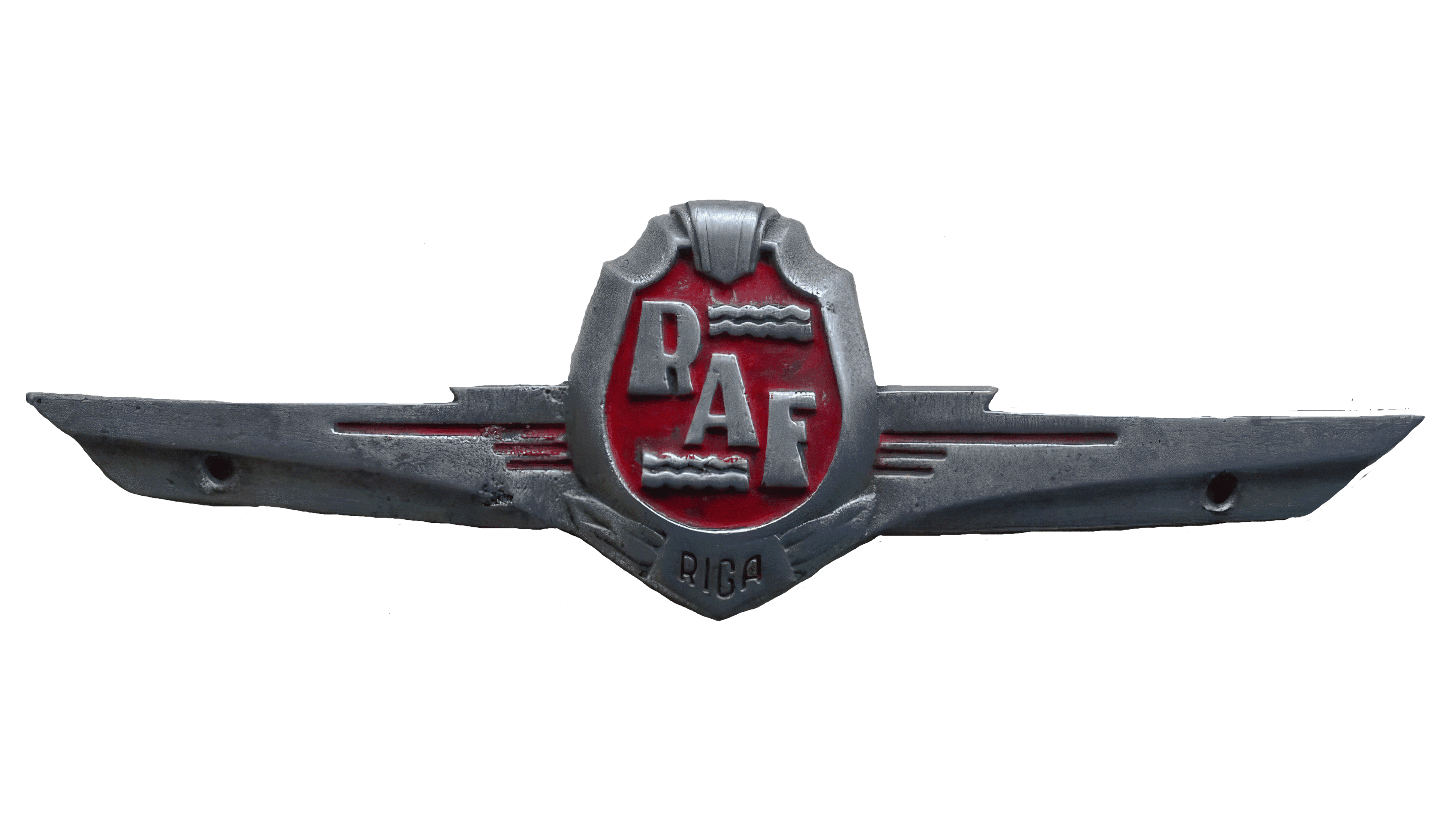
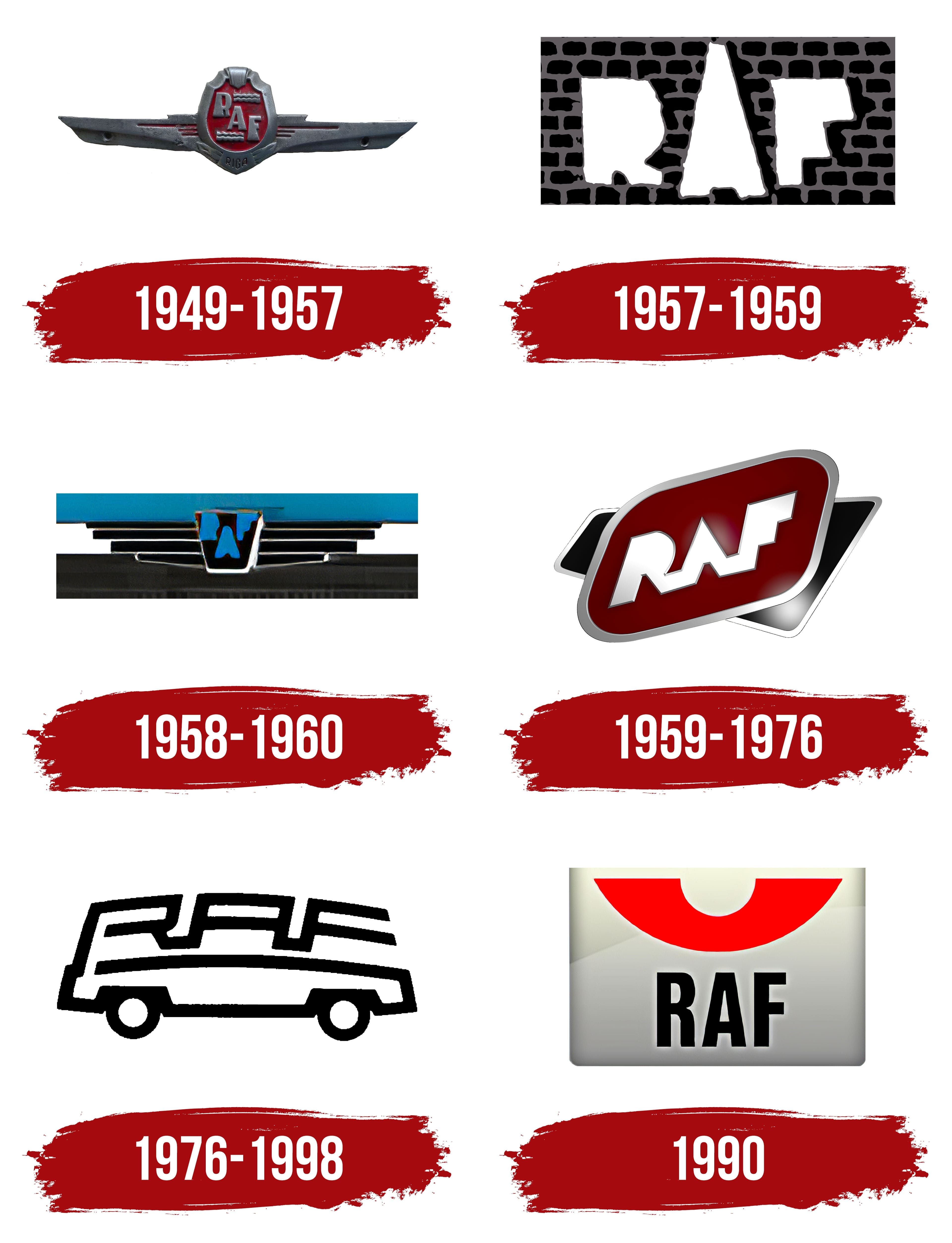
The logo is shaped like a chest badge, resembling an achievement award. It symbolizes the company’s recognition of those who choose its products, showcasing impeccable taste to the world. The technical aspects are well thought out, with the vehicle’s internal structure harmoniously complemented by visual elements that create a distinct brand image. Among the most significant details are:
- The crest of the minibus manufacturing plant (located in the center)
- The inscription RAF (an abbreviation formed from the full name Rīgas Autobusu Fabrika)
- Wings (there are two, positioned on the right and left of the central element)
The center of the crest features text and waves, indicating proximity to the Baltic Sea and the Daugava River, as Riga, where the plant operated, is located on its banks. Thus, the emblem features two waves that harmoniously complement the enterprise’s name. The city name is inscribed at the bottom on laurel wreaths, using block letters with thin strokes, adding sophistication to the emblem.
The wings consist of three stripes on each side. Although they add weight to the emblem, it still appears light and airy. This combination relies on contrast, attracting consumers’ attention as they wonder why wings are depicted here. The wings hold significant importance for the company, symbolizing the vehicles’ high speed, as if they were flying on the roads.
The inscription is set in a massive, elegant font: expansions replace serifs, and the wide and narrow strokes are harmoniously combined. This adds dynamics to the text, making it livelier and more appealing to potential customers, attracting attention, and encouraging them to read the name closely.
1957 – 1959
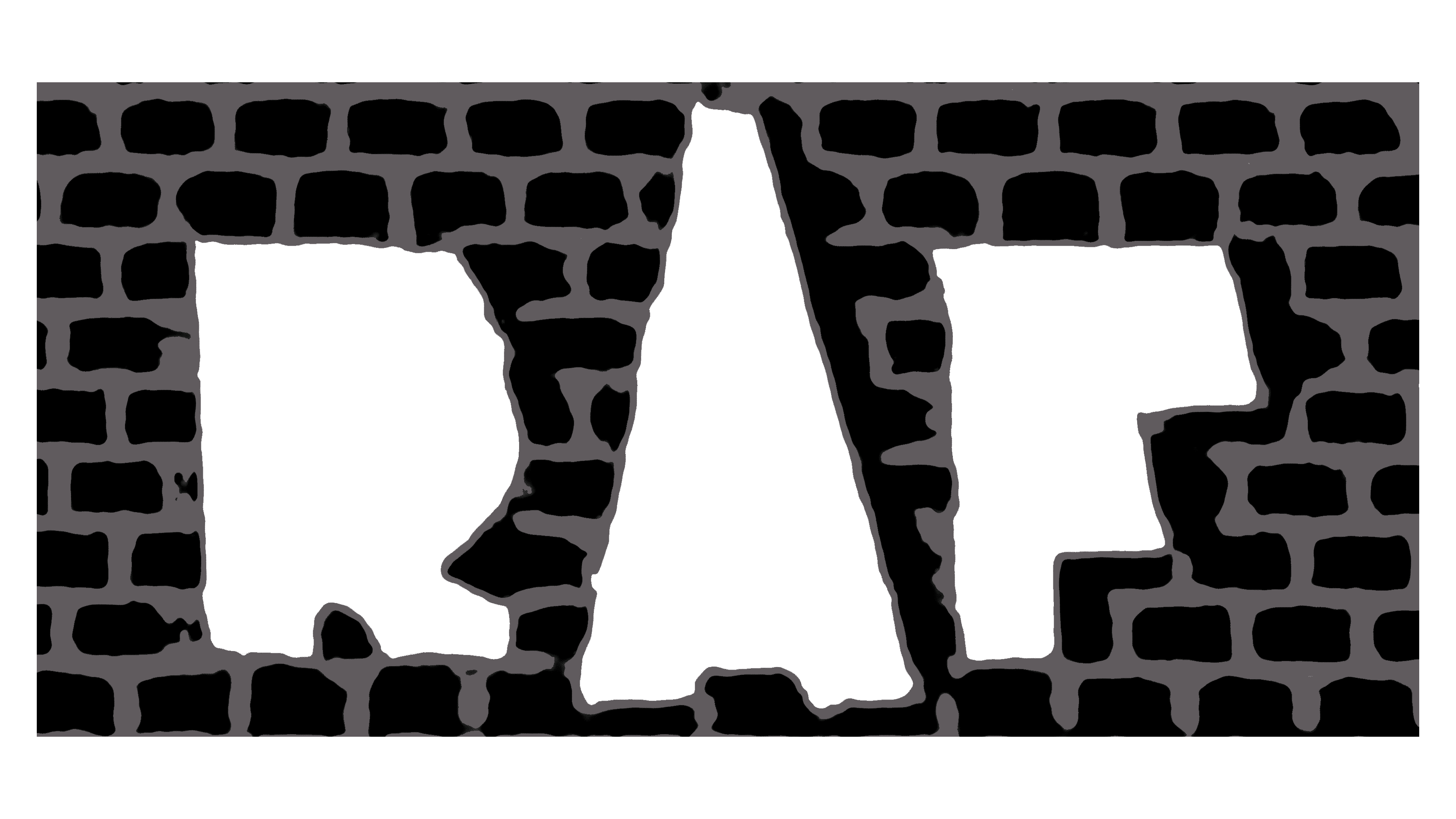
The era of abbreviations has arrived, so it dominates the RAF logo, pushing other elements out of view. The shape has also significantly transformed: the elegant details have been replaced by a background resembling a brick wall, introducing shadows cast by large glyphs on the rectangular emblem. This wall has weighed down the sign and is confusing because, according to the concept, it should be the logo of a minibus manufacturer. However, one sees only bricks, as the main focus has shifted to them, making it seem as if the emblem belongs to a brick factory.
The inscription hints at the automotive theme in white glyphs with solid fills, lacking gaps, bars, or legs – just outlines. The abbreviation is arranged horizontally, but the letters vary in size. The tallest letter is “A,” positioned in the center, touching the top. Through this design, the company aimed to:
- Present itself as a giant in the field of medium-tonnage vehicle production
- Emphasize its importance in the specialized market
- Demonstrate its high popularity among the population
The improvised wall background is black, the brick outlines are beige, and the letters are white. Together, they form a subtle, non-aggressive, practical color palette that fits the industry the brand represents. Translating from graphic language to human language, it becomes clear that the emblem suggests practical machinery for practical people.
1958 – 1960
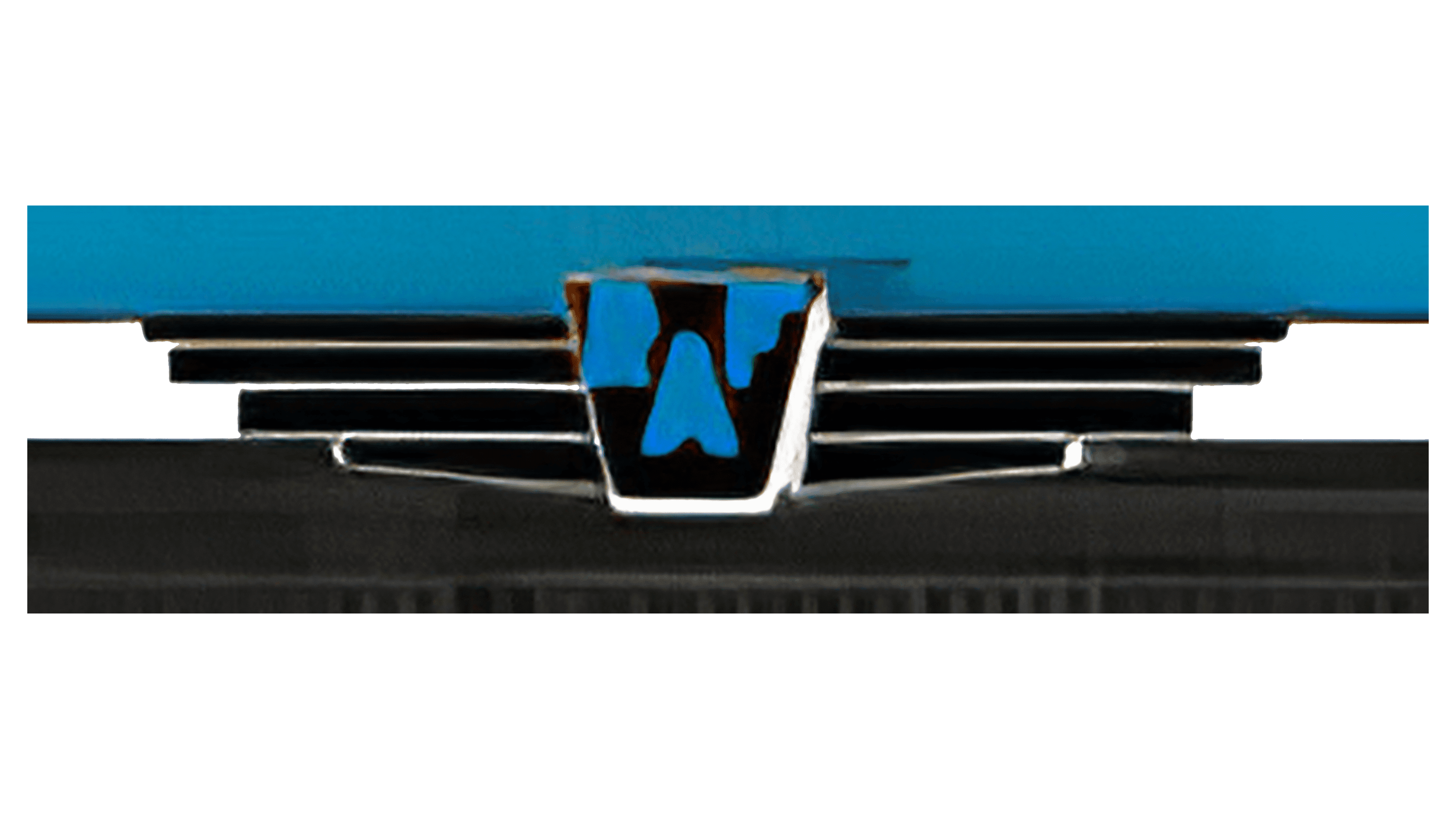
The return to elements resembling wings occurred because they resembled the radiator grille on car hoods. Designers noticed this feature and proposed a modern logo for the minibus manufacturer, where flight is associated with swift driving and transport machinery. Through meticulous work, a unique emblem emerged, where this similarity is taken to the extreme, making it unclear whether it depicts outspread wings or a radiator grille. They are perfectly balanced, highlighting the most important aspect: speed.
The crest was transformed into a modernist trapezoidal shield. It is now black with blue letters. This combination represents reliability, constancy, and progress. Blue signifies growth and upward aspiration, while black symbolizes practicality and the earth. Together, they symbolize rapid movement on the roads.
The abbreviation has been reformatted: the letters have been rearranged and made symmetrical. “A” has been moved down, and the adjacent “R” and “F” stand as guardians, extending on either side. The glyphs still have a solid fill, with no internal gaps or divisions – only the external contours are visible. For an automotive company, this means a lot, as its concept suggests a universal interpretation of the emblem for all models, regardless of their application.
The aim to unify different types of minibusses under a common logo stems from the fact that the company produces transport vehicles that have performed equally well across fields, from the medical sector, where they serve as ambulances, to the courier sector, where they deliver goods.
1959 – 1976
The rearrangement of elements successfully impacted the RAF logo with its many smooth lines and rounded shapes. These usually evoke positive emotions in consumers, as they do not associate with rigidity and sharpness. On the contrary, soft strokes create a sense of a beneficial purchase, a friendly mood, and a pleasant atmosphere, which is crucial for the minibus manufacturer to elevate its status and enhance its image. The emblem’s modernization mainly involved three features:
- Introduction of a diamond shape with rounded corners
- Moving the trapezoid (crest) to the background
- Aligning the abbreviation in a single line
The inscription now looks very presentable. It has become easier to understand because the letters are arranged in rows rather than scattered randomly. The line ascends, indicating an optimistic view of the future through the lens of previously established plans. The massive letters convey an atmosphere of confidence. This feeling arises when looking at the connected glyphs: they flow smoothly into one another.
The only thing that remained the same was the absence of internal gaps and bars in the letters, maintaining a solid fill and clear contours. For better readability, the inscription is painted white, clearly visible against the dark burgundy background. The trapezoid in the background is black. These colors blend well, forming a classic combination that suggests the company’s close connection to its roots and mastery of traditional technologies in the successful development of the brand.
1976 – 1998
RAF chose a logo featuring a stylized car to demonstrate its connection to the automotive industry. It consists of several elements that, at first glance, seem incompatible:
- The bottom of the emblem resembles the classic wheelbase of a passenger vehicle (side view).
- The upper part represents the manufacturer’s name, arranged in the shape of the car’s body.
The abbreviation is so curved that it is barely recognizable in the rectangular letters, which resemble geometric shapes more than conventional glyphs. The inscription is bold and cohesive, with distinct internal gaps. This reflects the manufacturer’s commitment to transparency, customer orientation, and friendliness. Open spaces also indicate an attempt to systematize processes, bring them under control, and simplify and ease them, requiring high professionalism and the implementation of innovations.
The car’s contours are precisely retained, though it is drawn with a single continuous line that curves to form the hood, the name, the wheels, and the rear windshield. Overall, the emblem is thematic, corresponding to the products manufactured under this brand.
1990
The RAF logo has acquired entirely different features: modernist, confident, and progressive. This reflects the company’s desire to become more contemporary and appeal to consumers who choose advanced technology that meets the demands of the times. To fully embody this concept, designers based the logo on a chrome rectangle with a gray gradient, transitioning from white at the top to dark at the edges.
This zoning created a three-dimensional emblem where each element stands out individually. The background impresses with the natural texture of a matte-silver surface. It gives the impression that this is not just a logo but an essential machine component, a crucial part without which the equipment would not function.
The manufacturer’s name, in a simple style, is centered on the chrome plate. The letters are tall, bold, and sans-serif. The absence of serifs indicates a commitment to collaboration, mutually beneficial deals, and customer loyalty. Smooth strokes suggest easy maintenance and wide accessibility of the equipment. Above the abbreviation is a large red arc. It perfectly balances the black glyphs, adding brightness and cheerfulness to the emblem.