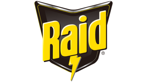
The Raid logo accurately conveys the properties of the products of this brand. A spectacular picture does not just indicate the essence of the product; it gives a powerful message, which is a powerful effect on pests. To do this, the designers used bright markers in the form of an expressive lightning icon and a figure resembling a shield. All this is supported by an incredibly expressive color scheme of contrasting colors. At the level of perception, it is a signal for action.
Raid: Brand overview
| Founded: | 1956 |
| Founder: | S. C. Johnson & Son |
| Headquarters: | United States |
| Website: | raid.com |
Raid is one of the most popular American brands. Under it, effective means aimed at combating insects are produced. Exposure features allow them to be classified as insecticides, providing lasting results. It is achieved using a special composition developed by SC Johnson & Son.
Raid is one of the few lines of insecticides that provide an immediate and fairly strong effect. This is achieved through the use of a combination of specific chemicals. Previously, cyfluthrin was used for manufacturing, as well as synthetic allethrin. The modern product line uses more active components that hit the target in seconds. The products’ high performance ensured their wide popularity and demand in the international market.
Meaning and History
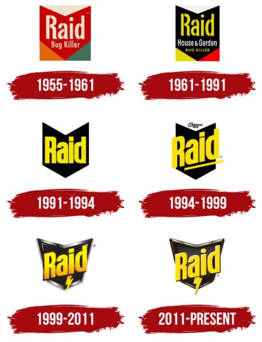
Over the entire period of existence, the visual concept of Raid has undergone many changes, as well as the insecticide itself. The corporate logo changed the font, layout, and color scheme. But, the main semantic load remained unchanged. It consisted in showing the consumer the power and high efficiency of the presented product. These traits were demonstrated through confident lettering, a thematic component, and a bright color scheme.
What is Raid?
Raid is the name of a line of quality and reliable insecticides that help in the fight against insects of various species. SC Johnson & Son uses only tested and proven ingredients to make its products deliver the results you want. At the moment, several varieties of funds with different effects are presented within the line framework. Among them are Flying Insect Killer, Ant & Roach Killer, etc.
1955 – 1961
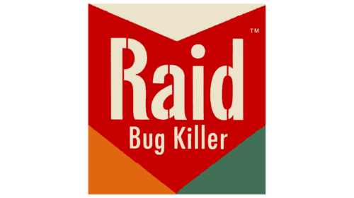
The first Raid tool was created in 1955, and already in 1956, it hit the local market. At that moment, the trademark already had a formed corporate identity, the basis of which was a bright, bold logo. Two inscriptions occupied its central part. The first meant the name itself, and the second – the explanatory slogan Bug Killer. For the design of the main inscription, a massive, grotesque font was used, symbolizing confidence and strength. It also showed decorative stripes running through the middle of the letters.
This stroke made the logo memorable. The lower inscription was designed in a thinner font of smaller sizes. Both signs were located inside another important symbol – an arrow pointing down. It symbolized the exact hit on the target, which characterized the action of the insecticide. The color scheme was dominated by expressive red – a symbol of power, energy, and speed. The picture was complemented by white, orange, and green colors.
1961 – 1991
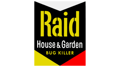
In 1961, the foundations were laid for a new aggressive concept that attracted even more attention. Recognizability was provided by more expressive contrasting colors, which more clearly emphasized the features of insect protection. The main part, in the form of an arrow, was painted in classic black, and the bright yellow letters of the name and slogan were placed against its background.
At the bottom of the emblem, one could also notice the red color, and at the top – an area with a white background. The combination of these colors demonstrates reliability, energy, and strength. Another inscription appeared on the logo, indicating the places where insecticides were applied. This not only updated the logo but also made it more informative. The font in the new version has not changed. The extraordinary format emphasized the uniqueness of the funds, as well as their power.
1991 – 1994
In 1991, the trademark switched to a minimalist logo. It was a simpler but, at the same time, stylish and modern version, which fully demonstrated the features of the goods. The designers simplified the verbal part, leaving only one inscription – Raid, and also removed the frame in the form of a square, consisting of several geometric shapes.
The font has also changed. The grotesque variant was replaced with a solid, thick sans-serif typeface. This format perfectly conveyed the main message – accuracy, efficiency, and reliability. The update has generally benefited the visual concept, as it has become more understandable and memorable.
1994 – 1999
Another decision to rebrand was made in 1994. Its result was a stylish emblem made in a three-dimensional format. In this picture, the arrow icon takes on a more powerful look and looks like a real shield. This change confirmed the use of new active substances in Raid products.
Against the background of the protective element, there was already a traditional wordmark in the form of the name of an insecticide, underlined by a thin elongated rectangle. The inscription was placed at an angle, which demonstrated dynamism and development. At the top, the name of the manufacturing company was also added, made in a direct geometric font. The coloring in this version remains the same.
1999 – 2011
In 1999, the emblem was decided to improve again. This time, the changes were especially noticeable. The new version looked very realistic and voluminous. This effect was achieved through the use of highlights and shadows, which provided associations with a glossy surface.
The shield-like sign received expressive contours of a metallic shade, which made it very expressive. The basis, as before, was the name of the trademark, made in massive letters with shadows. But, now, a characteristic sign of lightning appeared under it, symbolizing instantaneous and precise action. The effect was enhanced by contrasting colors, including black and yellow.
2011 – today
In 2011, a new version of the emblem was formed, which is still used today. The previous version was taken as its basis and finalized in several directions. The designers have made the shield shape softer and the font flatter and rounder. This version looks more harmonious and modern and demonstrates insecticide’s consistent benefits.
Font and Colors
The Raid logo can be with a signal sign denoting important information. This format was not chosen by chance since the means strongly impact the selected object. A confident, clear font with massive forms was chosen for the design to convey this message to consumers. Its lines are quite thick, and the cuts are smooth. There are small spaces between letters.
This style belongs to the Sans Serif category, which denotes progress, development, and activity. This is how you can characterize the production of these funds throughout the entire period of the brand’s existence. The company constantly strived to improve its properties and did it well. In addition, important brand characteristics can be seen in contrasting colors.
It consists of black and yellow colors. To some extent, this combination demonstrates the danger. But in the context of the Raid product, it is associated with a protective function. This means that the presented products create such conditions for pests, thereby protecting humans. An additional function of such colors is enhancing recognition, which distinguishes products from other similar products.
Raid color codes
| Cornsilk | Hex color: | #fff9de |
|---|---|---|
| RGB: | 255 249 222 | |
| CMYK: | 0 2 13 0 | |
| Pantone: | PMS 7499 C |
| Canary Yellow | Hex color: | #ffef0a |
|---|---|---|
| RGB: | 255 239 10 | |
| CMYK: | 0 6 96 0 | |
| Pantone: | PMS 102 C |
| Golden Yellow | Hex color: | #ffdd02 |
|---|---|---|
| RGB: | 255 221 2 | |
| CMYK: | 0 13 99 0 | |
| Pantone: | PMS 108 C |
| Platinum | Hex color: | #e9e9ea |
|---|---|---|
| RGB: | 233 233 234 | |
| CMYK: | 0 0 0 8 | |
| Pantone: | PMS 663 C |
| Spanish Gray | Hex color: | #8f8e8e |
|---|---|---|
| RGB: | 143 142 142 | |
| CMYK: | 0 1 1 44 | |
| Pantone: | PMS 877 C |
| Black Pepper | Hex color: | #453f3e |
|---|---|---|
| RGB: | 69 63 62 | |
| CMYK: | 0 9 10 73 | |
| Pantone: | PMS 439 C |
| Licorice | Hex color: | #231815 |
|---|---|---|
| RGB: | 35 24 21 | |
| CMYK: | 0 31 40 86 | |
| Pantone: | PMS Black 4 C |
