


![]() Rainforest Alliance Logo PNG
Rainforest Alliance Logo PNG
The Rainforest Alliance Logo symbolizes caring for nature and responsible farming. The organization behind it strives for harmony between production and the environment, developing sustainable approaches in agriculture, forestry, and labor relations, and setting new standards for the industry.
In 1986, a group of activists led by Daniel Katz gathered in New York with a shared vision: saving the rainforest. Their passion sparked the founding of the Rainforest Alliance, starting a journey to protect forests globally. Early on, they introduced forestry certification, setting standards for sustainable management. Soon, the initiative expanded to agriculture, certifying bananas from Costa Rican plantations their first certified product. Recognizing tourism’s impact, the Alliance also developed sustainability criteria that influence global travel. SmartWood, launched soon after, became the first global certification for forest products. Then came sustainable coffee certifications, beginning with farms in Guatemala. Quickly gaining international attention, the Alliance established regional offices and standards for tea and cocoa, later expanding its mission to include flower farms. The collaboration grew stronger as global corporations partnered with them, promoting sustainability on a wider scale. Expansion into Africa further deepened their impact by directly supporting local farmers. Eventually, merging with UTZ combined the strengths of both organizations, enhancing their certification programs. New digital tools and a focus on smallholder farmers have supported recent global growth. Today, the Rainforest Alliance continues to promote sustainability, expand its network of certified producers, and refine guidelines for forestry and agriculture worldwide.
Meaning and History
![]()
What is Rainforest Alliance?
It is a non-profit organization that develops standards for responsible agriculture, forestry, and tourism. The symbol appears on products such as tea, coffee, chocolate, and fruit, and it meets strict requirements for sustainable production. The organization partners with farmers, producers, and companies to help them implement practices that support natural resources and local communities. In addition, it provides training and inspects businesses to ensure that they follow established standards.
1987 – 2018
![]()
The Rainforest Alliance emerged in 1987, as indicated at the bottom of its green emblem. The logo resembles a quality seal: a circular outline with sharp edges reminiscent of sun rays or official document stamps. This is logical for an organization that certifies producers.
At the center of the emblem is the silhouette of a frog leaping with its limbs open. The frog wasn’t chosen randomly; it symbolizes nature conservation, biodiversity, and the ecosystem of tropical forests, the core areas in which the organization works. Small branches with leaves on both sides of the frog gently emphasize the connection between plant life and agriculture.
Encircling the symbol is the inscription “RAINFOREST ALLIANCE,” curved around in clear, large, sans-serif letters. Below, a bright horizontal banner crosses the circle, highlighting the word “CERTIFIED.” This is the keyword in the logo since the organization certifies producers who use sustainable methods in working with the land and nature.
The emblem’s overall color is green, which is associated with nature, plants, and agriculture. It also highlights the organization’s environmental focus.
2018 – today
![]()
The new Rainforest Alliance logo has been used since 2018 and has become more dynamic. Instead of the classic circular sign, it uses a horizontal composition, with the frog on the left and the organization’s name on the right.
The frog’s shape has slightly changed: its body is elongated, and its legs are extended forward as if the animal is ready to leap or grasp onto a surface. The figure’s outlines are smooth, without sharp lines, lending a natural and simple look. A small white contour appeared in the frog’s eye, making it stand out against the silhouette.
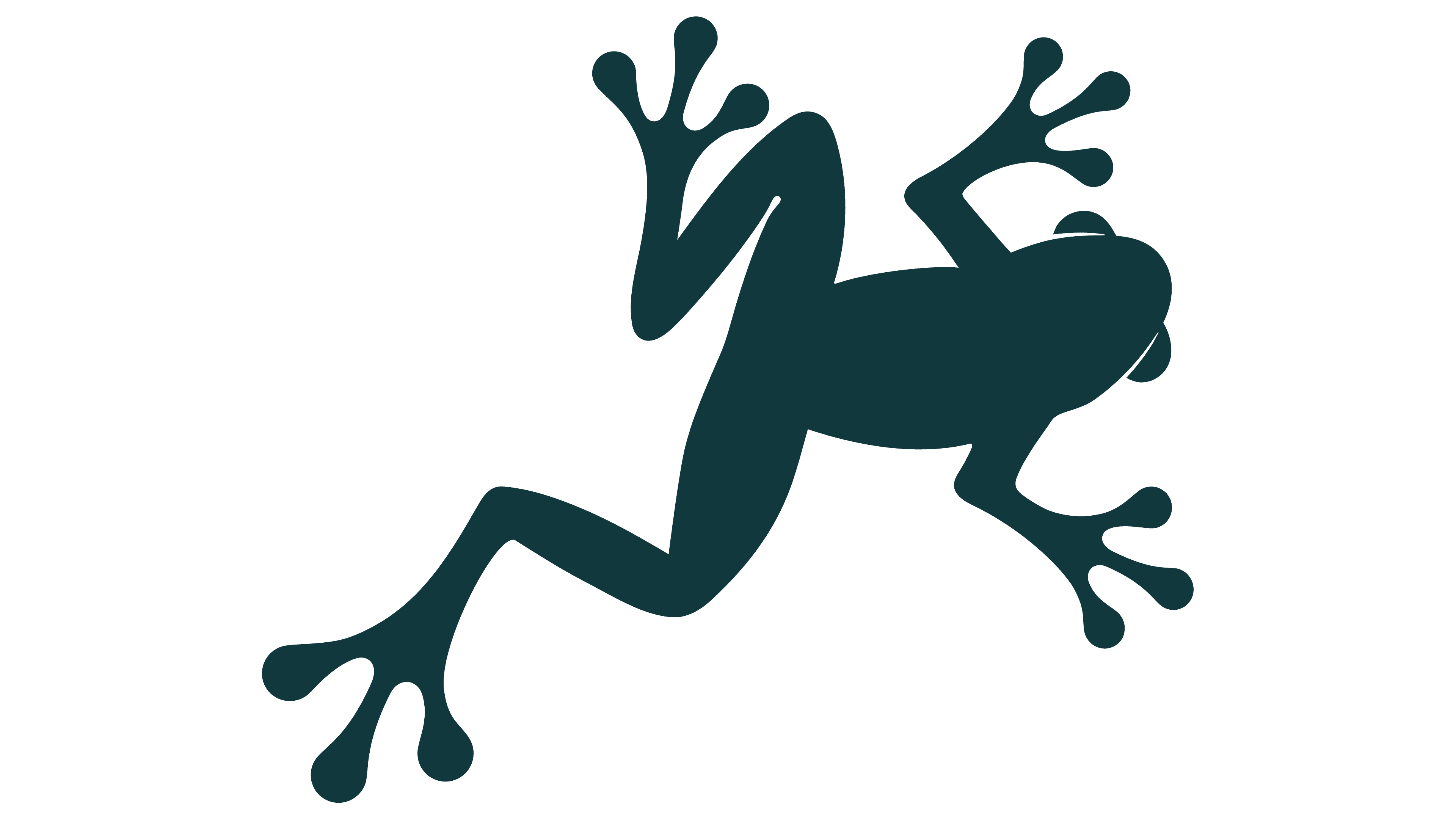
Next to the symbol is the text “RAINFOREST ALLIANCE,” written in uppercase letters arranged vertically in two levels. The upper word, “RAINFOREST,” is slightly smaller than the lower word, “ALLIANCE.” The font is bold, contemporary, sans-serif, with soft, smooth letter edges and uniform line thickness.
The color has changed: the shade of green has deepened, maintaining its connection to nature and the organization’s goals while adding greater seriousness and solidity. This reflects the company’s work supporting farmers, agriculture, and ecosystem protection.
Over the years, the frog symbol has become associated with sustainable production and responsible environmental attitudes. After updating the logo, the organization preserved its recognizability and continuity.
![]() rainforest (rainforesr) alliance cocoa certification logo
rainforest (rainforesr) alliance cocoa certification logo