


 7th Special Forces Group Logo PNG
The 7th Special Forces Group logo symbolizes the high level of training its soldiers receive, preparing them for the most challenging missions to protect their country. It embodies the spirit of unity, which is crucial for accomplishing team objectives. At the same time, the emblem reflects the ability to operate in difficult conditions that demand resilience and discipline.
The 7th Special Forces Group was formally established at Fort Bragg, North Carolina, on May 20, 1960. Its first area of responsibility was Latin America. From 1962, the unit trained partner forces across the region in special operations and counterinsurgency, while personnel studied Spanish and Portuguese for fieldwork.
Between 1963 and 1969, the group operated in Vietnam, carrying out missions and training local forces. Tactics developed during those deployments later entered wider special operations practice. During the 1970s, the unit deepened advisory work with Latin American militaries and expanded language programs. In the 1980s, it focused on counternarcotics work and local security training, and in 1983 took part in Operation Urgent Fury in Grenada.
In the 1990s, counternarcotics missions grew in Colombia and other parts of South America. The group worked on regional security assignments and humanitarian projects. From 2001 to 2010, it deployed to Afghanistan and Iraq while maintaining long-running commitments in Latin America.
In 2011, the unit moved to Eglin Air Force Base in Florida, gaining improved logistics and training facilities. From 2012 to 2020, it updated equipment and instruction while supporting both regional and global operations. Between 2021 and 2023, the group continued preparing for modern warfare, preserving its language skills, regional expertise, and capacity for deployments outside Latin America. Its regional focus remained unchanged.
Meaning and History
What is the 7th Special Forces Group?
This elite unit conducts special operations, including reconnaissance, training allied forces, and combat missions. These professionals are skilled in the languages, cultures, and traditions of the regions where they operate, applying their expertise in Central and South America and globally. The unit combines combat readiness with diplomatic missions, enhancing national security and cooperation.
1960 – today
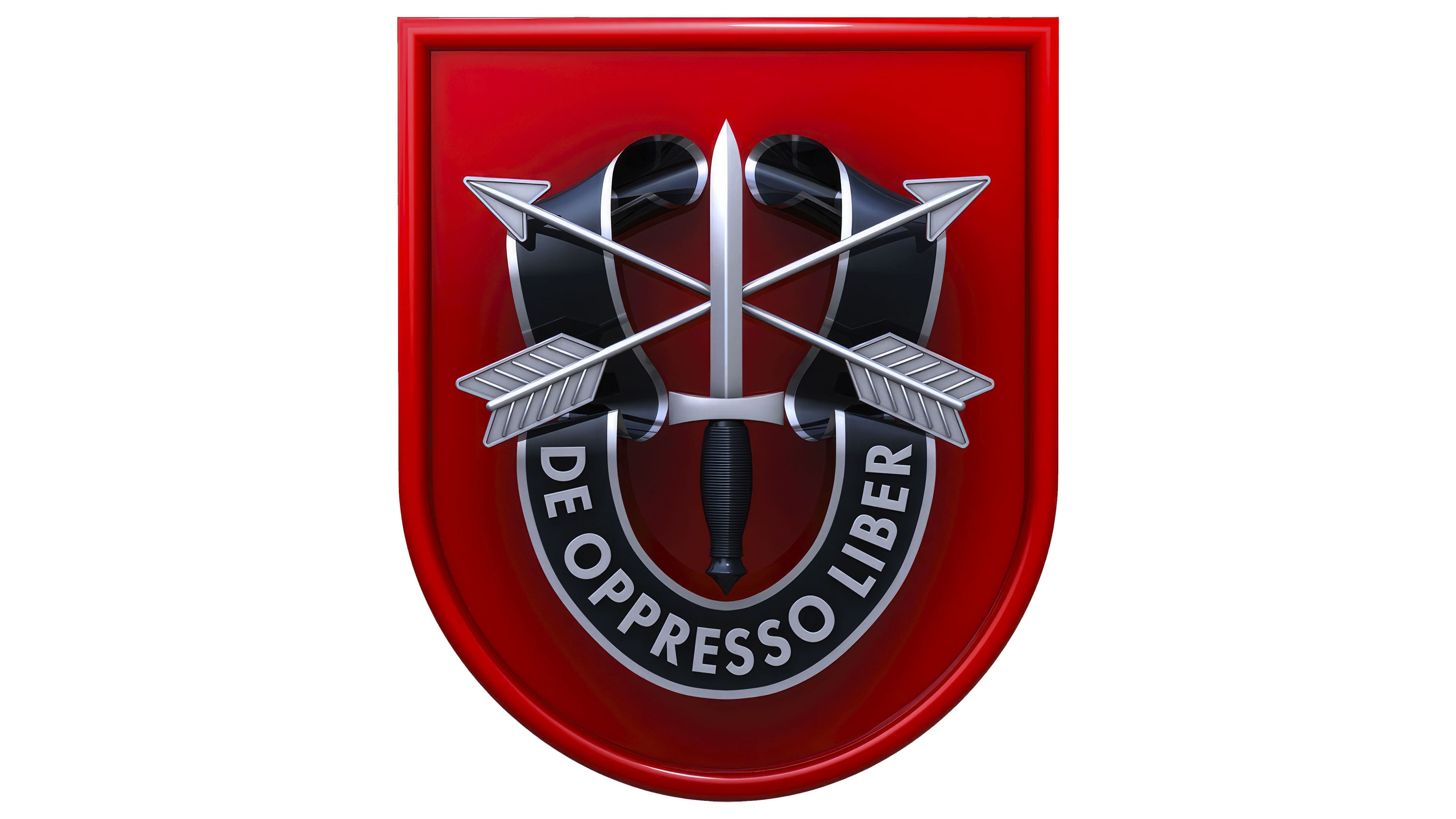
The 7th Special Forces Group logo aims to strengthen the esprit de corps among service members and instill a sense of pride in belonging to an elite unit. The modern three-dimensional design emphasizes the unit’s progressive nature, which engages in special reconnaissance, counterterrorism, information operations, and various classified missions.
The emblem’s foundation is a large quadrangular shield with a rounded base. It resembles the traditional beret patch of the 7th SFG but features a three-dimensional design. A red gradient and black shadows create a sense of depth. The red symbolizes courage and sacrifice, while the heraldic shield represents protection, resilience, and reliability. The emblem demonstrates the unit’s readiness to defend its country’s interests and maintain peace.
At the center of the emblem is a sword with a black hilt pointing upward. It symbolizes combat prowess and strength essential for executing covert operations. The sword’s blade overlays two crossed arrows, signifying the unit’s ability to operate across long distances and in diverse locations worldwide. The arrows also represent swiftness, determination, and flawless precision.
The sword is wrapped with a black ribbon bearing the inscription “DE OPPRESSO LIBER.” This Latin phrase is one of the mottos of the 7th Special Forces Group, highlighting the group’s mission to protect freedom and uphold justice. The lettering’s strict, undecorated design enhances the impression of confidence and resolve.
What stands out most in this logo is the texturing of its elements, which gives it a modern three-dimensional appearance aimed at appealing to young recruits:
- The sword’s blade and arrows appear to be made of polished metal.
- The center of the ribbon is matte, while both ends have a glossy sheen.
- The sword’s hilt has a ribbed texture with visible fine striped grooves.
- The shield’s edges are accentuated with shadows, creating a volumetric effect.
The 7th Special Forces Group’s logo’s silver tones evoke associations with weaponry, while the black emphasizes the unit’s discipline, strictness, and secrecy required for its critical missions.