![]() Ring of Honor Logo PNG
Ring of Honor Logo PNG
The Ring of Honor logo reflects the philosophy of a wrestling league emphasizing respect and skill. In this league, the focus is on sportsmanship and honest competition rather than spectacle. The symbol represents fair competition and adherence to principles.
Ring of Honor began in 2002 when Rob Feinstein founded his wrestling promotion following the closures of ECW and WCW. The first show featured future stars Bryan Danielson and Christopher Daniels. ROH became notable for its athletic, sports-oriented style and strict “Code of Honor.”
In 2004, after a scandal involving Feinstein, Cary Silkin acquired the company, stabilizing operations and distributing shows on DVD. ROH gradually became popular among wrestling fans who valued technical skill and athleticism.
In 2011, Sinclair Broadcast Group purchased ROH, bringing it to national television. Regular pay-per-view events began in 2014, and the streaming platform Honor Club launched in 2018.
A significant milestone was the 2018 All In event, organized by ROH wrestlers Cody Rhodes and the Young Bucks. However, their 2019 departure to form AEW weakened ROH. Following the COVID-19 pandemic, ROH was acquired by AEW owner Tony Khan, becoming a subsidiary promotion and continuing to host regular events and weekly shows on Honor Club.
Meaning and History
![]()
What is Ring of Honor?
It is an American wrestling promotion that focuses on technically demanding, intense matches with minimal scripted elements. A key tradition of the promotion is a mandatory handshake between opponents. The organization has produced numerous wrestlers who have become global stars.
2002 – 2004
![]()
The first Ring of Honor logo was created to reflect the wrestling company’s character. Its core element was the intertwined letters “R” and “H,” symbolizing opponents clashing in the ring.
The custom-designed font combined classic styling with the aggressive aesthetics of wrestling. The phrase “Ring Of Honor” appeared at the center in simple block letters, contrasting with the larger, stylized letters.
Dark red outlines enhanced the fighting spirit represented in the ring. White lettering added visual clarity.
The design shaped the company’s image as honest, combative, and entertainment-oriented.
2004 – 2011
![]()
Saloom Mahmood’s logo redesign significantly changed the previous style. Complex intertwining and gothic details were replaced by dynamic, energetic graphics aligned with the promotion’s growing popularity.
The abbreviation “ROH,” shown in black, featured a red three-dimensional shadow. The volumetric letters conveyed movement and tension, reflecting the atmosphere of the wrestling ring. The red color symbolized the energy and emotions of matches.
The square, angular font contrasted with earlier designs, while a white outline made the logo stand out clearly.
2011 – 2022
![]()
In 2011, the logo became more dimensional with a complex texture, designed by Jamie Sheldon. Known for sports graphics, Sheldon gave the logo a theatrical quality, emphasizing visual strength.
The logo transformed into a 3D design with a metallic effect, highlighted by orange lighting reminiscent of molten metal, symbolizing the intensity and passion of wrestling battles.
The letters “R,” “O,” and “H” acquired aggressive curves and sharp edges. The letter “O,” formed by two intersecting curved lines, symbolized confrontation in the ring. The style resembled cinematic titles, emphasizing wrestling’s entertainment value.
The shift from a red-black to a black-orange palette visually refreshed the brand. The orange provided depth, making the logo stand out in broadcasts and advertising.
Sheldon’s design strengthened the company’s image as professional and visually engaging.
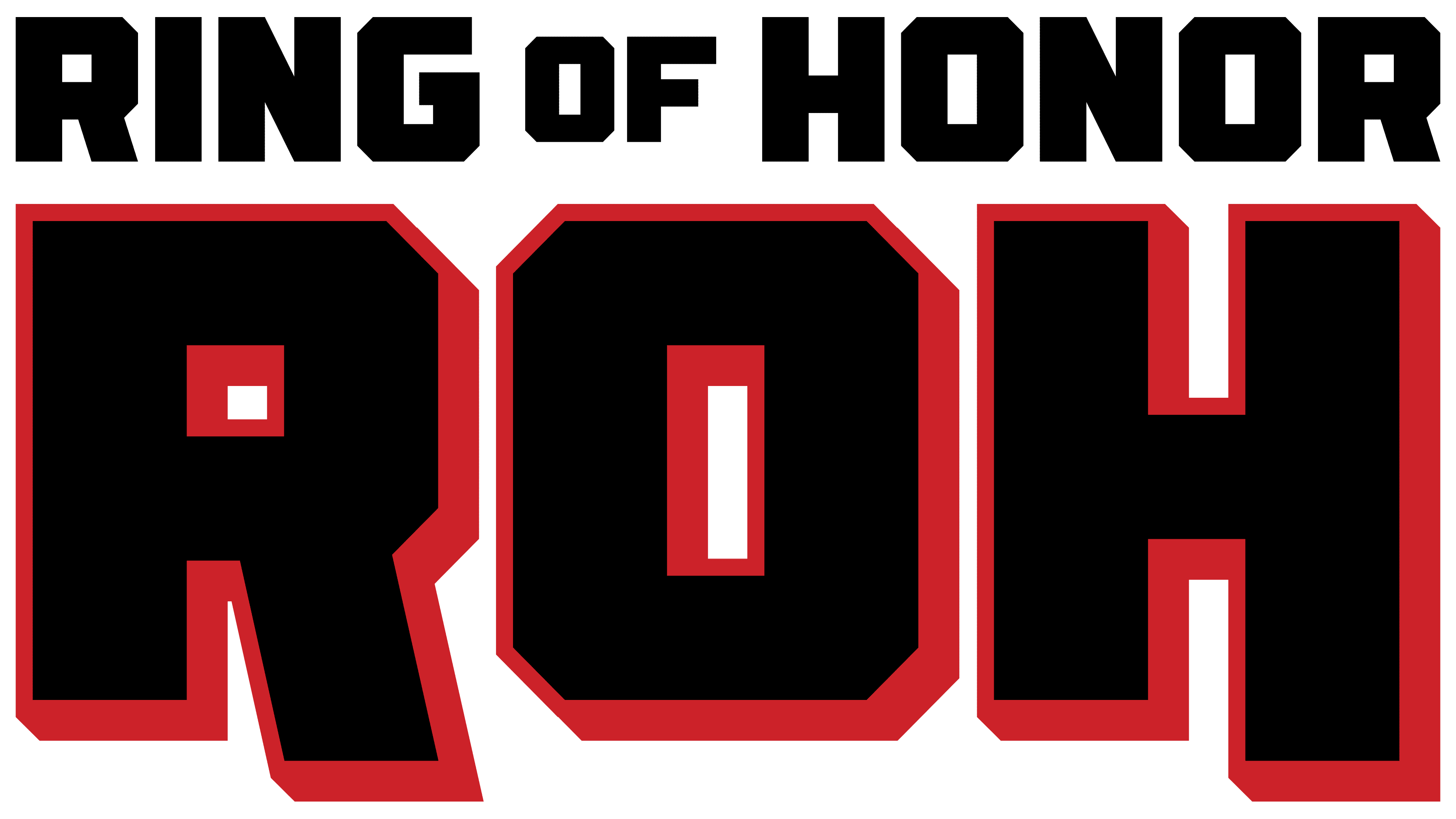
2022 – today
![]()
Ring of Honor moved toward minimalism, updating its logo to simpler, cleaner lines while preserving the brand’s energy familiar to wrestling fans. The new version has no dimensional effects or decorative details.
The composition of the mark is built on a text foundation and two levels of inscriptions. The top line displays the promotion name. The phrase “RING OF HONOR” is set in a heavy black sans-serif typeface. The letters are large, with cut corners on some outer edges, giving the text a sense of rigidity and sporting energy. The middle word “OF” is smaller but neatly integrated between “RING” and “HONOR.”
At the bottom is the abbreviation ROH. It dominates the design. The three letters are rendered in white and enclosed in a bright red ring. The outline creates an illusion of volume, becoming slightly thicker in the lower and right parts of the letters. The letter contours are straight and rigid, without rounded elements or curves, emphasizing the fighting spirit and competitive atmosphere of the wrestling world.
The red color took on a brighter tone and, together with black, enhanced the overall visual impact of strength and expression. This color pair complements the brand’s perception, closely associated with competition, physical power, and the spectacle of athletic matches.
All elements of the new Ring of Honor image maintained a connection to the company’s focus on combat sports. The emblem reflects the company’s modern view of wrestling and the sports industry.