Anchor updated its logo with Pearlfisher. The work was part of an update to Arla Foods’ butter and spreads range. The team kept the brand’s familiar image and strengthened the focus on taste, creamy texture, and the Double Churned process.
The main changes are tied to the logo. The Anchor name remained familiar, while the letters became softer in form and more precise in proportion. The logo looks more modern and keeps a connection to the brand’s previous appearance. The founding date now appears more prominently next to the name, recalling the brand’s long history.
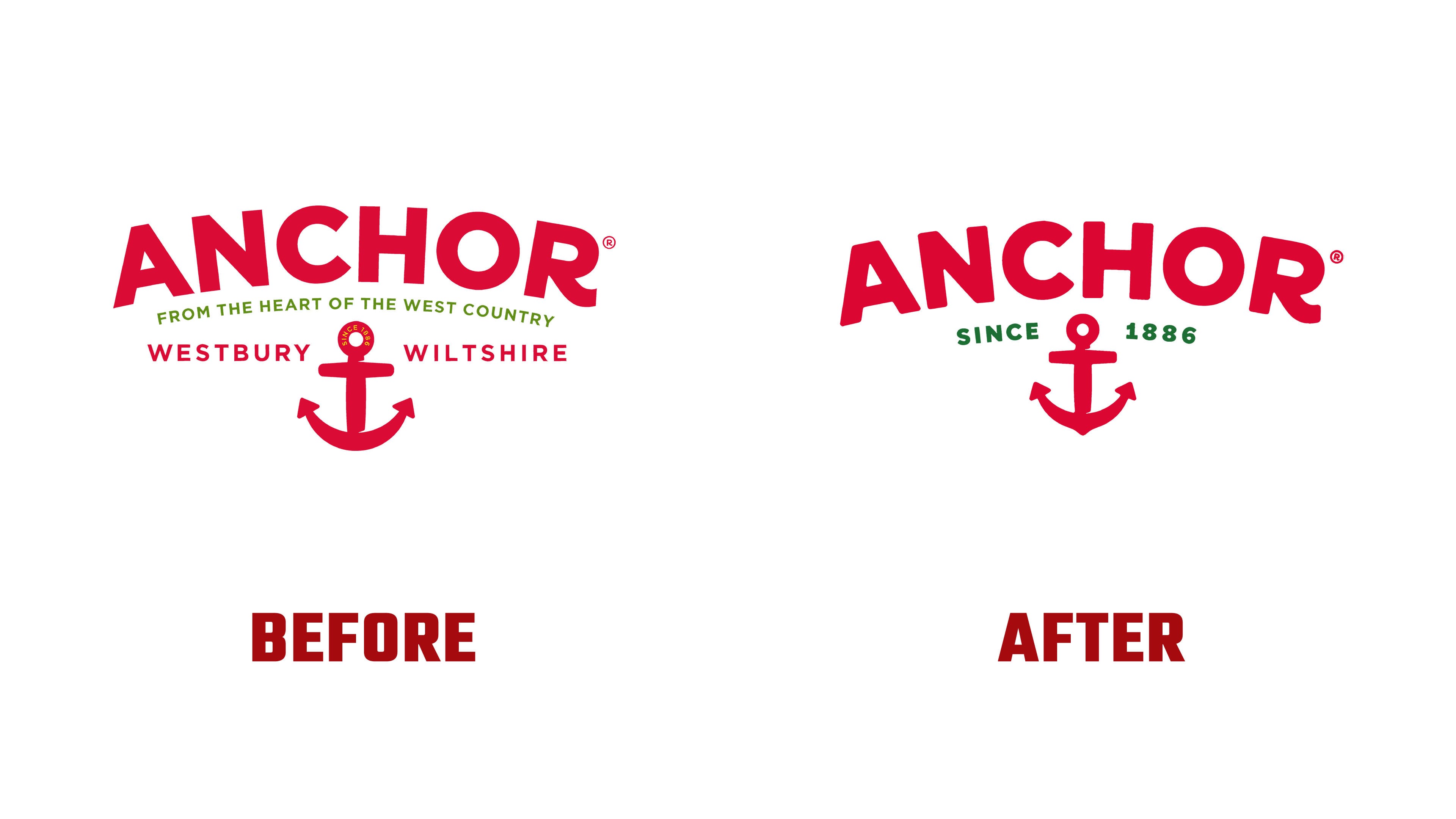
Additional explanations were removed from the mark. Earlier, it included many inscriptions, including the place of production and other details. The new version is built around the name, the anchor, and the founding date. With fewer details, attention shifts to the brand, and the logo looks more composed.
The anchor remained Anchor’s main symbol. Earlier, it was part of a more complex system of signs. Now its role is stronger. It serves as a standalone brand emblem, linking the Anchor name to its image.

The update helps the brand look more unified for modern shoppers. The logo preserves the link to the brand’s past, emphasizes the company’s experience, and strengthens the anchor’s role as the brand’s main symbol.