The Rakuten logo is bright and festive. The company puts maximum effort into providing consumers with convenient services. The lines of the emblem show determination and technological progress.
Rakuten: Brand overview
| Founded: | 7 February 1997 |
| Founder: | Hiroshi Mikitani |
| Headquarters: | Setagaya, Tokyo, Japan |
| Website: | global.rakuten.com |
Rakuten is a Japanese commercial corporation specializing in internet business and generating nearly 13 billion dollars in revenue. Its Rakuten Ichiba platform is the second-largest in the country. The corporation owns the Viber network, Kobo e-book store, Wiki encyclopedia, and Rakuten Mobile operator. The company employs 28,000 people. The headquarters is located in Tokyo.
Meaning and History
In its logos, Rakuten emphasizes the name to show that the main focus of the group’s work is the service sector. No matter which service the client uses, the quality of the platforms brings joy and a good mood. The verbal message is reinforced by the bright color. Each emblem update is associated with global growth, expansion, and entry into new markets.
What is Rakuten?
The company owns 70 internet services related to online stores; communication; banking; ticket sales; food delivery; internet encyclopedias, books, and TV. In addition to its platforms, it owns shares in major corporations: Ozon, Pinterest, and others. It operates in 30 countries. It is located in Japan.
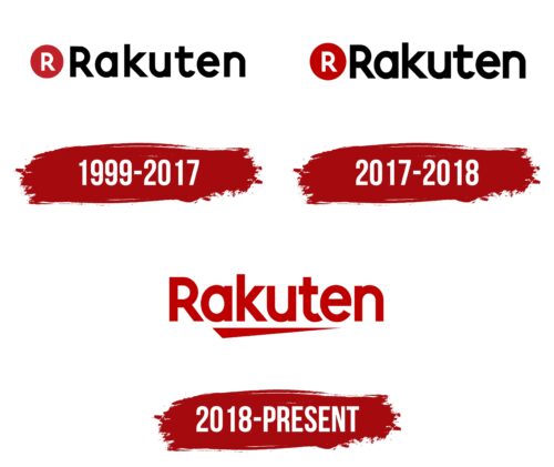
1999 – 2017
The first logo appeared in 1999, after the name change to Rakuten. The company was called MDM, Inc. for the first two years. The emblem consists of an image and a name.
The red circle with a white capital R inscribed in it resembles an icon or favicon. Since the corporation’s main business is on the internet, the appearance of such a concise symbol is quite justified. The letter R is the first letter in the company’s name. Red is very attention-grabbing. Thanks to it, the figure looks like a button that you want to press. The circle is a symbol of harmony and repetition, predicting eternal existence for the company.
Following the image is the group’s name. The full name is Rakuten Group Kabushiki-gaisha, but only the first word is used for the logo. In Japanese, its meaning is optimism. The combination of black and red colors expresses joy, inner uplift, and confidence in the future.
2017 – 2018
2018 – today
The company has managed to create its own logistics network and is also preparing to launch 4G. The expansion is marked by a new logo: the name in large font emphasizing the central part of the word.
The bright red letters symbolize growth and development. Their size signifies the addition of new services. The underline is done in the form of a narrowing strip, reminiscent of a receding road. This is a hint at logistics routes. The strip shows the company’s aspiration toward the future, a long-term journey that continues.
Font and Colors
The emblem is executed in a bright red color. This signifies expression and enthusiasm. Applying maximum effort for the result. The team enjoys what they do, and they try to convey this mood to their clients.
The color indicates rapid growth and development. In its 25 years of existence, the company has risen to third place in the world in e-commerce.
Red conveys the joy of life. Company founder H. Mikitani created the project after the death of his relatives. The event showed the businessman that life is short and needs to be lived happily and brightly right now.
The font is similar to QARVIC Grunge Bold but with individual nuances. The even and straight letters are an indicator of confidence and stability.
Rakuten color codes
| Venetian Red | Hex color: | #bf0000 |
|---|---|---|
| RGB: | 191 0 0 | |
| CMYK: | 0 100 100 25 | |
| Pantone: | PMS 485 C |
