The Razer logo is very unusual and magical. The emblem takes the viewer into a virtual space where even animals have the ability to communicate and complete missions. The sign promises realism and maximum sensations due to the company’s products.
Razer: Brand overview
| Founded: | January 2, 1998 |
| Founder: | Min-Liang Tan, Robert Krakoff |
| Headquarters: | California, United States |
| Website: | razer.com |
Meaning and History
The three-headed Razer snake is known to all esports and gaming communities because it is hard to miss: a bright, poisonous green symbol adorns mice, headphones, keyboards, and other brand devices. In this case, the main logo is the company’s name, depicted in an unusual font. The word “Razer” suggested using Robert Krakoff, who held one of the management positions. He cut himself with a razor blade and decided to immortalize the event but wrote “razor” incorrectly, confusing the “o” and “e.” The misspelled word was included in the brand registration documents.
What is Razer?
It is an American manufacturer of gaming peripherals, laptops, and software for gamers. It was founded in 1998 and is located in San Francisco, California. At first, the company was a division of Kärna LLC, but after its dissolution, it became an independent company.
1998 – 2016
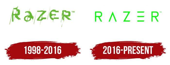
The Razer trademark originated in 1998 as part of Kärna LLC. It was a small startup focused on the production of Boomslang gaming mice. The logo of that time contained a light green inscription, lined with oblique lines. Each letter consisted of several irregular parts that were slightly offset up or down.
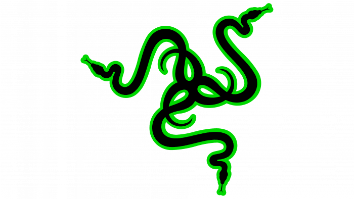
Simultaneously, the brand began using a symbol depicting three black and green snakes – the South African poisonous Boomslang. The executives chose it to show that their computing devices dominate others. After all, snakes by their nature eat mice, which means they can “eat” competitors’ products. Therefore, the reptiles on the logo look like they have already dined on Logitech mice. For the same reason, all Razer gaming mouse lines are named after snakes: Boomslang, DeathAdder, Mamba, and more.
In 2000, Kärna LLC was abolished. After a short break, Robert Krakoff and Min-Liang Tan bought out the brand’s rights and registered the Razer corporation in 2005, leaving the original misspelled name. They also retained the logo and symbol to show the connection between the new enterprise and the old startup.
2016 – today
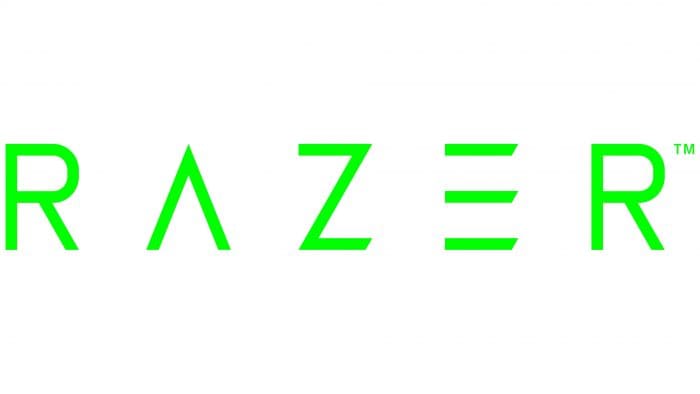
In 2016, a minor redesign was carried out, which only affected the word mark. The developers chose a new font – more strict, although the same non-standard. Unlike the previous version, here, each letter is delineated and consists of straight lines. Two strokes are missing: a horizontal line in the middle “A” and a vertical line along the left edge “E.” The symbol remains the same as it always was: three snakes, gracefully intertwined with tails.
Razer: Interesting Facts
Razer was started in 1998 by Min-Liang Tan and Robert Krakoff and became a major name in gaming hardware and software. They’ve always aimed to meet gamers’ high expectations with innovative products.
- Early Vision: Founded in San Francisco, Razer aimed to make top-notch gaming products. This city’s tech scene helped shape Razer’s innovative approach.
- First Product: In 1999, Razer released the Boomslang mouse, which is notable for its 2000 DPI precision. This made it a standout in gaming mice and set Razer on the path to fame.
- Design Awards: Razer isn’t just about tech specs; it’s also known for sleek product design, winning several awards, including the Red Dot Design Award.
- More Than Hardware: Razer now offers a wide range of products, including gaming laptops, desktops, and wearables, creating a full gaming ecosystem.
- Global Community: Known as “Team Razer,” the brand’s global fan base highlights its popularity and engagement with gamers through events and online communities.
- Esports Support: Razer actively supports esports by sponsoring teams and tournaments, helping to professionalize and grow competitive gaming.
- Environmental Efforts: Razer takes sustainability seriously, using recyclable materials and running conservation campaigns to reduce its environmental footprint.
- Razer Spaces: The company has opened flagship stores and cafes worldwide, offering places for gamers to meet, try new products, and enjoy gaming events.
- Helping Healthcare: During the COVID-19 pandemic, Razer made and donated millions of surgical masks, showing its ability to contribute to global issues.
- Financial Services: Razer Fintech offers payment and financial services tailored to gamers, broadening Razer’s reach into different aspects of gamers’ lives.
Razer’s growth from a San Francisco startup to a global gaming brand tells a story of constant innovation, a strong community focus, and a drive to excel in the gaming industry.
Font and Colors
The Razer logo is shaped like a triskelion. Perhaps this explains why there are exactly three snakes and not two or four. If we interpret the ancient symbol, then its spiral shape personifies the vortex of development, the dynamism of life, the movement of the Sun across the sky. However, a manufacturer of gaming peripherals could have put a completely different meaning into it.
In the original version, the snakes are black and have an acid green outline, but Razer is not afraid to experiment. For Valentine’s Day, the company repainted the reptiles pink, and in honor of the launch of the Mercury White Blade series of laptops, it made the symbol white. The shape of the emblem also changes periodically. For example, in March 2020, a manufacturer split up a snake to show the importance of social distancing during a pandemic. It should be noted that these changes were all temporary – Razer always went back to the original design.
The designers combined two fonts in the logo at once. For “R” and “Z,” the usual sans serif is used with lines of the same thickness. “A” and “E” look completely different: they have a stylized outline that makes them look like the Latin letters “Λ” and “Ξ.” By the way, the free Razed font was developed on their basis.
The lettering is the same acid green as the outline of the black snakes. The bright color was chosen because the graphic sign depicts Boomslang reptiles, and all representatives of this species are green in color.
FAQ
What is the Razer symbol?
The symbol is the triple-headed snake, one of the most recognized logos in the global gaming and esports communities. This emblem is iconic, symbolizing high-quality gaming products and a strong presence in the gaming world.
The brand has built a massive fan base across every continent. Its popularity comes from a dedication to designing and creating top-tier gaming hardware, software, and services. The triple-headed snake logo represents a commitment to excellence and innovation in gaming technology.
The company provides services tailored for gamers, including virtual credits, game optimization, and community platforms that connect gamers worldwide. The triple-headed snake logo is a testament to the brand’s influence and dedication to the gaming community.
What is the slogan of Razer?
The company slogan is “For Gamers. By Gamers.” This simple tagline captures the brand’s commitment to creating high-quality products for the gaming community.
The slogan reflects the company’s roots and deep connection to gamers. It shows that the brand understands its audience because it was founded by gamers who share the same passion.
The tagline highlights the brand’s focus on technological excellence. The brand is dedicated to innovation to enhance the gaming experience. This is clear in their wide range of products, from gaming laptops and peripherals to advanced software and services.
Why did Razer change its logo?
The company changed its logo to reflect the importance of social distancing during the pandemic. They unveiled the new logo on their official Facebook page, featuring three individual snakes instead of the usual interlocking ones. This design emphasizes the need to stay apart to prevent the spread of the virus.
The new logo shows the brand’s awareness and support for global health efforts. By changing its iconic logo, Razer highlights the importance of social distancing in keeping people safe. This temporary change demonstrates Razer’s ability to respond to current events, strengthening its bond with its audience.
What does the Razer logo mean?
The logo is a well-known symbol in the gaming world. It features three spiral silhouettes of South African boomslang snakes, representing the superiority of the brand’s gaming mice. The design emphasizes precision, speed, and deadly efficiency, all qualities important to gamers.
The boomslang snake’s choice is significant because it is known for its speed and agility, which match the performance of Razer’s products. The three snakes intertwine to form a dynamic and memorable image.
The logo includes the company name with a unique half-extinct “E” in the text. This styling gives the logo a modern and edgy look, making it easily recognizable.
The design and symbolism of the logo resonate with gamers, reinforcing the brand’s identity as a leader in gaming technology.
Can I use the Razer logo?
With permission, you can use the Razer logo, slogan, and trademarks only. Follow these steps to get approval:
- Submit an Official Request
- Contact the brand to request permission. This usually involves filling out a form or email explaining how you plan to use their branding.
- Comply with Legal Rules
- Follow the legal guidelines set by the company. These rules protect the brand’s image and reputation. They may include restrictions on usage and specific design requirements.
- Wait for Approval
- After submitting your request, wait for the company to review it. They will inform you if your request is approved and provide additional instructions.
Using the logo without permission can lead to legal issues. Always get proper authorization before using any part of the brand’s identity. This ensures the brand’s image stays consistent and lets approved users benefit from its recognition and reputation.
What is a Razer computer?
A Razer computer is a high-performance gaming machine for serious gamers and professionals. It has powerful hardware, unique software, and branded gaming peripherals.
The computers come with top-tier components, including the latest processors, high-end graphics cards, and fast RAM. This ensures smooth gaming experiences and efficient performance for demanding tasks.
The brand provides proprietary software like Razer Synapse and Razer Cortex. Razer Synapse lets users customize hardware settings, such as lighting effects and performance tweaks. Razer Cortex optimizes gaming performance and manages system resources.
Many laptops are portable and powerful, making them ideal for gamers and professionals who need a strong computer.
The computers feature customizable RGB lighting, allowing users to personalize their setup with various colors and effects, adding a unique touch to the gaming environment.
