


![]() RBD Logo PNG
RBD Logo PNG
The RBD logo is royally stylish and majestic. It conveys the school’s spirit, where the group members study, and emphasizes the young musicians’ talent and noble traits.
RBD was formed in 2004 as part of the Mexican telenovela Rebelde, produced by Televisa, originally featuring actors Anahí, Dulce María, Maite Perroni, Alfonso Herrera, Christian Chávez, and Christopher Uckermann. Initially intended as a promotional tie-in, the group’s popularity quickly soared beyond expectations, with their debut album Rebelde becoming a Latin pop sensation and achieving platinum sales. As the series aired globally in over 65 countries, RBD’s influence expanded, leading to packed concerts, including a historic performance at Brazil’s Maracanã Stadium. Their follow-up albums, notably Nuestro Amor and Celestial, reached diamond status and topped international charts. RBD captivated millions of young fans worldwide by blending pop melodies and heartfelt ballads. After disbanding in 2008, they reunited for a successful global virtual concert in 2020. They eventually launched the massive Soy Rebelde Tour in 2023, cementing their legacy as one of Latin America’s most influential pop acts.
Meaning and History
![]()
The identity of the real group is closely intertwined with the series’s fictional events, transporting viewers between the world of film and the stage. The ancient heraldic symbols create a spirit of prestige and class division in society, which the band members encounter.
What is RBD?
RBD is a Mexican sextet that rose to fame with the popularity of the series Rebelde, about six teenagers from the Elite Way boarding school. The actors simultaneously played themselves in the film and sang in the real band. In their original lineup for over four years, the band sold 15 million records and gained popularity and recognition, becoming the best-selling Latin American music ensemble in history.
2004 – 2008, 2020 – today
![]()
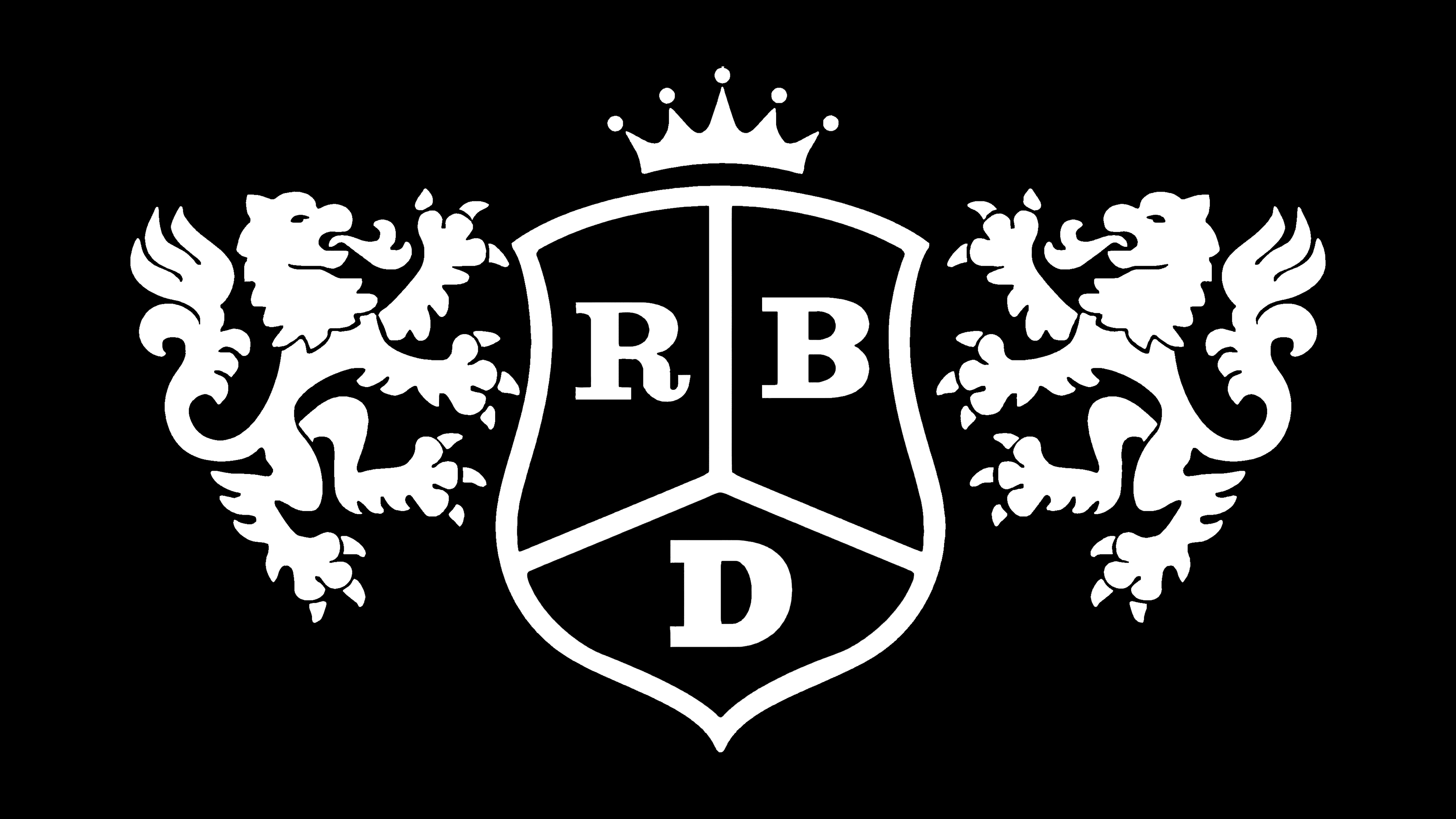
The group’s emblem matches the fictional Elite Way school crest, where the teenagers live. The shield shape at the center of the logo comes from the depiction of a stretched hide for drying, a common feature in heraldry.
On each part of the shield, divided into three panels, is written one letter of the name RBD, an abbreviation for ReBelDe. The name, translated from Spanish, means “rebels” and describes the elite school’s confrontation between the wealthiest families and talented scholarship students.
A group of extraordinary, diverse students forms a band and fights to perform on stage. They rebel against established rules, parental opinions, and anyone who opposes their creativity.
The thick black border emphasizes the strict confines of the students’ environment. The rules of the elite institution limit their activities and dictate how they spend their time.
The shield canvas is held by two rearing lions, borrowed from the ancient Spanish region of León. These lions later became part of Spain’s coat of arms. Since Mexico was a colony of Spain for 300 years, the choice of heraldry for the most elite school and selected group is linked to European monarchs.
The lions are also part of the coat of arms of Mexico City, where the school is said to be located.
Interestingly, the lion’s image resonates with the name of the school’s main owner, Leon Bustamante, who owns 51% of the shares. Choosing the symbol of the king of beasts conveys the youngsters’ elite status and great prospects. Talented students who make it into the program quickly ascend to Olympus.
Above the shield is a schematic representation of a crown, another symbol of power and might. It indicates that the powerful patronizes the music group and its members. In 2020, the group recorded “Sempre He Estado Aquí. ” In 2023, they officially returned for several world tours, but with a lineup of five musicians.
Font and Colors
Black, white, and red correspond to the shades of the students’ clothing during different seasons. The choice is associated with classic, strict colors that reflect the business world. White shirts, black suits and ties, and red jackets look stylish and expensive.
The palette speaks of the struggle between light and dark within the school and the group members. The red color reflects the rebellious spirit of the young musicians and the strong feelings that flare up in adolescence.
The elegant serif letters again emphasize the institution’s elitism and extravagance while highlighting the young prodigy’s talent and uniqueness. The logo’s typeface features expressive, slightly thickened lines and decorative serifs. Its design resembles classic typographic solutions, resembling popular fonts such as Clarendon by URW Type Foundry. Visually, the inscription appears confident and solid while maintaining refined letterforms.
The overall shape of the letters conveys a sense of reliability and assurance. The typeface looks modern despite noticeable retro elements. The characters have consistent stroke thickness, gently curved contours, and clean terminations, giving the emblem a balanced combination of formality and artistic character.