


 RCA Logo PNG
The RCA logo is powerful, strong, and monumental. It prompts the viewer to read the letters from bottom to top, seeing the enterprise as a whole. The emblem shows the company’s significant global impact.
RCA was registered in the United States on October 17, 1919. It was created in response to wartime concerns after World War I, when US officials decided that radio technology should not remain under foreign control. General Electric bought the American assets of the British Marconi Wireless Telegraph Company. It transferred them to the new Radio Corporation of America. Owen Young of GE became chairman, while David Sarnoff became commercial manager.
Sarnoff shaped RCA’s early growth. He joined Marconi in 1906 as a messenger and gained public attention in 1912 when he received signals from the sinking Titanic. In 1915, he proposed a “radio music box” for home broadcasts of music and news. The idea was initially ignored, but in 1921, RCA’s broadcast of the Dempsey-Carpentier boxing match demonstrated radio’s mass potential. Over the next three years, RCA sold more than $80 million worth of receivers.
In 1926, RCA created NBC, America’s first national radio network, with Red and Blue networks broadcasting from New York. In 1929, it acquired Victor Talking Machine Company, forming RCA Victor. In 1930, the US government forced GE to cut ties with RCA, and Sarnoff became president. During the 1930s, RCA worked on television, competing with CBS, and in 1939, it opened regular TV broadcasting at the New York World’s Fair with President Franklin Roosevelt’s address.
World War II shifted RCA to military production, including radar and radio equipment. After the war, the company developed a color TV system compatible with black-and-white sets. In 1953, it became the NTSC standard. In 1957, RCA opened Studio B in Nashville, which was later used by Elvis Presley, Roy Orbison, and Dolly Parton. In 1958, it launched SCORE. In 1986, General Electric bought RCA for $6.4 billion, kept NBC, sold RCA Records to Bertelsmann, and transferred consumer electronics and the RCA trademark to Thomson SA.
Meaning and History
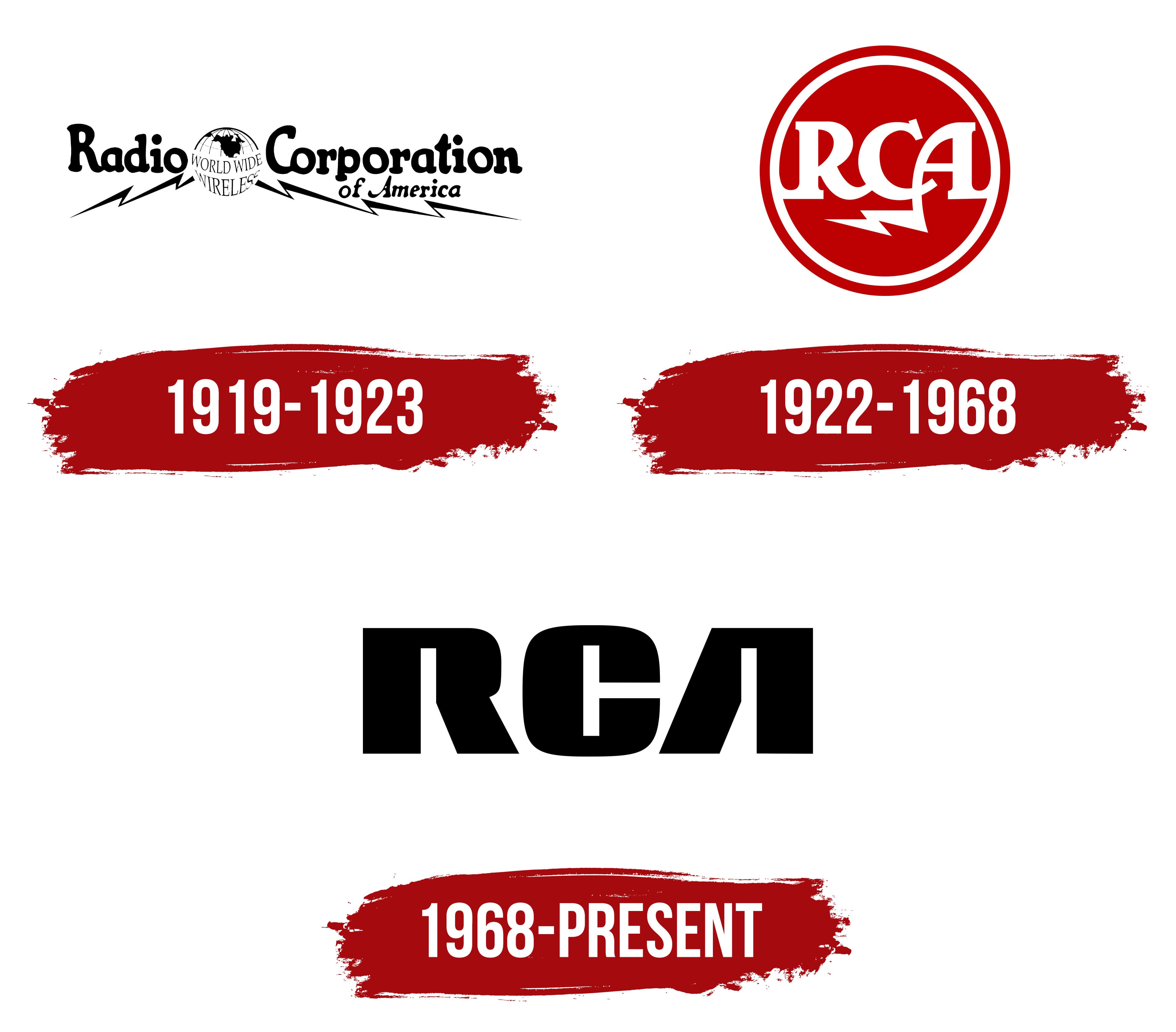
During its 90-year existence, RCA changed its logo three times. Each reflected changes in ownership and the company’s expanding scope. Two of the three emblems reflect waves, indicating that broadcasting is the company’s primary niche. The visual identity ceased to evolve and be updated after the corporation’s dissolution and the death of the organization’s first and main director, David Sarnoff.
What is RCA?
An American conglomerate that helped pioneer television and radio in America. It developed the first electronic television and color television according to the NTSC standard. In 1986, General Electric purchased it and sold it off in parts. Today, ten product lines from different companies operate under the RCA brand.
1919 – 1923

The initial logo shows the company’s full name, Radio Corporation of America. Between the first two words is a globe with a large, thin inscription: “Worldwide Broadcasting.”
The image visually reflects the name, demonstrating that American radio is on the air worldwide. General Electric created the company specifically to buy and manage Marconi’s transatlantic radio signal transmission technology. For decades, RCA was the only company that could broadcast to other continents.
At the top of the image, the outline of North America is highlighted to show where radio progress and development come from.
From the Earth, lightning bolts spread in different directions, symbolizing radio waves. David Sarnoff, the first director of a radio company, began distributing radio receivers and helped launch various radio broadcasts. This idea of replicating and reaching consumers is reflected in the stripes.
The lightning image evokes a flash, a sudden appearance, and instant popularity. It indicates electric radio devices.
1922 – 1968

1968 – today

The company has sold over 500,000 color TVs and remains a leader in this area. The energy of victory, triumph, and ascent to the top is reflected in the brand identity.
The new emblem evokes grandeur and monumentality. The three large RCA letters have no internal partitions. The massive glyphs embody undisputed leadership. The open symbols without closed spaces represent television and radio waves effortlessly penetrating every home, through any walls and at any distance.
The inner spaces of the outer letters resemble two TV towers transmitting a signal to each other.
The full name is no longer used, as the company has long since expanded its activities far beyond radio. It is now more commonly known by its abbreviation, so customers don’t have to decipher it.
Font and Colors
The visual sign’s primary color is black. Combined with the large, bold letters, it creates the impression of a globally known corporation. The brand’s products are sold across multiple continents, and its broadcasting system covers the entire world. The shade makes dominance and the absence of significant competitors at this stage of development evident.
The unique font features characters that seem to be bent from strong iron rails. The bright light of television and radio enters people’s lives through the holes they create.