Brand stores are always open. The Real logo reflects the calm, measured work of the network with a gradual and confident development. The movement of the logo indicates a gradual improvement in service quality and the range’s expansion.
Real: Brand overview
| Founded: | 1992 |
| Headquarters: | Düsseldorf, Germany |
| Website: | meinreal.de |
Real is a German hypermarket chain owned by Metro AG until 2020. The first stores operating under this brand were opened in 1992. This was made possible by merging several other chains, including Continent, Basar, Divi, Real-Kauf, and Esbella. For a long time, Real functioned at the German and the international level. Until 2014, the chain’s hypermarkets opened in Ukraine, Turkey, Poland, and Romania. However, they were subsequently bought by the Auchan Group. Metro, in 2018 decided to sell the Real brand. Subsequently, the hypermarket chain significantly reduced the number of stores until 2020, and the rights were transferred to Edeka, Rewe, Globus, and several other organizations. As a result, only 60 stores should remain under the Real trademark.
According to information for 2018, the network’s revenue was 7.4 billion euros. At that time, the organization employed 36 thousand employees, but their number has decreased since selling part of the rights.
Meaning and History
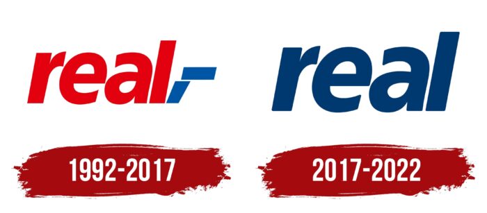
When Metro AG owned the Real brand, and after its sale, the logo’s feature was a bright, eye-catching style that attracted the attention of the target audience. The name itself indicates that the organization specializes in something real and significant. The logo of the hypermarket chain has undergone only one change in the entire history of the brand. The first option lasted from 1992 to 2017. The second one is still relevant today.
What is Real?
Only after reading the name do potential customers of the store chain get a feeling of something worthwhile. The presented network of hypermarkets is known far beyond the borders of Germany, which deserves special attention.
1992 – 2017
The original Real logo had a color palette of red and blue on a white background. The brand name was done in lowercase cursive letters. After “Real,” two parallelograms were added as an emblem, which was on top of each other. Thus, an angle was created. Calm colors and the absence of unnecessary elements should evoke a sense of reliability, strength, and loyalty among web visitors. There are no additional elements, including copyright marks, on the logo, which allows the client not to be distracted directly from the message embedded in the image.
2017 – today
After changing the logo, it began to feel minimalistic even more than in the previous version. Only one color was used, namely dark blue. It should create a sense of reliability and professionalism in the company. At the same time, the logos placed on the stores of the network have a lighter shade. The parallelograms used in the 1992-2017 version have been removed. Now the Real logo consists solely of the name of the network. All letters are also in lowercase cursive style.
Analyzing the image, you can conclude that the brand’s key value is quality. The presence of lowercase letters without additional elements causes friendliness and affection for the target audience.
Font and Colors
The logo font is close to Gentona. The creators of the logo used lowercase cursive letters for the logo.
As noted above, Real’s signature palette consists of two colors: red and blue and their shades. Additional elements, including images, are absent in both logo variations. However, after 25 years of using the original version, the company decided to update it with a uniform style that used only a dark blue hue. Consequently, the Real network stands out from the competition with its minimalism, which attracts the attention of potential buyers and does not distract them from the main message.
Real color codes
| Flame | Hex color: | #e65028 |
|---|---|---|
| RGB: | 230 80 40 | |
| CMYK: | 0 65 83 10 | |
| Pantone: | PMS 172 C |
