


![]() Recycle Logo PNG
Recycle Logo PNG
The world-famous Recycle logo appears on many products and packages. It acknowledges the materials’ safety and recyclability. The label is used for environmental purposes and draws attention to environmental issues.
Meaning and History
Chicago-based Container Corporation of America (CCA), a major recycled paperboard manufacturer, organized and sponsored the best recycling logo contest. It was conducted among US students studying art and design. The key objective of the event was to attract global attention to the problems facing nature worldwide. The winner was Gary Anderson’s project, a 23-year-old student from the University of Southern California. Now, his work is in the public domain.
At the same time, Anderson studied to be an engineer, not a graphic designer. Later, he clarified that creating the logo took him no more than 2 days and that he was awarded almost $2,000. Moreover, the student did not develop the logo from scratch since he already had blank arcs and arrows from another presentation.
What is Recycle?
Recycle: waste-recycling process and garbage-recycling icon. It appeared in 1970 on the initiative of the Container Corporation of America, when Earth Day was first celebrated. Its author is student Gary Anderson, who won a competition.
However, it is believed that the universal mark had a prototype. An almost similar stamp with two arrows could serve as inspiration. In the 1960s, Volkswagen used it for parts of their cars that needed refurbishing. However, Anderson’s simple and thoughtful design has become an iconic symbol of sustainability. Its graphics are understandable in any language and do not require additional text. There was never a single word in the logo.
At first, the sign’s globality was questioned: would they want to use it everywhere? But now, there are recycling markings and labels on many everyday items. They allow you to determine how the various packaging materials are processed.
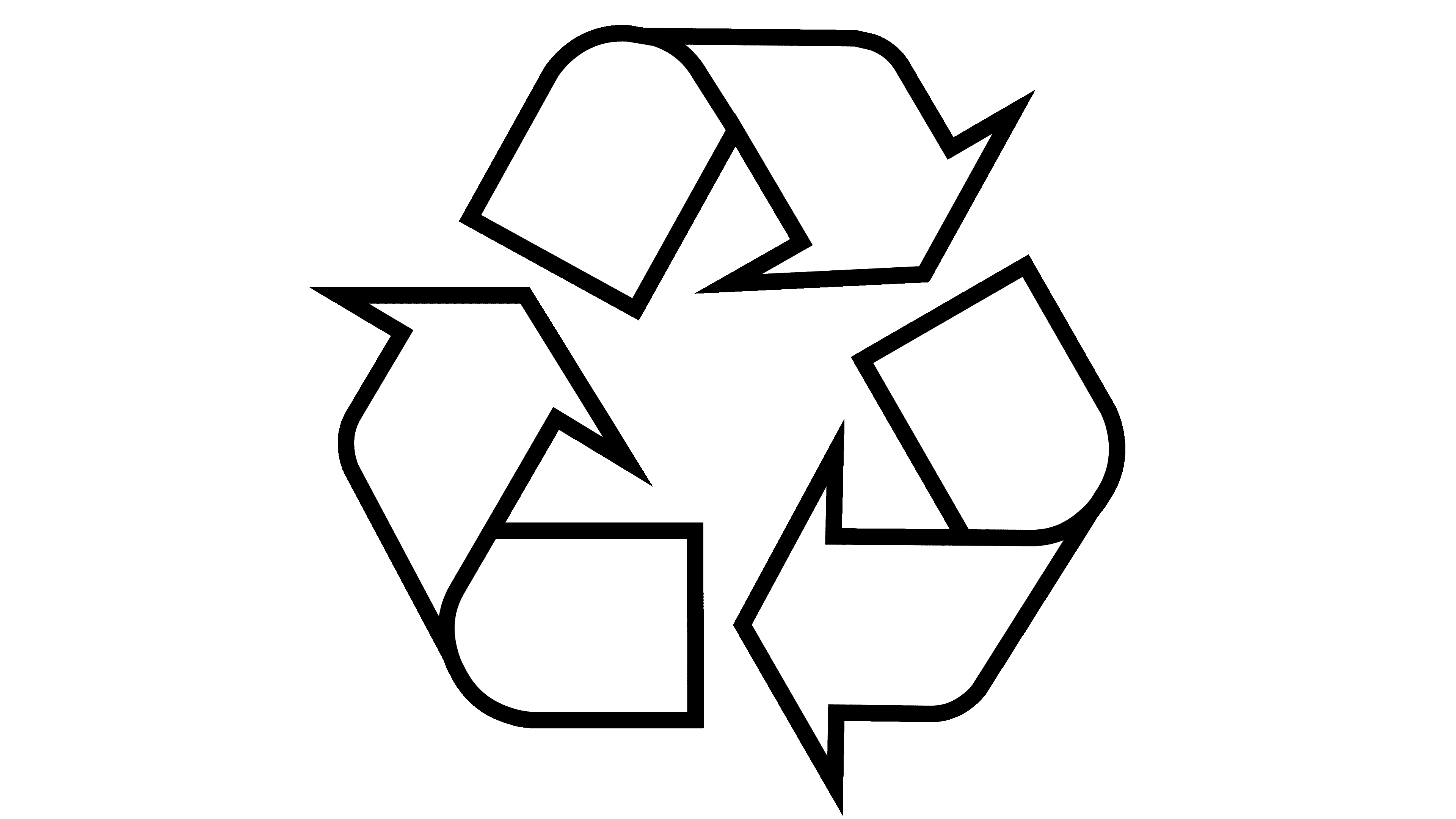
The Recycle symbol consists of three reverse arrows, the twisted Möbius ribbons. They form a cyclical triangle with no beginning or end. It denotes the continuity of the process, an endless cycle of transitioning raw materials from one form to another without loss of quality or environmental harm.
Usually, the icon has a black outline and a green fill inside. However, because it lacks standardized features, it is not uncommon for companies, enterprises, and organizations to change its design, leaving only a recognizable form. The American Paper Institute has developed four versions for different purposes, and Unicode offers no less than six logo variations. As a rule, arrows are bright green and dark green, with or without edging along the edge color, where the upper side is lighter, and the lower side is darker. Black-and-white modification is also considered equal.
Font and Colors

The Recycle logo does not have rigid frames and is generally accepted as a standardization, so any text and font can accompany it. After all, the most important thing for her is the triangle shape with reverse arrows.
The color does not matter much, but traditionally several shades of green predominate, as they are closest to an eco-friendly palette dictated by nature itself. A combination of black arrows on a white background is also used.
FAQ
What is the symbol of recycling?
The recycling symbol consists of three arrows forming a triangle. It is known worldwide and designates items that can be recycled. It can be found on various products, packaging, and recycling bins to remind us to recycle for the environment’s health.
There are two Unicode characters for this symbol:
- U+2672 (♲) “UNIVERSAL RECYCLING SYMBOL” is usually just an outline.
- U+267B (♻) “BLACK UNIVERSAL RECYCLING SYMBOL,” shaded black to make it stand out.
These symbols help promote recycling and proper waste management.
What do the three arrows mean in recycling?
The three arrows on the recycling symbol represent a key step in waste management: reduce, reuse, and recycle. They create a cycle that helps us use resources wisely and reduce waste.
- Reduce: This arrow encourages us to create less waste. By using and throwing away less, we help reduce the amount of waste that needs to be disposed of.
- Reuse: This arrow indicates the reuse of items. We can extend their lifespan and reduce their environmental impact by finding new ways to use old items, such as repurposing or donating them.
- Recycling: The last arrow means recycling. This involves collecting and recycling old materials into new products. Recycling conserves natural resources, requires fewer raw materials, and typically requires less energy than making products from scratch. This step completes the cycle, returning materials to use and keeping them out of landfills.
What symbols mean recycle?
Seven main symbols indicate that plastic items can be recycled, each representing a different type of plastic.
- PETE or PET (Polyethylene Terephthalate): Commonly found on water bottles and food containers, PET is one of the most frequently recycled plastics, known for its lightweight and strength.
- PVC or V (Polyvinyl Chloride): Used in items like plumbing pipes and clear food packaging, PVC is less often recycled because it contains harmful chemicals.
- PP (Polypropylene): This plastic, found in yogurt, syrup, and medicine containers, is valued for its heat resistance. Recycling rates for PP are growing.
- Other (Various Plastics): This catch-all category is for plastics that don’t fit standard categories. Due to their mixed composition, these items are difficult to recycle.
- HDPE (High-Density Polyethylene): This strong, extensively recycled plastic is used in milk jugs, detergent bottles, and some bags.
- LDPE (Low-Density Polyethylene): Found in grocery bags and some food wraps. It is recycled more often, although not as widely as HDPE or PET.
- PS (Polystyrene): Also known as Styrofoam, PS is used in coffee cups and take-out containers. However, its bulky nature and high transportation costs mean it is recycled less frequently.
Each symbol is usually part of a recycling triangle with a number indicating the type of plastic.
What logo is used for recycling?
The recycling logo features a Möbius strip with three curved arrows forming a continuous loop. Based on a shape discovered in 1858 by the mathematician-astronomer August Ferdinand Möbius, this design symbolizes the endless cycle of recycling. Each arrow on the logo represents a stage in the recycling process:
- Collection: The first arrow concerns the collection of recyclable materials. This step involves collecting used items for recycling into new products.
- Processing: The second arrow indicates the transformation of collected items into raw materials, which can be used to produce new products.
- Purchasing: The third arrow represents purchasing products made from recycled materials. This encourages the recycling cycle to continue.
The recycling logo is recognizable worldwide on various products, packaging, and recycling bins. It indicates that an item is recyclable or made from recycled materials.