 Red Horse Extra Strong Logo PNG
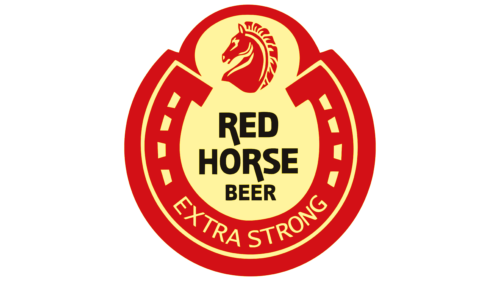
Red Horse Extra Strong logo features a striking blend of symbolism and color psychology, designed to resonate deeply with its target audience. A horseshoe, widely recognized as a symbol of luck, takes center stage. On the horseshoe, the term “EXTRA STRONG” is boldly displayed. Above it, a horse’s head, drawn with simple lines, complements the horseshoe. The core of the emblem consists of the black words “RED HORSE BEER,” distributed over three lines. The color scheme is red and yellow, a fiery combination that communicates the high potency of the alcoholic beverage.
The horseshoe is an ancient emblem associated with fortune and good luck; its inclusion here isn’t accidental. By featuring it prominently, the brand signals an underlying message of fortune and positivity, qualities that many consumers appreciate in a beer that bears the label “EXTRA STRONG.” This strength isn’t just about the alcohol content; it extends to the overall experience the beverage promises.
The horse head, sketched with minimalist strokes, serves multiple purposes. It reinforces the name of the brand—Red Horse Extra Strong—while simultaneously lending an air of regality and power to the logo. Horses are associated with freedom, power, and grace, qualities that resonate with many beer drinkers looking for an extraordinary experience.
The color scheme adds another layer of meaning. Red is a color that demands attention and is associated with energy, action, and passion. Conversely, yellow signifies joy, happiness, and, in some cultures, wealth. Combined, these colors create an intense, eye-catching contrast that is hard to ignore. It’s a palette that tells the consumer this is no ordinary beer; it’s a beverage that packs both flavor and potency.
Centering the logo are the words “RED HORSE BEER” in black, an assertive color linked with elegance and sophistication. Using black for the typography, the brand introduces a grounding element to the otherwise fiery emblem. Black not only adds visual weight but also brings a touch of sophistication.
Splitting the name into three lines gives a balanced, organized feel, suggesting a well-crafted product. It invites the consumer to experience a strong, finely balanced beer with various complex layers.
The emblem successfully merges traditional symbols with modern design elements, creating an engaging visual narrative that appeals to a wide audience. It’s not merely a visual treat; it’s a story that aims to encapsulate what the brand stands for—strength, luck, and a high-quality experience.
Red Horse Extra Strong: Brand overview
| Founded: | 1982 |
| Founder: | San Miguel Brewery |
| Headquarters: | Philippines |
| Website: | sanmiguelbrewery.com |
In 1982, the Philippines saw the introduction of Red Horse Extra Strong beer by the renowned San Miguel Brewery. Something of a first for strong lagers in the country, the beer had an alcohol content of 6.9%, setting it apart from its milder counterparts. It was meticulously crafted to resonate with the Filipino palate’s inclination towards more intense and rich beer flavors.
By the end of the 1980s, the brand had etched its presence prominently in the Philippine beer landscape, ascending as one of its leading names. Its potent alcohol content and strategic marketing positioned it as emblematic of Filipino masculinity and “machismo.” Such branding propelled Red Horse as the choice for those embracing the strongman ethos.
Today, the legacy of Red Horse endures, with San Miguel Brewery continuing its production in its Mandaue City facility. The beer’s prominence remains unshaken, particularly in the high-strength lager segment of the Philippine market. Over time, the brand has intertwined with Filipino popular culture, making Red Horse a symbolic beverage in the nation’s social tapestry.
Meaning and History
What is Red Horse Extra Strong?
Recognizable by its striking red label, Red Horse Beer has become an emblem of vigor and audacity in the Philippine beer scene. Debuting in 1982, Red Horse lager, with its impressive 6.9% ABV, set itself apart from other beers. It’s no wonder it rapidly drew the interest of beer connoisseurs and has been a preferred choice ever since.
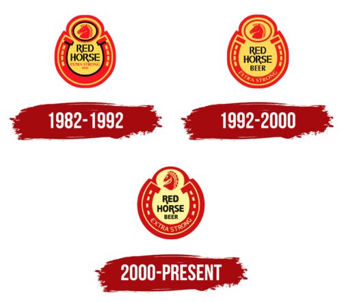
1982 – 1992
1992 – 2000
2000 – today
Red Horse Extra Strong color codes
| Maximum Red | Hex color: | #d31016 |
|---|---|---|
| RGB: | 211 16 22 | |
| CMYK: | 0 92 92 17 | |
| Pantone: | PMS 485 C |
| Flavescent | Hex color: | #fff49e |
|---|---|---|
| RGB: | 255 244 158 | |
| CMYK: | 0 4 38 0 | |
| Pantone: | PMS 601 C |
| Shadow Black | Hex color: | #1a1511 |
|---|---|---|
| RGB: | 26 21 17 | |
| CMYK: | 0 19 35 90 | |
| Pantone: | PMS Neutral Black C |
