 Red Hot Chili Peppers Logo PNG
Traveling through life with the band’s music is the main advice of the emblem. The Red Hot Chili Peppers logo shows teamwork in the commonwealth with fans. The band sings for the listeners, and the listeners come to the concerts and inspire the musicians.
Red Hot Chili Peppers: Brand overview
| Founded: | 1983 – present |
| Headquarters: | Los Angeles, California, U.S. |
| Website: | redhotchilipeppers.com |
Meaning and History
The most permanent Red Hot Chili Peppers have is vocalist Anthony Kiedis and bassist Michael Peter Balzary, better known as Flea. They entered the original composition and since then have never left it. So they can be heard in absolutely every album, which cannot be said about the band’s other members. The manner of performance also changed frequently, balancing between rap, funk, punk rock, psychedelic music, and even melodic ballads with string arrangements.
We can say that Red Hot Chili Peppers develops not only their sound but the entire rock genre. It all started with the release of the studio album of the same name in 1984, which, by the way, disappointed the musicians themselves. In their opinion, it turned out to be too “polished” due to adaptation to the radio. As for the listeners, they liked everything, so after the debut album, the group went on a big tour, where they had to play 60 concerts in two months.
Over the years, the popularity of the Red Hot Chili Peppers has only grown. The band’s performance style has influenced nu-metal, rap rock, rap metal, and funk metal. And according to vocalist Anthony Kiedis, their music is reflected in the works of Linkin Park, Kid Rock, and Limp Bizkit. The band’s name was composed of two phrases: Chilli-Willie and Red Hot Peppers. These were the favorite bars of Kiedis, which he decided to immortalize in this way. The past names (Majestic Masters of Mayhem and Tony Flow) are now forgotten, forever giving way to the Red Hot Chili Peppers.
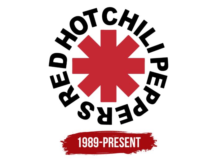
Experimenting with sound, the band never changed their logo. It was drawn by Kiedis in 1984 when the label executives asked for some graphic sign to identify the band visually. This happened shortly before the release of their debut album. The story goes that Enigma Records / EMI employees commissioned musicians to add the logo to the promotional material. The frontman drew an eight-pointed star with rectangular edges on paper without thinking twice and sent it to the recording studio representatives. This is how one of the most famous logos of the rock scene was born.
The result of Kiedis’ creativity looks like a typographic symbol of an asterisk but has a slightly different shape. The star on the cover of the first album, which eventually became the main identification mark of the Red Hot Chili Peppers, consists of four intersecting rectangles in the center. In fact, these are two crosses superimposed on each other: a straight line (in the form of a plus) and a diagonal (X-shaped). They are painted bright red and are in the band’s name ring. The inscription is difficult to read due to the narrow spacing between words. All letters are capital, black, bold, and sans serif.
When the vocalist Kiedis designed the logo, he initially didn’t put any meaning into it. It was nothing more than an abstract symbol coerced by the recording studio. Now, of course, it is of great importance because it represents the cult rock band and is associated only with it. By the way, some Red Hot Chili Peppers have tattooed themselves with an eight-pointed star: Frusciante and Kiedis wear it on their right wrist. Many fans have followed their example, so it is a kind of identification mark of the most devoted members of the fan club.
Despite the initial meaninglessness of the emblem, the musicians tried to give it an explanation, and it was not always correct. In his autobiography Scar Tissue (2004), Kiedis stated that it was not an asterisk. According to his words, he drew a view from the earth to an angel who is in the anus of heaven.
And fans see in the Red Hot Chili Peppers logo a connection with the so-called Star of Affinity. This graphic symbol appeared in 1970. Michael Moorcock created it to show the complexities of life choices. The straight cross denotes the four cardinal points, as in geography. Diagonals represent additional opportunities that create chaos and prevent you from determining the right direction. In addition, fans associate the band’s logo with the illustration in Breakfast of Champions (1973) by satirical master Kurt Vonnegut. The author put a similar symbol in the preface and also said that it was not an asterisk but something else.
The first version makes sense: perhaps the Red Hot Chili Peppers’ emblem and Star of Affinity are interconnected because the band plays chaotic music, experimenting with different genres. But the connection with the illustration in the novel “Breakfast of Champions” has not been proven because Kiedis, unlike the bass player, was not a devoted fan of Vonnegut’s creativity.
Font and Colors
The simple and crisp Franklin Gothic font makes the letters stand out, but the circular arrangement of the words makes the lettering difficult to read. The selected typeface was designed by Morris Fuller Benton, Chief Designer for American Type Founders. The font family originated in 1902 and expanded over the next 65 years.
The dominant colors are red, black, and white. The first is used for the eight-pointed graphic symbol, the second is for the band name, and the third is for the background.
Red Hot Chili Peppers color codes
| Mahogany Red | Hex color: | #c52833 |
|---|---|---|
| RGB: | 197 40 51 | |
| CMYK: | 0 80 74 23 | |
| Pantone: | PMS 1788 C |
| Black | Hex color: | #000000 |
|---|---|---|
| RGB: | 0 0 0 | |
| CMYK: | 0 0 0 100 | |
| Pantone: | PMS Process Black C |


