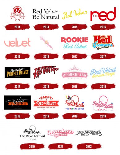
The Red Velvet logo is delicate and refined, perfectly fitting the group’s young female performers. The emblem represents a diverse group capable of pleasing the most demanding listeners.
Red Velvet: Brand overview
| Founded: | 2014 |
| Founder: | SM Entertainment |
| Headquarters: | Seoul, South Korea |
| Website: | smtown.com |
Meaning and History
SM Entertainment, which handles the group’s promotions and branding, pays close attention to the group’s image. Each EP, single, and album gets a separate logo corresponding to the theme and content of the product. There’s no consistent theme that ties all the emblems together. Various graphic elements or inscriptions of different colors are used.
What is Red Velvet?
A South Korean band of 5 girls performing a variety of music: pop, disco, hip-hop, and blues, thereby attracting a wide range of listeners of different ages. The group’s albums top the local Gaon charts, have been recognized by Billboard as a bright representative of K-pop, and are famous beyond South Korea.
2014
The logo for their first single, “Happiness,” became a unique crest consisting of a round coin with a maroon core, symbolizing red velvet fabric. The group sings for two types of audiences. The first set of songs, labeled as “Red,” are pop tracks for the younger audience. The second type of song, named “Velvet,” is a blues and hip-hop variant from the 90s for older listeners. Hence the red velvet in the name and logo.
Around the coin are the names of the members. There are four of them because the fifth member, Yeri, joined a year later.
In the center are stylized capital letters R and V. The R lacks its main glyph, whereas its semicircle and leg are transformed into the left stick of the V. The composition turned out to be elegant and light, emphasizing the young age of the singers.
The coin is underscored by an iron heraldic ribbon with drooping ends fastened with rivets. This touch emphasized that the group plans to immortalize its name and remain in music history for a long time.
2014
The team’s second single, named “Be Natural,” received a new sign, consisting of two parts: the group’s name and the disc’s name, connected diagonally. The dividing diagonal, running from bottom to top, hides parts of the inscriptions. This technique seemingly lifts a curtain, showcasing genuineness and naturalness. The logo also hints at unveiling the second part of their creativity – Velvet, while the first single was from Red.
2015
A childlike, joyful emblem with a hand-written yellow diagonal inscription adorned the group’s first EP – “Ice Cream Cake.” The emblem reflects light dance melodies and lyrics about happiness and love.
2015
The studio album released 2015 had a large stylized inscription “The Red” as its emblem. Judging by the title, the album features youthful compositions. Capital letters merge at their edges, forming three circles. The rich color underscores the bright and daring concept of the Red image.
2016
A continuation of the debut album, combining compositions from the Velvet image, appeared a year later and was released as an EP. The title “The Velvet” in the logo is done in a delicate pink-cream shade to convey the subtlety of the direction. The font combines smooth and sharp lines to showcase the edginess of hip-hop and the velvety smoothness of blues solos.
2016
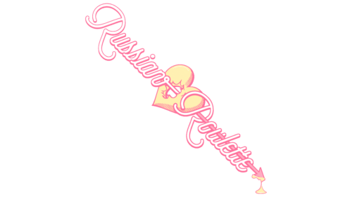
The emblem for the third EP differs from all previous ones. The inscription “Russian Roulette” is designed as an iron arrow piercing a heart. The title, spelled out with the arrow’s shaft, embodies the process of conquering love. After all, the battle for the heart of a loved one is akin to the gamble of Russian roulette. The outcome is left to chance.
2017
The emblem for the fourth disc, “Rookie,” is bright and bold, much like the catchy tracks of the EP. Large bold red letters seemingly predicted the first place in Billboard World Albums. A delicate ultramarine subtitle showcased a balanced combination of red and velvet tracks, which critics noted.
2017
The compact red-blue inscription for the album “The Red Summer” embodies the hot sun and warm sea. Combining contrasting colors and using three fonts emphasizes the group’s diverse styles and points to the bright “red” tracks that make up the EP.
2017
The logo for the second album, “Perfect Velvet,” aligns with the R&B style. The black background gives a sense of subdued light. The golden inscription diagonally seems like music’s shimmering, ascending and descending to the ground. The intricate white title of the group swirls in dance, embodying the flawless execution of complex compositions.
2018
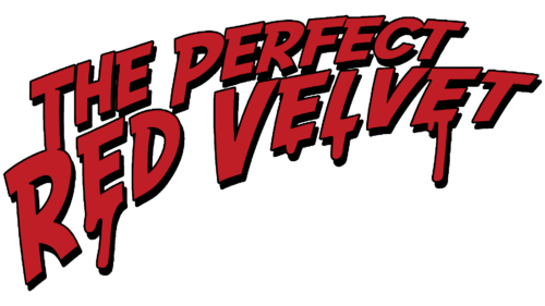
For the reissue of the second album, Perfect Velvet, they chose a new title: The Perfect Red Velvet, and introduced a new logo, seemingly written in blood. The red streaks resemble tears from a heart wounded by love. The fading inscription symbolizes the passage of time. A dark shadow elevates the letters, suggesting that the collection features only the best compositions throughout their career.
2018
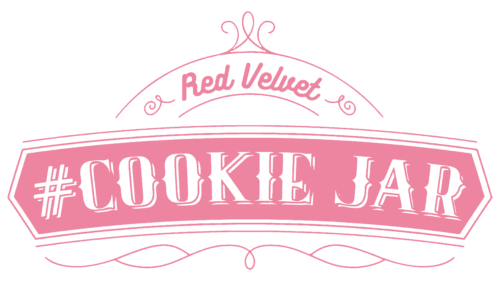
A completely different style was chosen for the first Japanese album, Cookie Jar. The pink label, white inscriptions, and delicate decorative elements exude sweet tenderness. Every song in the album is like a tasty cookie collected in a jar.
2018
The second summer album, Summer Magic, continued the theme of sun and water. The yellow and blue inscriptions wind like waves washing over the sand, setting the mood for light relaxation.
2018
The fifth EP, with the cryptic title RBB stands out with its dark emblem combining black and red elements. This choice embodies the allure of “bad boys,” which is the theme of the Really Bad Boy (RBB) collection. The sharp, peak-like lines emphasize the danger of such love.
2019
A transformed version of the previous logo was used for the emblem of the second Japanese album Sappy. The sticker-like label and arc-shaped inscription echo the Cookie Jar sign. A distinctive feature is the list of the performers’ names, aimed to introduce Japanese fans to the girls.
2019
The unusual title of the special collection, The ReVe Festival: Day 1, resonates with its equally distinctive emblem. The roller-coaster loop and flag capture the amusement park atmosphere. The name ReVe belongs to a toy robot, the album’s mascot, and means “fantasy” in French.
2019
The roller coaster loop, a defining feature of the two-part series, also appears on the emblem for The ReVe Festival: Day 2. Like the album’s songs, the pink inscription lends a dreamy and romantic aura.
2019
The black emblem for The ReVe Festival: Finale signifies the passage of time. The collection is an archive of previously released songs. The dynamite-lit elements at the ends of the loop promise the most fiery tracks and an explosion of emotions.
2021
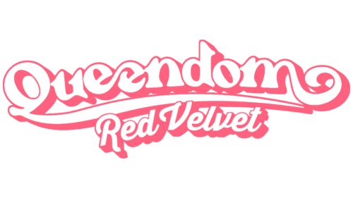
Voluminous white letters with pink edges represent the bright kingdom of dreams. The EP’s logo, Queendom, has an elegant style. Like carefree princesses, the members revel in their status and the richness of emotions.
2022
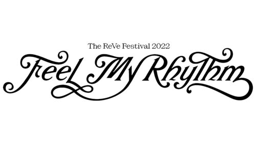
Dance tracks from The ReVe Festival 2022 – Feel My Rhythm are depicted with a refined black inscription. Numerous flourishes enchant the emblem, just like the magical music festival envisioned by Red Velvet.
Font and Colors
The foundation of the group’s emblem is black, pink, and red.
- Red signifies vibrant and fiery songs. It hints at the main theme of the tracks: love.
- Pink embodies tenderness, innocence, and the young age of the performers.
- Black accentuates style and flawless performance.
The font is unique due to the connection of words through ornate glyphs. The inscription resembles a curling plant from a magical garden.
Red Velvet color codes
| Black | Hex color: | #000000 |
|---|---|---|
| RGB: | 0 0 0 | |
| CMYK: | 0 0 0 100 | |
| Pantone: | PMS Process Black C |

