


![]() Redbox Logo PNG
Redbox Logo PNG
The emblem represents the service industry in shades of convenience and friendliness. The Redbox logo represents points for the self-acquisition of video products. It is enough to press the button, and the selected cassette will be in the user’s hands.
Redbox began inside McDonald’s as part of an experimental retail project launched in 2002. The original idea involved automated kiosks selling household goods inside restaurants, but the concept failed quickly. One company manager, Gregg Kaplan, suggested using the machines for low-cost DVD rentals instead. In 2004, McDonald’s tested the idea in Denver with bright red kiosks that offered movie rentals for $1 per day.
The concept expanded rapidly because customers could rent and return discs at different locations without subscriptions or the need for store employees. In 2005, Coinstar purchased a 47 percent stake for $32 million after companies such as Blockbuster and Netflix showed little interest. By 2009, Coinstar had taken full control as Redbox spread into supermarkets, pharmacies, and shopping centers across the United States.
At the same time, Redbox entered into conflicts with studios, including Warner Bros., Universal, and 20th Century Fox, over cheap DVD rentals. Some studios delayed access to new releases, forcing Redbox employees to buy discs directly from retail stores. Agreements reached in 2010 introduced 28-day delays in release. Despite those restrictions, Redbox reached one billion rentals in 2010 and controlled a major share of the US DVD rental market by 2013, operating more than 43,000 kiosks.
The rise of streaming services eventually weakened the business. As Netflix and Amazon shifted viewers toward digital subscriptions, Redbox traffic declined. The company launched Redbox On Demand in 2017 and was acquired by Chicken Soup for the Soul Entertainment in 2022. Heavy debt and falling revenue led to bankruptcy proceedings in 2024, ending Redbox’s operations after two decades on the market.
Meaning and History
![]()
Redbox was originally a McDonald’s project aimed at acquiring new customers. Its creator, Gregg Kaplan, represented the business development team. He also proposed renting a video and made it possible to return the discs to any kiosk, regardless of location.
Then the fast-food chain attempted to eliminate Redbox and sold this brand, Coinstar, piece by piece. The last shares were bought in 2009. The new owner popularized DVD and Blu-ray rentals, expanding the number of locations to include many pharmacies, shops, and fast-food outlets. In 2016, the company was acquired by Apollo Global Management.
The only things that have never changed are the stalls’ red color and the Redbox logo. It reflects the essence of the name and is the most memorable element of the corporate image.
2002 – 2016
![]()
The first-word mark featured bright red “Redbox” lettering set in a bold sans-serif typeface. All letters were lowercase and had rounded corners. A curved line stretched from “r” to “e,” forming an arch. This logo was discontinued in 2016, though it remains visible on individual kiosks.
2016 – 2017
![]()
The redesign occurred after Apollo Global Management acquired Redbox. The lettering and arc remained in place, but the color took on a pronounced dark pink tint, and the letters became thinner and more angular.
2017 – today
![]()
In 2017, there was another logo update, but not all Redbox customers were pleased with it. A wave of criticism was caused by the bold type, as a result of which almost all letter spacing disappeared. The thick horizontal serifs at the ends of the “r” and “x” have received little public approval. Many consumers didn’t like the purple dot at the end of the word. But all the changes were accepted because the company would not abandon the new identity and confidently moved forward.
Font and Colors
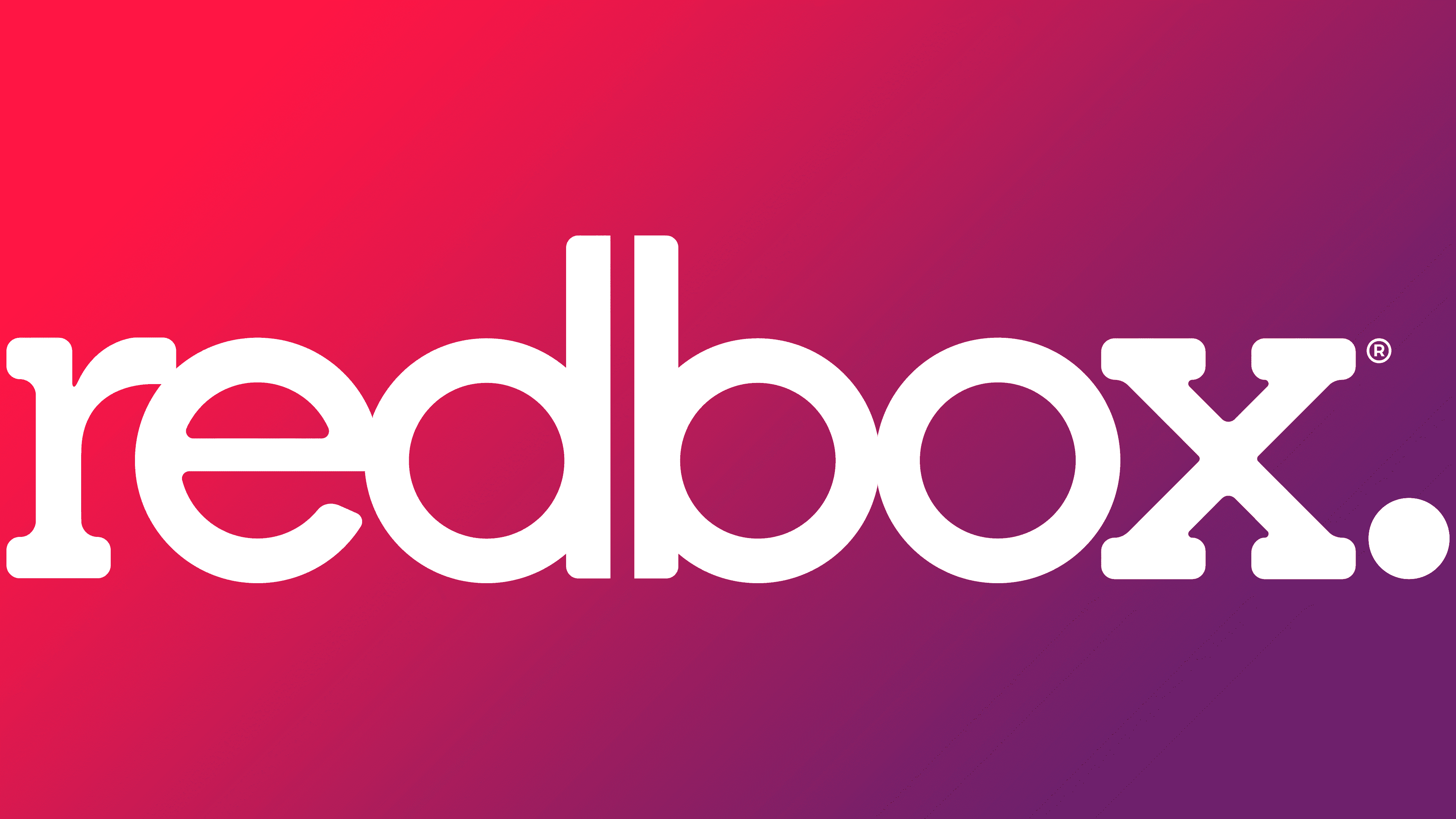
In the past, the most emblematic element of the Redbox logo was the curved arch. She seemed to unite all the letters, showing their commonality and denoting the inextricable connection between the company and its customers. In 2017, the arc was removed, but after the inscription, a purple circle appeared. Due to its location (bottom right), it was used as a point styling the title for Redbox, adding originality to the company’s image.
The first logo font was a variant of Target Book. Typographer Tomi Haaparanta designed an original typeface that avoids corners and serifs. Most of the attention was drawn to the lowercase “e” with a diagonal stroke in the middle. The modern wordmark also uses rounded-corner letters; only the “r” and “x” have serifs. They are as wide as the other lines.
The lettering color matches the name ‘Redbox’ and has a slight pink tint (#E41644). This reddish-pink tone complements the wordmark well, particularly with the purple dot at the bottom, as introduced in the 2017 redesign.