


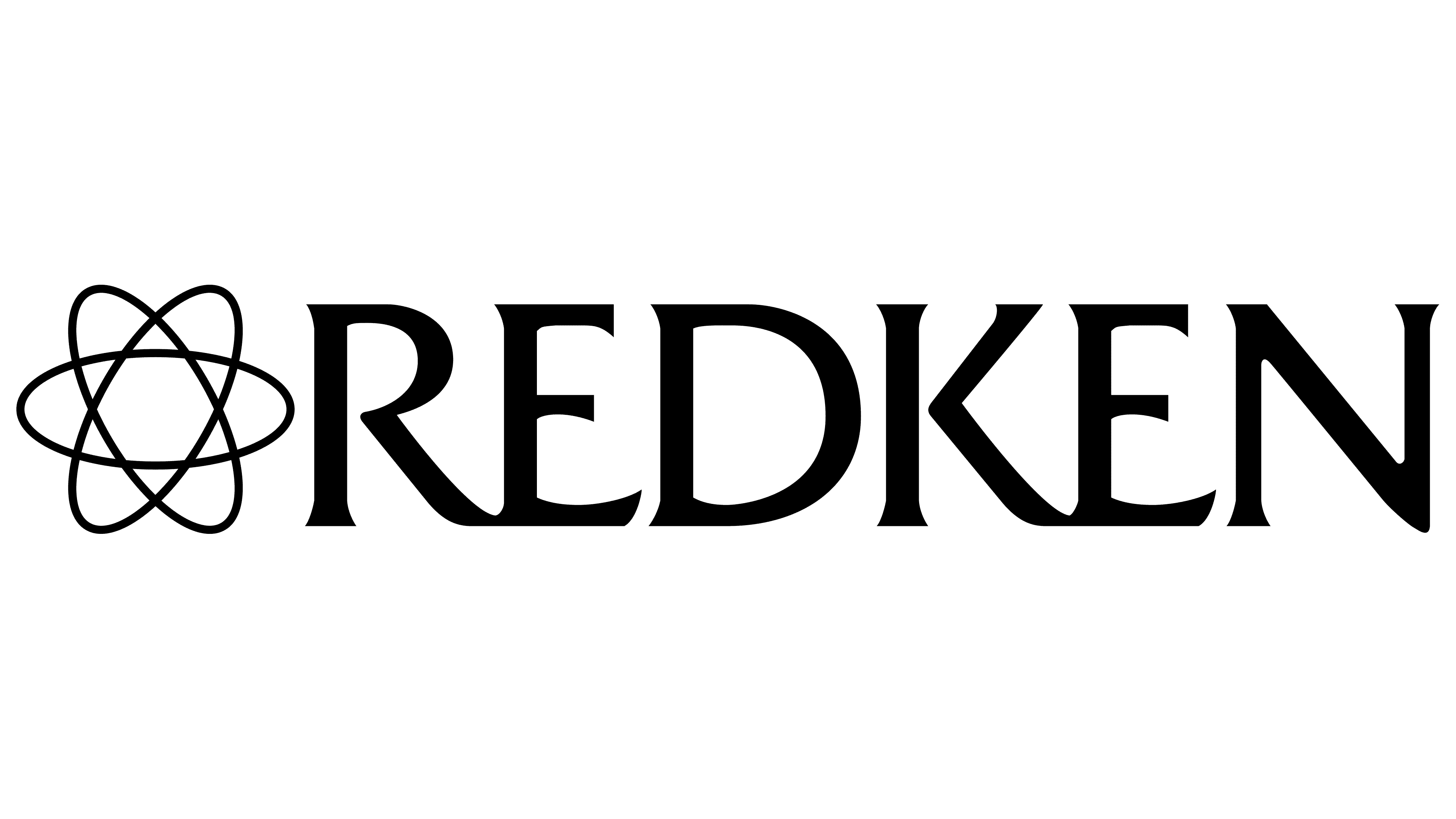
![]() Redken Logo PNG
Redken Logo PNG
The Redken logo promises users strong curls that won’t fall out. The company’s funds are effective and consistently deliver clear, positive results. The emblem hints at the manufacturer’s rich experience and trustworthiness.
In the late 1950s, on a Hollywood set, actress Paula Kent struggled with thin, sensitive hair and constant allergic reactions to salon products. After consulting dermatologists and stylists without clear answers, she concluded that hair cosmetics lacked a scientific basis. This realization shaped her idea to rethink the industry.
Through her hairdresser, Kent met Jheri Redding, who had moved to Los Angeles after World War II and was experimenting with hair chemistry. In 1956, he created a protein-based conditioning rinse, built on the assumption that hair is primarily protein and can be restored with it. In 1960, Kent invested about $3,800 in funds earned from a Hamm’s beer commercial, and together they founded Redken Laboratories, Inc. The name combined Redding and Kent. The company launched with three products and an educational program for stylists.
Unlike competitors such as Wella and Clairol, Redken promoted a scientific approach. It published product ingredients and focused on the hair’s acidic pH balance. Protein lines like Amino Pon and PPT gained traction in salons. Distribution remained limited to professional channels, with stylists working directly.
In the late 1960s, Kent invited Vidal Sassoon to collaborate on shows in the US, strengthening the brand’s position among professionals. By 1971, Redken went public and raised $ 5 million. In 1974, it organized a symposium for 500 hairdressers, establishing a model for industry education.
In 1983, Redken introduced Shades EQ, a color gloss product that became widely used in professional coloring. Revenue reached 120 million dollars by 1988 and 165 million by 1993, when the company was sold to Cosmair Inc., a licensee of L’Oréal. After the acquisition, Redken relocated to New York and, in 1996, opened the Redken Exchange training center, continuing its focus on the salon segment.
Meaning and History
![]()
The brand’s salon hair cosmetics feature a discreet design that highlights their superiority. After all, minimalism is now in vogue, and many beauty brands use it. As for Redken, it offers premium products with a sophisticated logo featuring simple lettering. The manufacturer not only discarded everything superfluous but also never became attached to it, since his previous wordmark was extremely simplified. Combining a black-and-white palette and an elegant font inspires subconscious trust among consumers. And all thanks to the fact that buyers do not expect any catch from a brand with a simple, understandable identity: it seems not to be trying to hide behind a beautiful screen.
What is Redken?
This leading professional haircare brand combines salon-proven treatments with scientific expertise and is part of L’Oréal’s Professional Products Division. The brand offers a variety of product lines, including Color Extend and Extreme Repair, as well as specialized styling products used by professional hairstylists worldwide. The brand’s philosophy centers on the science of hair proteins, enabling it to offer tailored solutions for all hair types and concerns, including texture management, damage repair, color protection, and volume enhancement.
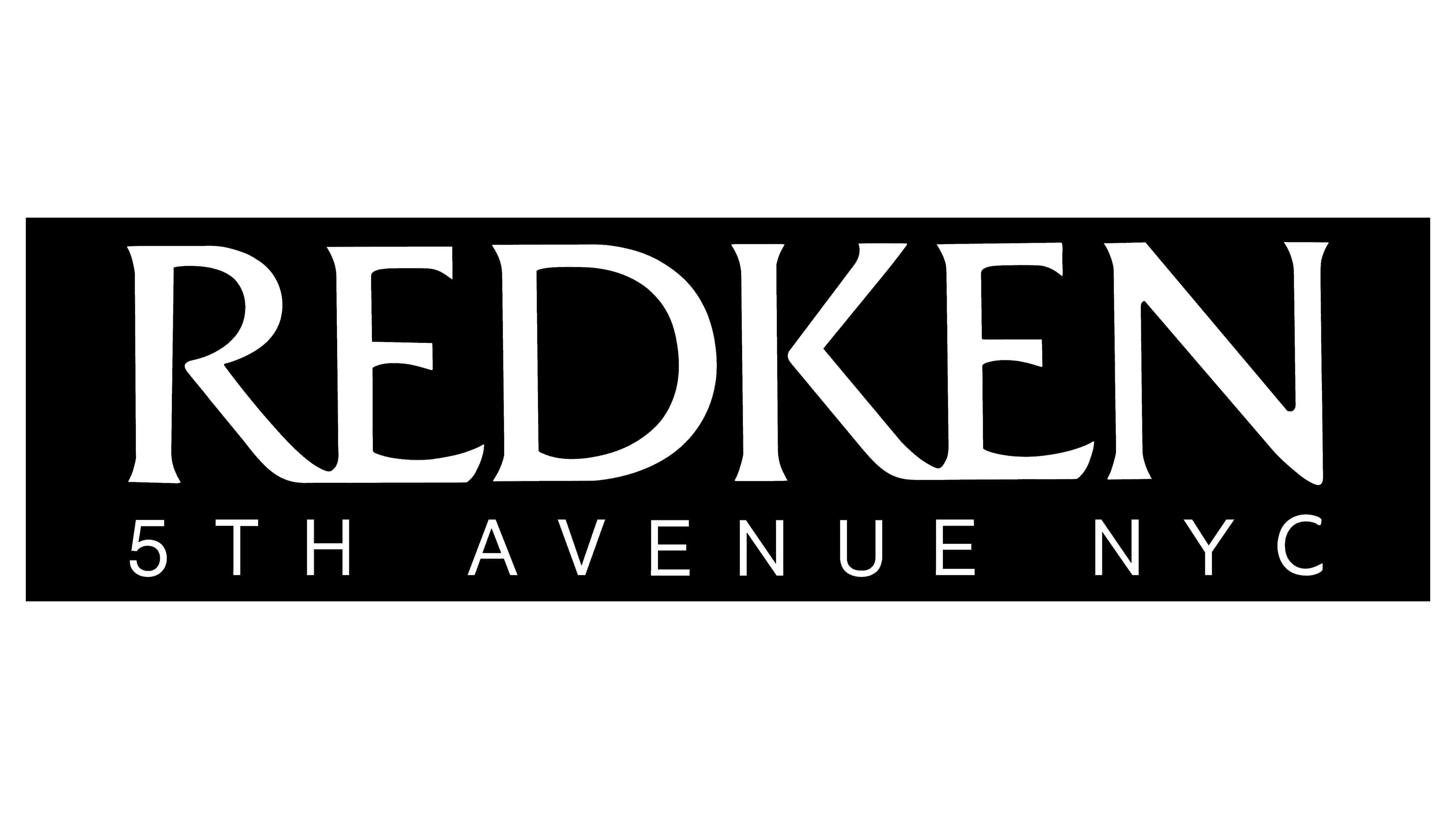
Before 2005
![]()
The company’s corporate identity consists of a laconic sign with no unnecessary details. The logo features the brand name and a reference to its head office’s location, “5th Avenue”. Also indicated is the settlement where the street is located: “NYC” (short for New York City). The text is placed on two lines. At the top is the brand name, consisting of wide stripes. The word “Redken” has the letters “R” and “E” tightly connected, and the “K” and “E” touch at the bottom. Below the bottom, there is a second inscription with thin lines and a large inter-character breakdown.
2021 – today
![]()
After the upgrade, the Redken logo has taken on a new look. Now it looks more professional and legible because the designers have fixed the main problem with the inscription: they removed the visual imbalance by straightening the lines and making them slightly thinner, making the brand name easier to read. Short rectangular serifs not only decorate the letters but also create a sense of internal dynamics. The second line still contains the phrase “5TH AVENUE NYC”, but now it is less conspicuous because the developers have reduced the glyphs. For this part of the wordmark, a serif typeface is also used, which was not observed before.
Font and Colors
The emblem uses two typefaces: the first has serifs and wide letters, while the second is chopped and narrow. The logo is monochrome: black and white.
Recently, the typography of the Redken logo has changed. Now the inscriptions are set in a contrasting typeface with short, rectangular serifs. All letters are in uppercase. It is noteworthy that the neighboring “R” and “E,” as well as “K” and “E” in the brand name, are connected at the bottom by horizontal lines. This feature of the wordmark was preserved even after the redesign, which was reflected in the font. As for the color scheme, it, as before, consists of a classic black-and-white combination.