The Reliant Motors logo conveys a sense of speed associated with automobiles. Its dynamic design indicates constant development and technological improvement, as the company pursued innovation for many years until it was closed.
Reliant Motors: Brand overview
In 1935, Eddie Sanders Thompson and Thomas Lawrence Williams founded Reliant Motors in Tamworth, England. They began by making three-wheeled vans, which were well-liked by small business owners because they reduced taxes and could be operated by people with motorcycle permits.
When the first vehicle was introduced in 1935, it was a three-wheeled model with a single-cylinder engine, similar to an Austin Seven motorcycle. This car’s economy and usefulness helped it become very well-liked very quickly.
With the introduction of its first entirely original engine in 1939, the business established itself as a separate manufacturer. However, World War II halted further advancement, forcing the company to transition to manufacturing military hardware.
The manufacturer started producing three-wheeled vehicles again after the war. One of the business’s most popular products, the Regal, was first offered in 1950. It was produced and continually improved upon until 1973.
The 1960s saw substantial growth. In 1962, the business bought Bond Cars, another three-wheeled car manufacturer. The company’s first four-wheeled vehicle was the Scimitar GT, a sports coupe that gained popularity in 1964.
The introduction of the Robin, perhaps the most well-known vehicle, ushered in the 1970s. Introduced in 1973, this three-wheeled vehicle gained notoriety and was intermittently produced until 2001.
In addition, around this time, the company developed more traditional four-wheel drives, like the Scimitar GTE, a sports estate that quickly gained popularity among enthusiasts.
The 1980s brought difficulties. The business experienced financial troubles and multiple ownership changes. Production went on despite this, and the Rialto model was unveiled in 1984 to replace the Robin.
The company made three-wheeled cars throughout the 1990s, but sales decreased. The business concentrated on creating and producing specialty automobiles, such as electric vehicles.
The 2000s were the final decade of the company’s history. The Robin’s production ended in 2001. The business tried to focus on producing parts and specialty cars, but its financial issues remained.
The car manufacturer ceased operations in 2002. The renowned British company ended when the rights to the name and a few models were sold to other businesses.
Meaning and History
What is Reliant Motors?
The British automaker’s headquarters are located in Tamworth, Staffordshire. The manufacturer gained fame for creating sporty, three-wheeled, compact cars such as the Reliant Regal and Robin, which became icons of British culture. Despite their unusual appearance, these cars were popular due to their low running costs and good fuel economy. Additionally, the company produced four-wheel-drive vehicles like the sports car Scimitar, which attracted interest from enthusiasts. The company specializes in using fiberglass for body construction, making the cars resistant to corrosion and lightweight.
1935 – 1950s
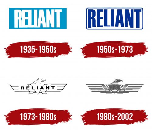
The old Reliant Motors logo embodies true British meticulousness. Extremely precise lines, perfectly straight angles, and balanced shapes reflect the orderliness that helps the company create high-quality and reliable automobiles.
Although the emblem appeared in the first half of the 20th century, it still looks progressive thanks to its minimalist style. The central element is the word “RELIANT,” the brand’s primary identifier. To emphasize its importance, designers used an uppercase font with exaggeratedly tall letters. This makes the inscription appear disproportionate and massive. The excessively narrow spacing between the letters makes the company name almost unreadable.
The lack of serifs saves the situation, as the smooth ends of the glyphs create a sense of confidence and determination. This reflects how the automaker positions itself in the market. The word’s white color is also symbolic: it is associated with openness, purity, and balance, aiming to inspire trust in Reliant Motors.
The inscription is set against a light blue background, evoking a sense of tranquility and inner harmony. The base is rectangular, symbolizing stability, reliability, and order. It conveys the brand’s seriousness and prestige, especially considering that simple geometric shapes are part of the classic style.
1950s – 1973
The company needed a new logo because the old one was not legible enough. To improve readability, the spacing between letters was widened, and the thickness of some strokes was reduced. The developers also experimented by changing the height of the letters, making them uneven. The result is that the upper boundary of the word is aligned horizontally, while the lower part curves in an arc. This unusual design makes the word “RELIANT” embody the motion of moving cars and the dynamism of the developing brand.
The base retained its elongated shape but now has rounded edges, symbolizing safety, comfort, and readiness for compromise. This contrasts with the inscription, which has many straight angles, creating a sense of refined elegance. This reflects the appearance of the vehicles, combining sharp and smooth lines.
The rectangle is painted white and outlined with a thin, dark blue border. The letters are also dark blue, making them more visible against the light background. The successful combination of colors makes the name Reliant Motors noticeable and recognizable, while the curved shape of the text adds dynamism, which is essential for a car manufacturer.
1973 – 1980s
In 1973, the company started using a logo featuring a stylized eagle. The eagle is depicted with outstretched wings, symbolizing freedom, strength, and movement. The bird’s silhouette comprises simple geometric shapes, particularly a triangle and two parallelograms. The wings are divided into thin, long sections, giving a sense of speed. This style resembles Art Deco, popular in the mid-20th century, adding retro charm and pointing to Reliant Motors’ rich history.
The word “RELIANT” is written in large letters across the bird in the logo’s center. Its bold sans-serif font conveys reliability and stability. The clear and straight lines without decorative elements emphasize the company’s practicality and pragmatism, which strives for high-quality automobiles. The proportions of the letters are perfectly balanced, and the spacing between them is carefully calculated, giving the brand name a complete look.
The emblem’s color scheme is black and white. This timeless classic highlights two aspects of the company: strength (black) and simplicity (white). Combined with the eagle image, the contrasting colors make the logo memorable.
1980s – 2002
In the 1980s, a modernized version of the eagle emblem appeared. The bird no longer resembles a totem but resembles a stylish car badge. The silhouette is formed by numerous stripes with gaps between them, creating an illusion of lightness. The outline of each feather is now clearly visible, making the eagle appear as if it is in flight. This symbolizes that Reliant Motors cars uplift their owners and speed down the road like they have grown wings.
As before, an inverted triangle is in the center. Designers repurposed it by placing the capital letter “R” inside—all that remains of the long inscription. It represents the brand name, famous for its three-wheeled cars. The font with large serifs gives an impression of classical elegance, matching the majestic appearance of the bird.
The most interesting aspect of this logo is its rough texture. Small dots covering the eagle’s silhouette mimic a rugged surface. A silver gradient creates the effect of metallic shine, linking the emblem to the automotive industry. The alternation of light and dark stripes enhances the sense of dynamism as they stretch horizontally and accentuate the elongated shape of the wings.


