


![]() REMAX Logo PNG
REMAX Logo PNG
The REMAX logo stands out provocatively against the background of other real estate sales emblems. But this allows the American company to remain visible and conduct high-profile promotions. Its graphic symbolizes development and change, which always accompany large transactions.
RE/MAX began in Denver, Colorado, in January 1973. Dave Liniger, a young real estate agent, was frustrated with the traditional brokerage model, where agents often split commissions with brokers. Together with Gail Main, he founded RE/MAX, short for Real Estate Maximums, around a different idea: agents kept 100 percent of their commissions and paid a fixed monthly fee for office space and support.
The model was designed for experienced, high-performing agents seeking greater control over their income and client base. The first year was difficult because many in the industry doubted the system. Still, several established agents joined, giving the young company credibility. In 1975, RE/MAX opened its first office outside the United States in Edmonton, Alberta, marking the start of its international franchise expansion.
In 1978, the company began using the red, white, and blue hot air balloon at corporate events. The image soon appeared in advertising, brochures, and office materials across North America. During the 1980s and 1990s, RE/MAX expanded through the United States, Canada, Europe, Australia, South Africa, and Latin America, competing with Century 21 and Coldwell Banker.
The 2007-2009 real estate crisis hurt the network, reducing agent numbers and closing offices, but growth returned in the early 2010s. In October 2013, RE/MAX went public on the New York Stock Exchange under the ticker RMAX. By then, the network had more than 100,000 agents in over 90 countries. Dave Liniger remained closely tied to the company for decades, including after recovering from a serious illness in 2013.
Meaning and History
![]()
The name of the real estate company was chosen by its founders, Gail Main and Dave Liniger. They proceeded from the concept of maximizing the role of intermediary agents: specialists received almost the entire commission. The authors of the innovative business idea decided that the phrase “Real Estate Maximums” best describes their idea. They took the initial letters of the first two words (“R” and “E”) and combined them with the third word’s abbreviation, separating them with a slash.
As a result of such linguistic experiments, the neologism “RE / MAX” gained fame thanks to its distinctive logo. This corporate symbol is hard to miss because the real estate chain is putting it up on balloons and spending billions of dollars on advertising. It all started in 1978, when the company participated in the Albuquerque International Balloon Fiesta by launching a red-and-blue “RE/MAX” balloon.
A balloon as high as a seven-story building immediately attracted attention. Hence, marketers decided to repeat this experience and make it the basis of a new concept under the slogan “Above the Crowd!”. Over time, the agency has had a whole fleet of balloons, now numbering more than a hundred. Emblazoned with the REMAX logo, they take to the skies yearly at charity and sporting events. The logo has evolved, but these were not some radical changes. It always featured the brand name in red and blue.
What is REMAX?
REMAX is an American company that sells residential and non-residential real estate. It earns revenue from its brand through franchising agreements. As a result of the transfer of intellectual property rights, she created a network of several thousand branches across almost 100 countries.
1973 – 2017
![]()
When Gail Main and Dave Liniger founded the real estate company, they chose a name and a patriotic color scheme of blue, red, and white. These two aspects were combined in the logo, which consisted of the word “RE/MAX.” The letters were red, the diagonal separating them was blue, and the background was white.
The designers used the standard bold grotesque as a basis and modified some glyphs to match the author’s idea. Unlike “R,” “E,” and “X,” the letters “M” and “A” looked non-standard. For the M, the second and fourth lines were vertical, while the first and third lines were diagonal; they ran parallel to the slash. For “A,” the left side was vertical, while the right side went down at an acute angle and intersected with “X.”
2017 – today
![]()
The REMAX wordmark has remained intact for nearly 45 years. Everything changed in 2017 when the company presented its new identity during the next Re/Max Broker Owner Conference. The Camp + King designers sought to preserve the original branding while making minor adjustments to adapt the logo for digital marketing. They managed to save the inscription and present it unexpectedly. Now all letters look standard; only “E” and “M” are missing fragments: in the first case, half of the lower horizontal stroke is missing, and the second part of the top is on the left side. They are cut symmetrically to the slash that separates these glyphs.
Font and Colors
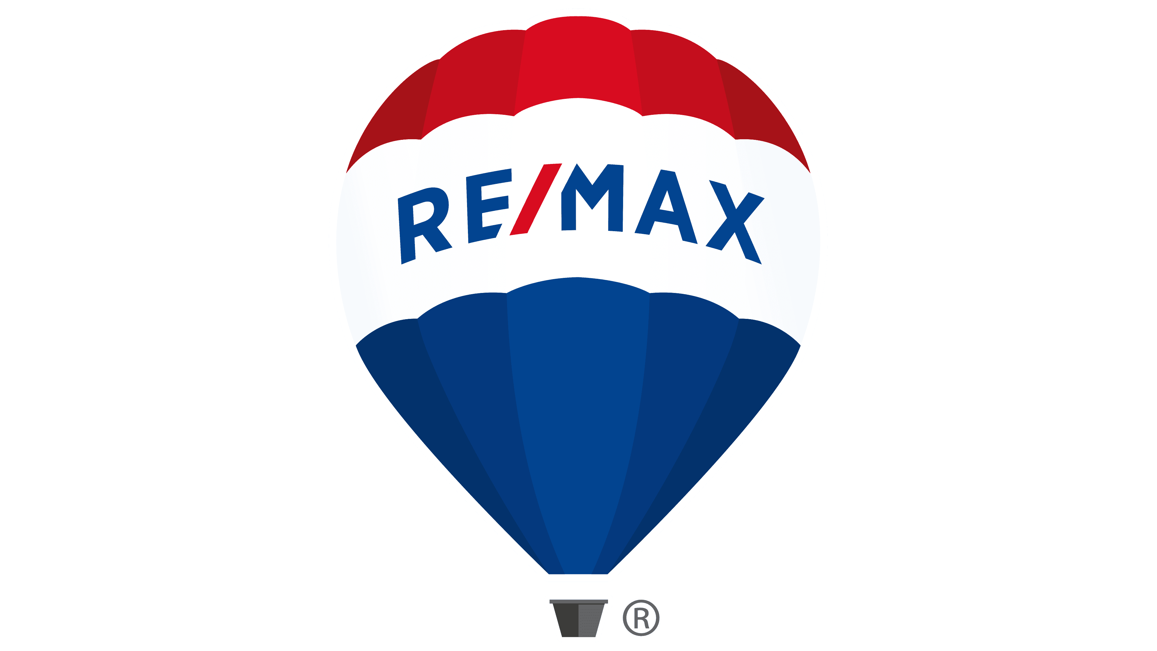
In addition to the word mark, REMAX has an emblem: a tricolor balloon. The modern version of the symbol was introduced in 2017 and designed by Camp + King. The artists depicted the balloon as three-dimensional, using different shades to create a sense of depth. A wide white strip inside the company logo separates the red top and blue bottom. In this case, the letters are blue, and the slash is red. The designers did not forget about the basket either: they drew it as a miniature gray trapezoid.
The balloon embodies an advertising strategy dating back to 1978. It embodies REMAX slogans such as “Above the Crowd!” and “We’ll take you above the crowd.” That is, it symbolizes the company’s growth, development, superiority, and global expansion.
The real estate chain uses the Gotham font for its logo, inspired by century-old city signs. This geometric sans-serif was created by typographer Tobias Frere-Jones and his colleague Jesse Ragan in 2000.
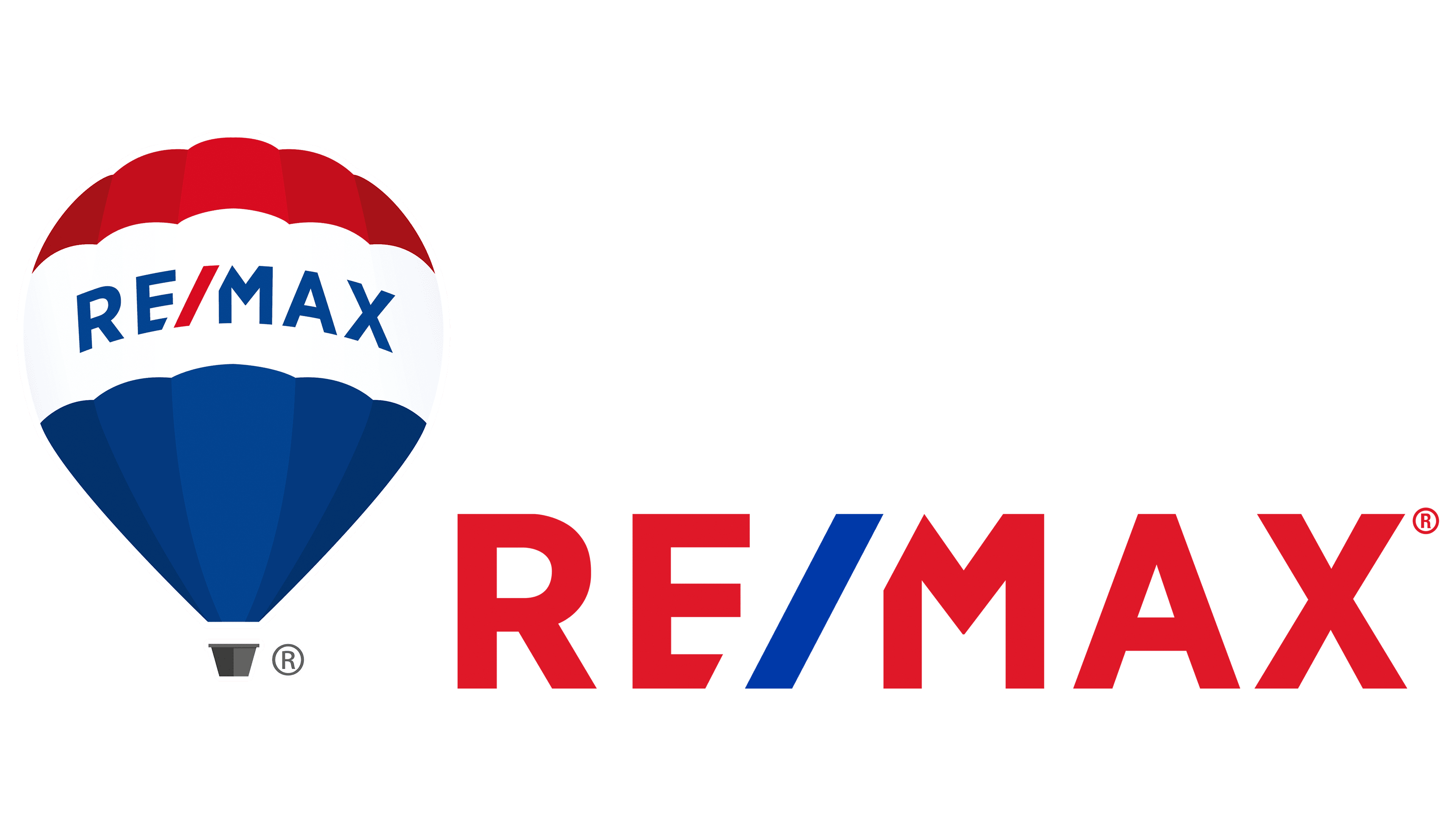
The main color of the inscription is red (#DC1C2E). But the slash is bright blue (#003DA5). As for the emblem’s palette, which depicts a balloon, it is more diverse. In addition to white, it includes light and dark shades of blue, red, and gray. But there is no gradient: the artists made a clear separation between fragments of different colors.