


![]() Remington Logo PNG
Remington Logo PNG
One of the oldest gun manufacturers respects its historical heritage. That is why the Remington logo is designed in an elegant style that reflects a reverence for years of tradition. It embodies the elegance, quality, and prestige that the American company strives for.
Remington is now a reorganized bicentennial American gun company. It specialized in rifles, shotguns, and pistols for individuals. The Remington logo features 100 original models, including the popular Model 700, whose variants are still used by police and the military today.
Eliphalet Remington founded the firm in the early 19th century (1816). Later, several owners managed the business: Marcellus Hartley (since 1888), DuPont (in the 1930s), Clayton, Dubilier & Rice (since 1993), and Cerberus Capital Management (since 2007). They ensured Remington’s prosperity. After the CEO of the management company resigned in 2017 and the high-profile shooting of schoolchildren by the firm’s guns, Remington’s business declined. It ceased to exist in 2020, after 200 years on the market, due to bankruptcy, and was sold off piecemeal.
Meaning and History
![]()
The Remington gun business began in 1816. The company was named after its founder, the American engineer and blacksmith Eliphalet Remington. It was his last name that was reflected in the logo that adorned rifles and then appeared briefly on typewriters, cutlery, and housewares.
The arms and ammunition manufacturer became so popular that in 1926, it began selling decorative patches with its emblem. Subsequently, he had new products, clothing, and accessories. No matter what was sold under the Remington brand, its logo has always been a testament to the quality of its products. It remains recognizable today, even though the company split up after its 2020 bankruptcy.
What is Remington?
A vintage Remington family gun house that manufactured products for the government during World War I and II, police officers, military, snipers, hunters, and for self-defense by individuals.
Old
![]()
The logo is enclosed in an oval, a symbol of self-sufficiency and completeness. Inside the figure, they placed as much information as possible to convey the spirit of Remington.
In the center, in large white letters with elegant swirls, is the name. It is underlined with a line to show how firmly the company stands on its feet. It also points to the family name at the heart of the business. Relying on it, the brand will endure through the ages.
At the top and bottom of the oval, separated by fine white lines, are the inscriptions “Rugged, durable, dependable” and “In all weather and at all times.” Their main purpose was to demonstrate the product’s highest quality. A subconscious message was conveyed to the buyer that the products would last him and his descendants for many years.
In proximity to the central inscription are two visual images: ears and a gun.
The two ripe crossed ears above the title, drawn in thin yellow lines, are overflowing with grains. They had several meanings:
- Prosperity of the firm, prosperity.
- A large number of goods are produced.
- The longevity of the company.
At the bottom of the name is the outline of a gun. The image is the only element directly indicating the company’s line of business. The combination of the spikes and the gun, made in the same style, indicated hunting.
The dark green background is a sign of abundance and luxury. It hints at velvet fabric. It is also the color of money.
The logo is too rich and crowded with symbols, so it is poorly remembered. Placing it on a dark background makes the image look heavy.
before 2000
![]()
The logo features the white Remington name inside a green gradient oval. The shades flow seamlessly from light green at the top to black at the bottom. And a gradient of gray is used for the translucent shadows surrounding the emblem. The lettering consists of bold italic letters with thin and long serifs. The font looks like a modified Felis Bold Italic version from Typomancer. The elegant letters are a tribute to the company’s rich history and traditions. In addition, this design symbolizes the high quality and sophistication of Remington firearms.
2000 – 2020
![]()
The new logo is simple and concise, like a pistol shot, and consists only of the word mark. It is much easier to perceive than the previous one.
The founder’s last name is the most recognizable part of the brand. Remington planned the firm as a family business to be continued by his sons. So he registered the company as E. Remington and Son. But only the last name was used for the logo and the names of all gun models.
The refined serif font with vintage-style elements reflects the company’s history in the best possible way. At the same time, it does not look out of fashion. The italic font with a forward slant symbolizes the brand’s desire to develop and move forward, following consumer demand and the peculiarities of the era.
Elements hinting at Remington’s line of business have been added to the lettering.
- The extended foot of the letter R resembles a trigger.
- The current above the “i” resembles the barrel’s muzzle and the shot.
- The tail above the g is the top trigger in shotguns. It is also an allusion to the bolt of an antique flintlock rifle that started the family business. With a homemade copy, the founder won second place in competitions in his youth. It was from there that Eliphalet brought his first orders.
- The round bottom g mimics the trigger’s ring.
In recent logo variations, Outdoor Company is added to the main inscription at the bottom, and a schematic image of three mountain peaks is added at the top. This is because Vista Outdoor Inc. bought the rights to the brand after the bankruptcy. The mountains are part of the owner’s firm’s emblem. And an additional hint of hunting.
Font and Colors
The main color of the emblem is black. Demonstrates a strong position and self-confidence, total leadership (in 2015, the company was the largest rifle manufacturer in America). The shade echoes gun grease, gunpowder, and the most common black color of guns. It is the tone of power, strength, and death that is encased in each barrel.
In some variations, the logo is presented in shades of green, echoing the first emblems. The chosen shade conveys calmness, judiciousness, and balanced decisions, which is important when owning a gun. The color evokes nobility and prosperity.
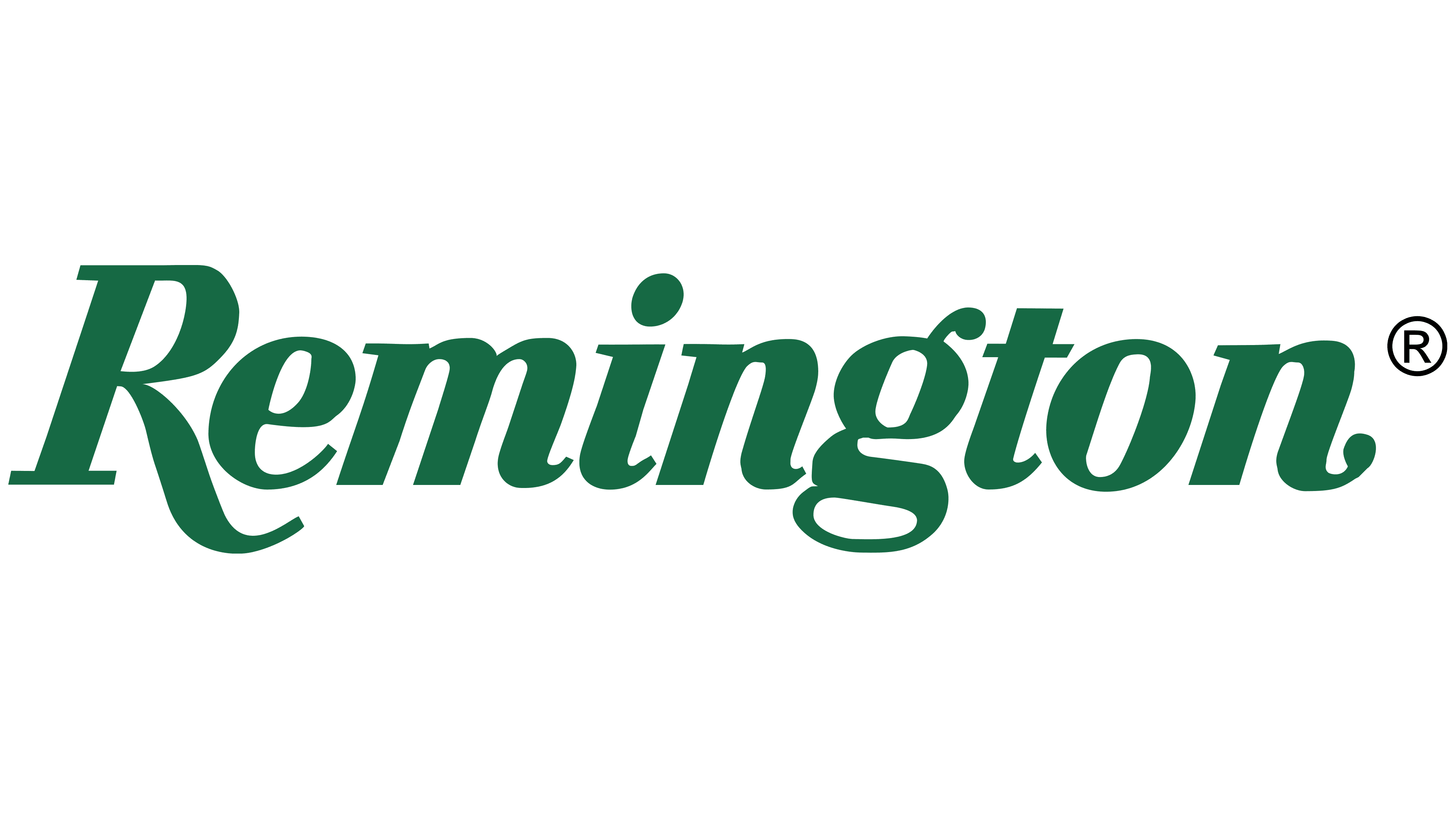
The font echoes the Walbaum SH Bold Italic but differs in the added detail to a few letters. This makes it unique.