The Renault Trucks logo reflects the French company’s rich heritage and innovation. Its design symbolizes the brand’s strength, dynamism, and reliability. Every detail of the emblem embodies the truck manufacturer’s philosophy of striving for high quality and safety standards.
Renault Trucks: Brand overview
| Founded: | 1978 |
| Headquarters: | Saint-Priest, France |
| Website: | renault-trucks.com |
In 1975, the well-regarded French brand Renault ventured into the trucking industry by securing a share in Saviem, a renowned French truck maker. A few years later, in 1978, the company revamped its truck division, renaming it Renault Véhicules Industriels, which translates to Renault Industrial Vehicles.
By 1980, Renault V.I. proudly launched the Premium, a series of robust heavy-duty trucks. Over time, this model would be heralded as one of Renault’s signature offerings in the heavy truck segment. Fast forward to 1987, and Renault V.I. found a strategic partner in the Dutch truck manufacturer DAF. Together, they established Renault Véhicules Industriels et Commerciaux (RVIC). However, this partnership faced challenges. By 1992, DAF exited, and RVIC transitioned back to its earlier name, Renault V.I.
The late 90s saw the birth of the Kerax, a rugged, heavy-duty construction truck, broadening Renault’s portfolio. But the dawn of the new millennium marked a transformative phase for Renault V.I. In 2001, the business caught the attention of Volvo and was subsequently absorbed into the Volvo Group. A year later, the collaboration between the two gave rise to a refreshed identity known as Renault Trucks, concentrating its production activities in its homeland, France.
In the years that followed, Renault Trucks was relentless in its pursuit of innovation. 2006 welcomed the new Range T model, a successor to the iconic Premium. Moreover, in 2010, the brand displayed its commitment to sustainability by kickstarting an electric truck initiative, leading to the development of the Renault Trucks D Z.E prototype.
Meaning and History
What is Renault Trucks?
Incepted in 1978, Renault Trucks is a distinguished manufacturer of commercial trucks in France, noted for its top-tier vehicles. The company’s headquarters are in Saint-Priest, close to Lyon, and it has functioned as a subsidiary of the Volvo Group since 2001, reinforcing its position as a leading authority in the sector.
Renault Véhicules Industriels has been a heavyweight in the commercial truck market for over a century, playing a significant role since its beginnings in 1902. The company’s contributions extend beyond producing sturdy, reliable trucks – they also manufactured buses, underscoring their versatile capabilities in the automobile industry.
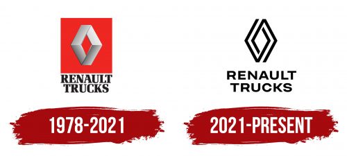
1978 – 2021
Renault Trucks borrowed part of its name from Renault and the legendary diamond-shaped symbol. The company continues to use this emblem even though, since 2001, it has belonged not to the eponymous French car manufacturer but to the Swedish corporation Volvo Group.
The original quadrilateral sign, created in 1925, represented a stylized radiator grille but lost its initial meaning over time. It is a large diamond, appearing as a rhombus with two truncated corners. It embodies several qualities:
- Strength and durability, as it represents the hardest natural stone
- The beauty achieved through flawless cutting
- Exclusivity, given that diamonds, are incredibly rare and precious
These characteristics precisely reflect Renault Trucks’ concept, prioritizing high quality in its vans, trucks, and military vehicles. Since these vehicles are not small and delicate, the automaker uses a logo with a corresponding “brutal” version of a diamond.
The rhombus appears very massive, consisting of wide trapezoid and parallelogram shapes. They are separated by dark outlines, creating a sense of depth. A silver gradient gives the image a three-dimensional look and mimics the texture of smooth metal, reflecting the brand’s connection to vehicles.
The geometric sign is placed inside a large red rectangle. The empty center of the rhombus, also colored red, adds a visual light to the emblem. Red is associated with the energy, strength, and power of trucks capable of traveling long distances and carrying heavy loads. Additionally, the lower part of the diamond hints at the perfection of Renault Trucks’ products, as it clearly forms the letter “V” – a symbol of victory.
Designers wanted the brand name to fit entirely under the red rectangle, so they divided it into two lines and adjusted the letter spacing. The simple black inscription does not match the futuristic style of the logo. However, its elegant font with rectangular serifs still looks modern and dynamic, reflecting the progressive ideas of the French company.
2021 – today
The company pursued simplification, transforming the massive diamond with a metallic texture into a two-dimensional pattern of thin interwoven lines. Four pairs of connected corner brackets form a diamond shape, which is much better suited for the digital environment than the previous full-color version.
The flat design aligns with the trendy minimalist style that has influenced the identity of many automotive brands. It reflects Renault Trucks’ commitment to future technologies while preserving its valuable historical heritage. The diamond-shaped sign, resembling a labyrinth, can be interpreted in various ways:
- The lines symbolize roads, and the angles represent sharp turns that agile trucks handle well
- Two interlocked hooks convey the idea of interaction and transformation
- The dynamic shape infuses the emblem with visual motion, reflecting the energy of the vehicles
Despite its minimalism, designers aimed to adhere to a futuristic style, making the diamond pattern look progressive and modern. The phrase “RENAULT TRUCKS” placed just below produces the same impression. The company name is traditionally divided into two lines and set in an uppercase font, but now the letters lack serifs.
The absence of decorative elements has improved the readability of the text, while wide letter spacing has added visual lightness. The deliberately simple font style evokes a sense of clarity and accessibility, projecting these qualities onto the brand to attract new customers. The black-and-white color scheme also conforms to minimalist principles. It is a timeless classic that underscores the automotive manufacturer’s seriousness, professionalism, and business approach.


