![]() Rewe Logo PNG
Rewe Logo PNG
“Ask what you need, we sure have it!” the Rewe logo promises. The emblem symbolizes communication between sellers and customers. It is enough to place an order to deliver the desired goods to the buyer.
REWE was founded in Cologne on January 1, 1927, when 17 purchasing cooperatives from the Rhineland and Westphalia formed Revisionsverband der Westkaufgenossenschaften. The name referred to a revision association of western purchasing cooperatives. The initiative appeared in post-inflation Germany, where independent retailers faced pressure from prices and competition. Early trade was built around goods such as hazelnuts, dried apricots, and raisins.
In the 1930s, REWE began coordinating store presentation and advertising for affiliated shops. In 1932, the network introduced unified lettering for store signs, giving the cooperative a more consistent public identity. In 1935, purchasing cooperatives from Central Germany joined the organization. By 1940, REWE had reached 8,000 members. During World War II, shortages forced the group to secure supplies through a coffee factory and by cooperating with local wineries.
After the war, REWE entered the private-label market under the REWE Dreistern and REWE Kronjuwel brands. On May 17, 1972, management was divided between Rewe-Zentralfinanz e.G.m.b.H. and Rewe-Zentral-Aktiengesellschaft. In 1973, after acquiring Leibbrand Gruppe, REWE launched Penny, entering the discount segment while EDEKA and expanding discounters remained its main rivals in German retail.
In 1978, REWE opened the first Toom Baumarkt in Frankfurt am Main, entering the home improvement market. From 1988, tourism became another major field for the group. In 1993, REWE acquired a stake in Budgens and expanded into Austria and Eastern Europe through BILLA. REWE Digital GmbH was created in 2013, bought commercetools in 2014, and the REWE Group co-founded EURELEC in 2016. The company later sponsored 1. FC Köln, a club in the German Bundesliga during the 2020/21 season.
Meaning and History
![]()
For almost 100 years, the grocery store chain’s logo has changed only a few times. Moreover, the fact that the company was founded in Germany will be clear to a potential Rewe client almost immediately. This is due to a simple yet bright range of colors and brutal, solid forms. Thus, supermarkets operating under the Rewe brand embody discipline and strength.
What is Rewe?
This is a century of development and improvement. Along with the new stage, the previous logo was replaced with one that reflected the period’s trends, the tasks, and the organization’s goals.
1977 – 2006
![]()
The original Rewe logo was introduced in 1977. For the brand name, a bold sans-serif font was used. Red was used as the palette. The wordmark is in capital letters. In addition to the inscription, the creators added two lines. One red one looked like wings. Below it was the second, yellow, visually designed to look like a straight line. As a result, the red and yellow colors on a white background helped potential buyers feel the company’s strength and reliability, as well as the quality it is working toward.
2006 – 2015
![]()
Almost 30 years later, Rewe Group decided to change the supermarket chain’s logo. As a result, it has not only been visually redrawn but also greatly simplified. The brand name itself is made using bold white capital letters. The background was red, which was the main color of the original logo. Each letter in the title had barely perceptible rounded corners. Thus, the authors tried to make the main inscription more friendly to the target audience.
2015 – 2020
![]()
The previous option did not last even ten years. The company decided to radically change the logo’s visual appearance. For the first time in the brand’s history, the slogan “Dein Markt” (“Your market”) was added, positioned below the main inscription. She, in turn, has not changed visually from the 2006 logo to the 2015 logo. However, not a standard background was used; instead, a red dialog symbol was used. Thus, Rewe Group sought to demonstrate that its hypermarket chain is open to dialogue with its target audience.
As in the previous version, the name “Rewe” was set in bold capital letters, with minimal rounding. The slogan, in turn, also consisted of capital letters but without bold type. In addition, the distance between characters in it is much less than that of the brand name.
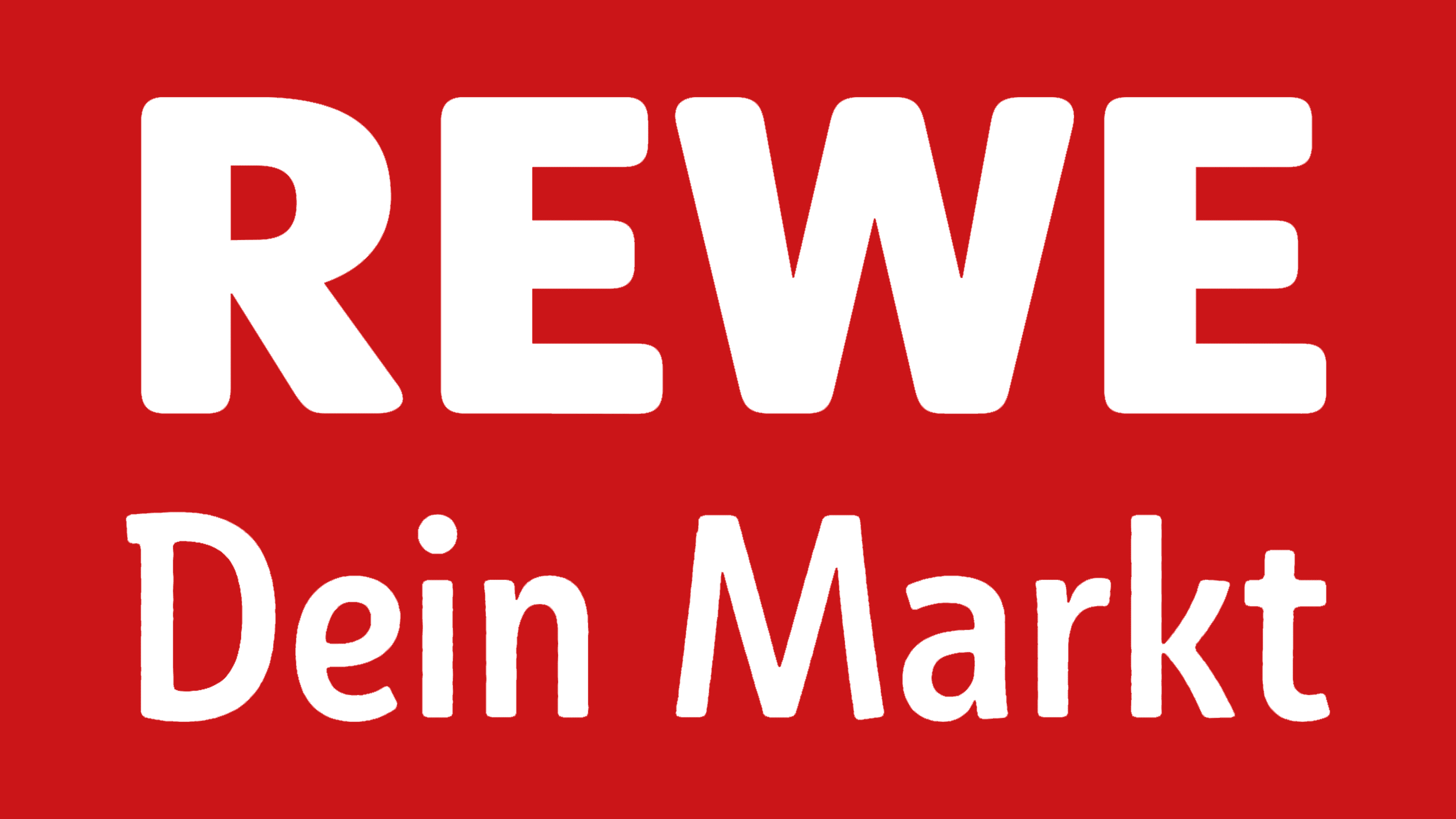
2020 – today
![]()
The concept has remained identical to the 2015-2020 variant. The author made changes exclusively to the slogan. Capital now was only the letter “D” in the word “Dein.” The slogan is also in bold type. Otherwise, this logo variation was a complete duplicate of the previous one.
Font and Colors
The font of the Rewe supermarket chain logo is as close as possible to Segaon Soft Black. Its characteristic features are solid sans-serif letters.
The authors used red and white as the color scheme, except for the first version of the logo, which included a yellow line. The most minimalist Rewe logo was used from 2006 to 2015, with no additional elements.