The benefits and taste of ripe berries and fruits take first place in manufacturing brand juices. The Rich logo emphasizes the natural composition without additives, and raw materials are grown without the use of chemicals. The purest natural mix gets into the glass of the consumer.
Rich: Brand overview
| Founded: | 1995 |
| Founder: | Coca-Cola (2005) |
| Headquarters: | St. Petersburg, Russia |
Rich is a Russian brand of natural fruit and berry drinks. It produces juice, morses, and nectar mainly from peach, cherry, apple, pear, raspberry, strawberry, banana, blueberry, grape, grapefruit, pineapple, orange, mango. The brand was created by the Multon specialty plant, which appeared in 1995. The names of the company’s founders were not disclosed, but they are believed to be businessmen Dmitry Korzhev, Yuri Pilipenko, and Dmitry Troitsky. The head office and industrial sites are located in St. Petersburg (Russia). The brand’s current owner is the Coca-Cola corporation from the U.S., which bought it in 2005.
The brand was created as a subsidiary of the Multon juice plant. It was supposed to represent premium products, so the founders gave it a foreign name. In addition, they were constantly in control of the marketing strategy, which was based on the box’s design. The presentation of products was held in 2001, and in 2002 unique juices and nectars Rich first appeared on the shelves of Russian stores.
After the Russian factory was taken over by Coca-Cola (in 2005), the company “rebooted” the brand and made it the main one, adding fruit mix-desserts to the assortment. This was in 2007. The change of ownership went smoothly: consumers did not even notice this fact because, by that time, the products of this brand were already in wide demand in Russia.
Meaning and History
The new owner of the brand made a powerful advertising campaign, which contributed to the popularization of soft drinks. Its basis was the original label on the box, on each side of which was one letter of the logo. The package was rotated to make the whole word “Rich.” The company slogan was a philosophical statement: “Life is a good thing, no matter how you turn it around.
What is Rich?
Rich is a Russian brand of nectars and juices which has chosen a foreign name to be associated with the premium class. The Multon company created it in 2001, and in 2005, together with it, it became part of the American food corporation Coca-Cola. Rich has separate lines of fruit and berry drinks for younger children and puree-based desserts.
Old
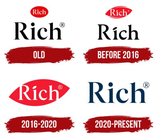
The old logo shows the name of the juice brand, designed in two ways: in pure form and with graphics. In the first case, a large black inscription is located at the bottom of the logo. It is written in a serif font with “i” and “h” at the ends. Almost all the letters are lower case, except for the “R,” which is capitalized according to grammatical rules. The intra-letter spaces are rounded and smooth. There is a small rhombus at the end of the word, replacing the dot. The second name is miniature, white, and located in a red oval. It is identical to the lower variant.
before 2016
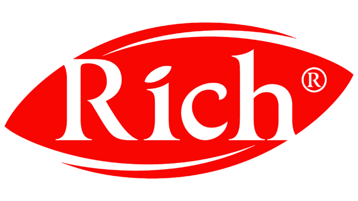
After buying Bend Rich, the Coca-Cola Company redesigned the logo. It removed the impromptu dot at the end of the name because it needed to leave only four characters – one on each side of the package – for marketing purposes. In addition, the designers changed the lettering style to make it lighter: they thinned the lines of the letters and sharpened the ends even more. The diamond above the “i” turned into a diagonal ellipse, which repeats the shape of the upper element in red. A complex configuration replaced the oval with two deep notches at the top and bottom.
2016 – 2020
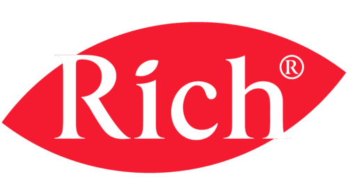
After a slight rebranding, the black inscription was removed. Only a stylized bright red leaf with the word “Rich” in white and a registered trademark sign remains. The designers have enlarged these elements and slightly changed the font. Now the top corner of the “R” appears longer, and the dot above the “i,” which looks like a small leaf, is thicker and shorter. As for the “c,” one of its sharp ends is rounded, giving the logo a visual softness.
2020 – today
For 2020, Tuman Studio has redesigned all Rich products and redesigned the iconic logo at the same time. It was decided to abandon the traditional red color – its absence was to be compensated by botanical illustrations on juice and nectar packages.
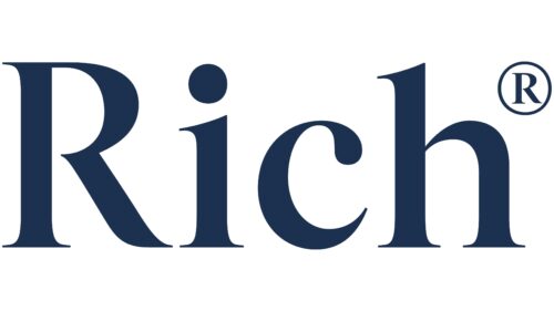
The logo became dark blue but retained continuity because the font has not changed much. As before, an elegant typeface with sharp and long serifs is used for the brand name. However, the designers have increased the contrast of the letters, making thin lines even thinner. They also fixed the “c” shape to make the teardrop element at the top look elegant.
The color of the modern lettering was inspired by nature itself: the mystical beauty of the evening sky and the endless depths of the ocean. But the recognizable figure in the form of a stylized leaf has disappeared – nothing else reminds of it. Even the dot above the “i” now looks not like a small leaf but like a regular circle.
The blue color allowed Rich products to stand out among other fruit and berry juices. But, despite the new approach to identity, the designers managed to keep the associations with the premium segment. The rebranding campaign ran from November 2020 to February 2021.
Font and Colors
Rich from the beginning paid more attention to the emblem to promote its product quickly and for sure. And so it turned out: the drinks were in high demand almost immediately after they entered the commercial network. So well thought-out was the identity of the trademark. The pointed oval that is used now resembles the leaf of a fruit tree and some berry bushes.
The juice producer chose a printed antiqua for its emblem with custom adjustments. For example, the letter “i” is supplemented not with a dot, as in the classic version, but with an oblique oval with pointed ends. Similar corrections are made to the other characters – their serifs flow smoothly into the legs, so they look like miniature spikes. The color palette consists of red, white, and black.
Rich color codes
| Fire Engine Red | Hex color: | #d31926 |
|---|---|---|
| RGB: | 211 25 38 | |
| CMYK: | 0 88 82 17 | |
| Pantone: | PMS Bright Red C |
| Black | Hex color: | #08080a |
|---|---|---|
| RGB: | 8 8 10 | |
| CMYK: | 20 20 0 96 | |
| Pantone: | PMS Black 6 C |
