The Rihanna logo is confident and powerful, like the singer’s vocals. The design reflects her vibrant career and significant presence on the global music stage. The elements convey the star’s maturity and strong character.
Rihanna: Brand overview
Rihanna, known as Robyn Rihanna Fenty, hails from St. Michael’s, Barbados, and is a true global icon. Since 2005, the multifaceted artist, entrepreneur, and philanthropist has left an indelible mark on the world stage, captivating millions with her musical prowess, outstanding acting skills, and remarkable business endeavors.
Rihanna began her passion for music at an early age. American record producer Evan Rogers noticed her talent and quickly made her famous. In the watershed year of 2005, Rihanna signed with Def Jam Recordings, and her captivating hit “Pon De Replay” took the world by storm.
The release of her first album, “Music of the Sun,” in 2005 began Rihanna’s ascent in the music world. Six more studio albums followed, featuring iconic songs such as “Umbrella,” “Love on the Brain,” and “Work.” Collaborations with industry stars such as Jay-Z, Eminem, and Kanye West solidified her position in the musical panorama.
In addition to music, Rihanna has also proved herself in acting. Her movie debut in Bring It On All or Nothing in 2006 showcased her acting talent. Subsequent roles in films such as Ocean’s 8 in 2018 further confirmed her irresistible charisma and versatile talent, making her a prominent figure in the film industry.
Rihanna’s entrepreneurial endeavors are a testament to her prowess in more than just entertainment. In 2017, she unveiled an inclusive cosmetic line, Fenty Beauty, which received acclaim from consumers and industry members. Collaborations with fashion houses such as Puma and the launch of the Savage X Fenty lingerie brand further emphasize her influence in the fashion sphere.
Rihanna’s influence is not limited to her professional endeavors. An example of her philanthropic endeavors is the founding of the Clara Lionel Foundation in 2012. The foundation, named after her beloved grandparents, is dedicated to developing educational and medical resources for underprivileged populations worldwide. Through this philanthropic endeavor, Rihanna is making a positive impact on the lives of a huge number of people.
Rihanna’s exceptional talent, resilience, and successful journey have made her one of the most influential figures in today’s entertainment industry. Her diverse career spanning music, acting, entrepreneurship, and philanthropy, as well as her unwavering dedication and commitment to making a positive difference worldwide, inspires many.
Meaning and History
What is Rihanna?
Robyn Rihanna Fenty, is a Barbadian singer, actress and businesswoman who has had a significant impact on music, fashion and beauty. Emerging in the music industry in 2005, she quickly gained worldwide popularity for her catchy pop tunes and charisma. In addition to music, she launched her successful beauty brand Fenty Beauty in 2017 and luxury fashion house with LVMH in 2019, demonstrating her influence in various industries.
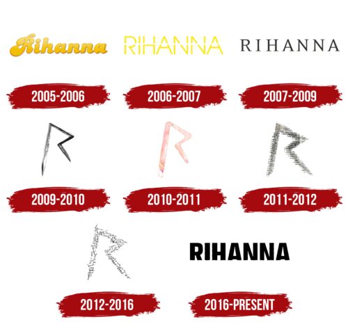
2005 – 2006
The early emblem of Rihanna’s career featured her name in a yellow, calligraphic, and precise font. This logo symbolized youth, freshness, and energy and was used at the beginning of her career. The gold-tinged letters conveyed the value of her artistry, attracting attention with their brightness and elegance.
The logo perfectly matched the title and theme of Rihanna’s debut album, “Music of the Sun.” The bright yellow color emphasized the energy and novelty Rihanna brought to the music scene, reflecting the sunny mood of the album. This color symbolizes light and warmth, aligning with the album’s musical style and overall concept, filled with a sunny Caribbean vibe.
2006 – 2007
The thin uppercase letters of the logo for the album “A Girl Like Me” shine like sun rays. This brightness reflects Rihanna’s freshness and vitality in her second album. Caribbean influences continue to play a significant role in her work, evident in the use of a bright color palette inspired by the sun and warmth of her native islands.
The name “Rihanna” on the logo is intersected by a white stripe, splitting it in half. This line symbolizes an important phase in the singer’s life—a transitional moment of growing up and gaining independence as she turned 18. The white stripe is a metaphor for this milestone, highlighting how her inner world and perception of reality have evolved.
The songs on “A Girl Like Me” are based on Rihanna’s personal experiences. They reflect changes in her perspectives and her growth as an individual. Each track is filled with sincerity and depth, showcasing her journey in a short but eventful period.
2007 – 2009
The logo for the album “Good Girl Gone Bad” features a simple yet elegant font. Black letters with serifs mirror the stylish look of fashion magazines. This font choice emphasizes the modernity and sophistication of the design, making it appealing to viewers and fans.
The album logo represents a significant phase in Rihanna’s career. During this period, she solidified her position in the music industry and achieved international recognition. The logo’s design elements reflect her confidence and professional growth, resonating with a broad audience.
The signature on the cover harmonizes with Rihanna’s image on the album cover. She is presented as a seductive and mature woman, highlighting her artistic and individual evolution. This portrayal is far from her early image as a young and innocent girl.
2009 – 2010
The logo with the letter R, designed with sharp lines and angles, resembles an unfinished shot, creating a sense of edginess. This symbol is a key element of Rated R’s album, highlighting its bold and confident nature. The black charcoal color of the logo enhances the dark and aggressive sound of the compositions, which blend elements of R&B and rock. This color and shape symbolize defiance against the world, a desire to break free from everyday constraints and go beyond conventional standards.
The album’s logo and music demonstrate the artists’ unwavering desire to make a statement, express inner strength and independence, challenge established norms, and create something unique and memorable.
2010 – 2011
The softened logo emphasized the return to light and pop-oriented tracks in the album “Loud.” This step indicates the singer’s intention to create an image that matches the new sound and atmosphere of the album. Retaining the overall look of the emblem shows that the singer found the ideal symbol reflecting the character of her work, allowing her to remain recognizable to fans.
The pink shade of the logo adds a touch of softness and femininity, harmonizing with the romantic mood of the music. This color choice highlights the lyricism and emotionality of the songs, creating a cohesive visual and auditory image that attracts listeners and lets them dive deeper into the world the artist has created.
2011 – 2012
The letter R, made from newspaper clippings, takes center stage on the cover of the album “Talk That Talk,” immediately grabbing attention with its original design. This symbol blurs, creating a sense of movement and dynamism that enhances the dance nature of the music in the collection. This technique conveys the energy and rhythm of the compositions, making them even more captivating.
The symbol’s unique texture resembles a passionate lover’s touch, evoking a shiver. This effect closely ties to the theme of the songs, which explore aspects of seduction and romance. Each touch seems to bring the emotions sung about in the tracks to life, adding depth and sensuality.
2012 – 2016
The album “Unapologetic” logo features the letter R created from separate inscriptions. This design looks like letter excerpts, giving it a unique personality and depth. The emblem symbolizes the singer’s multifaceted nature and the diversity of her work, showcasing her ability to create pieces that resonate with a wide audience. The singer aims to write songs that touch the heart and help people cope with life’s challenges.
2016 – today
The logo was designed in 2016 to promote the ANTI studio album and features a black wordmark with the words “RIHANNA” in bold sans-serif letters. The font resembles Reznik Heavy by The Northern Block, with unique modifications. The crossbars of the letters “H” and “A” are offset downward, and the letter “N” appears wider due to the offset of its right vertical line.
These typographic changes give the logo a distinctive personality. The shifted “H” and “A” and the elongated “N” provide the word “RIHANNA” with a unique appearance, setting it apart from any font library. This design reflects her music – familiar yet always introducing something new. The black color enhances the word’s expressiveness, adding an elegant, modern look.
The bold sans-serif font ensures readability, while the modifications introduce an element of surprise. The black color gives the logo a striking and sophisticated presence. The unique typographic elements mirror Rihanna’s style, combining familiarity with unexpected twists.

