![]() Rimowa Logo PNG
Rimowa Logo PNG
The elegant Rimowa logo is associated with luxury suitcases, bags, backpacks, small luggage cases, and various accessories. A rebranding marked every innovation that changed the history of the company.
Rimowa began in Cologne in 1898, when Paul Morszeck and Heinrich Görtz founded a workshop for travel trunks. By 1900, Görtz had left the business, and Morszeck became the sole owner of Kofferfabrik Paul Morszeck. Its early products were wooden trunks covered with leather, a typical form of luggage for wealthy travelers before the age of aviation.
In the 1920s, Richard Morszeck, the founder’s son, joined the company and began studying new materials. A key reference was the German Junkers F13 of 1919, the world’s first all-metal passenger aircraft. Its corrugated duralumin structure, developed by Hugo Junkers, showed how thin metal sheets could gain strength without excess weight.
In 1931, Richard registered the Rimowa trademark at the Imperial Patent Office in Berlin. The name came from RI for Richard, MO for Morszeck, and WA for Warenzeichen, the German word for trademark. Around 1937, a factory fire destroyed much of the wooden production, while aluminum survived. The company then released its first duralumin suitcase, lighter than wood and more resistant to moisture and rough handling.
In 1950, Rimowa added parallel grooves to its aluminum cases, inspired by the Junkers F13, to increase shell rigidity. In 1976, Tropicana became the first fully waterproof suitcase, aimed at camera operators, journalists, and photographers. In 2000, Salsa introduced polycarbonate. In October 2016, LVMH bought 80% of Rimowa for about €640 million, later connecting the brand with Supreme, Fendi, and Dior. In 2021, Hugues Bonnet-Masimbert replaced Alexandre Arnault as CEO.
Meaning and History
![]()
The Rimowa logo first appeared on hardwood cases in 1898, but it had nothing to do with the modern emblem. After all, the company did not get its current name until 1937, when Richard Morszeck (son of the founder of the family business) designed an aluminum suitcase. The initial letters of his name and surname formed the basis of the word “Rimowa,” which has decorated the company’s products ever since.
The stylish mark, made in a strict font without serifs, became world-famous in 1950. That’s when the German manufacturer released a metal suitcase with grooves inspired by an all-metal aircraft design. A few more years later, the austere logo was on waterproof cases designed to protect sensitive equipment. In 2018, the company celebrated its 120th anniversary with a new logo based on the unique architecture of Cologne Cathedral. It is a monogram of the letters “MO,” complementing the lettering.
What is Rimowa?
A division of the international group LVMH, founded in Germany in 1898. It produces products for luggage transportation: suitcases, bags, backpacks, and trunks.
1898 – 1937
![]()
The company’s first logo was a raised picture enclosed in an oval. It shows the silhouette of an ancient building with towers and spires. It reminds us of the Italian cathedral in Cologne, a landmark in the city where the company was founded. Above it are clouds in the form of schematic semicircles. In the center of the cityscape is a round bas-relief with the monogram MO inscribed. These are the first two letters of the founder’s last name, Morszeck. The monogram also resembles a subway sign and indicates travel. In general, the whole image is a symbol of tourism and travel, visiting interesting places.
1937 – 1950
![]()
The company made a significant breakthrough. The son of Raul Morszeck developed the first model of a suitcase, which was made of aluminum, distinguished by its
- ruggedness;
- lightness;
- presentable appearance.
This was the beginning of a new era for the company, replacing the era of wooden suitcases. In connection with this, there was an update of the visual sign.
The basis of the logo was a heraldic ribbon as if forged from metal. Rimowa was written on it in simple, smooth capital letters. Below, in a recess below the ribbon in small print, it says: “eingetr schutzmarke” (registered trademark). This signature had a special meaning. Richard Morszeck registered the company’s trademark in the year 31. This date can be considered the birth of the brand name Rimowa. Before that, the company was just a suitcase factory.
The brand name is a compound word formed from the first two letters of the words: Richard, Morszeck, and Warenzeichen (trademark).
The simplicity and brevity of the visual sign reflected the smooth and clear lines of the company’s products. And the ribbon embodied the winners and added charm to the black-and-white image. The composition said that the company’s suitcases are fashionable and stylish. And all of them would now be produced under the Rimowa brand.
1950 – 1981
![]()
The 50th year was marked by the next big innovation of the company – the use of a special aluminum alloy that increases the durability of the product. Suitcases made of it provided tightness but remained light, so they were especially suitable for air transport. And their fluted surface became a trademark feature of the brand. This stage was again marked by rebranding.
The new logo was enclosed in an elongated oval or rectangle with rounded corners. The shape echoed the shape of the suitcases. It was a reflection of the waves on the surface of the sashes. And also demonstrated complete protection and isolation of the contents from external negative factors.
The name of the company was inscribed inside the figure. It is there in safety, like the things inside the suitcase. The font remained straight and smooth but became bolder, and the distance between the letters increased, demonstrating the development and larger occupation of the niche, displacing competitors.
1981 – 2018
![]()
In 1978, third-generation owner Dieter began developing models of suitcases for professional needs. He offered receptacles for photographers and camera operators. They were capable of preserving equipment during fluctuations in temperature and humidity.
These features were reflected in the company’s visual mark. The borders of the oval acquired thicker lines, symbolizing enhanced protection. The internal inscription has changed the font. The writing of the letter M highlights it. The upper roundings of which hint at the grooved surface of the suitcases. And the letter W resembles two overlapping ticks, embodying double protection and the best choice for travel.
The highlighting of the M directs the user to the first letter of the dynasty surname, Morszeck. Since the company was run by three generations of the family, the capital R from the word Richard was no longer relevant and not quite fair.
The logo has changed the color scheme becoming a pleasant blue. It echoes the sky, water, flying, and travel.
2018 – today
![]()
In 2016, the company became part of Moët Hennessy Louis Vuitton, a luxury and luxury goods concern. The products met the necessary parameters as stylish, comfortable, and quality. That’s why it was noticed. The purchase led to a change in the logo.
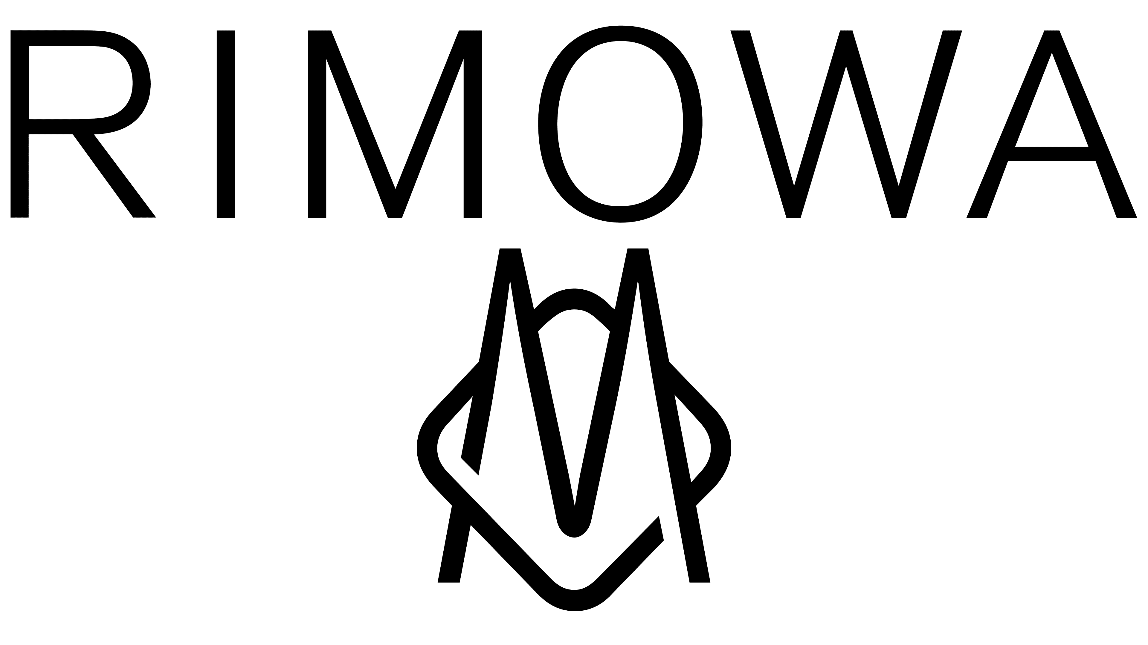
The latter visual mark became one of the most unremarkable in Rimowa’s history. However, it is in the general style of the LVMH brands – thin black capital letters with ample space between them. The composition creates a sense of lightness and shows that all Rimowa products are lightweight.
The emblem bears little resemblance to the previous brand concept. This may be due to the expansion of the range and the move away from just suitcases. Backpacks and bags no longer have a standard shape. Therefore, a clear oval in the emblem is no longer relevant.
Some variations use the MO monogram, borrowed from the first logo, under the name. The letters in it are as thin as the lettering. And the “O” is stylized as a rhombus with soft corners, which echoes the shape of the suitcases. The company’s website points out that the M is also an allusion to the spires of the Cologne Cathedral twins. All of this is reminiscent of the company’s origins.
Font and Colors
The main color of the logos is black. It is austere and “not marky.” Associated with roads, earth, and asphalt. Black stands out against any background. It is the choice of businessmen. Elegant and appropriate to any style, popular at all times. The choice was a tribute to longevity.